Ensure that the presentation graphics enhance your presentation. Too often, the graphics can get in the way of a good flowing presentation. Worse, the speaker simply reads the slides out. Remember! Less is more!
Less is more
As an information management professional, you will be unsurprised to learn that I still do use presentation graphics software. However, over the years I have developed a series of strategies to try to ensure that the presentation graphics enhance the talk.
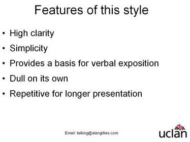
Consider the following set of slides:
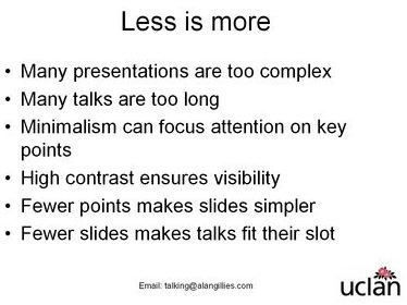
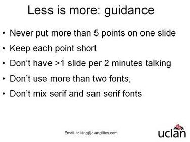
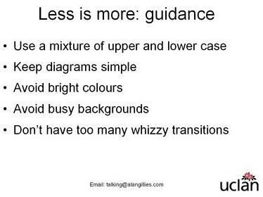
The guiding principle here is minimalism. So the design template is almost black and white with just the University logo to provide some colour. The black text on white background maximises the contrast and a simple Arial font guarantees a consistent look wherever the presentation is shown. The design ethos is in the spirit of modern design classics such as the Apple iPod where “less is more”
This style of presentation is not designed to viewed on its own. Each point may be expounded in the talk and expanded. So, for example, the point
“Use a mixture of upper and lower case”could be expounded as:
“Using a mixture of upper and lower case provides better clarity than simply upper case alone or lower case on its own. Think about the writing on motorway signs. Previously, road signs had used upper case only, but the use of a clear type face known as “Transport” and a mixture of case provides much greater clarity,”
So does this presentation follow all its own “rules”? Pretty much:
- There are no more than 5 points per slide
- Each point is short, although some have more than 6 words, 6 is an aspiration, not a rule
- If this talk was planned at more than 10 minutes, then 5 slides is OK.
- There is only one font
- As there is only one font, it cannot mix serif and sans serif, although the use of sans serif fits with the University logo.
- It does use a mixture of upper and lower case
- There are no diagrams
- It avoids bright colours, complex backgrounds and whizzy transitions
- It will stand out from other coloured presentations, if yours is one of a group.
So you think this is minimalist? Well, it could be more minimalist. You don’t have to use a set of slides at all. You could just talk. There are situations where the slides just distract.
Or you could use a slide show like this to structure your thoughts before hand but not when talking.
Or you could use a slide show like this to structure your talk by generating handouts for listeners to make notes whilst you are talking. In this case, you can use the slides as prompts.
The trick is not to get ideological about minimalism. It is not a good thing per se. But it is a means to put the talking back where it belongs: centre stage. It is a way of challenging the orthodoxy that more is better, and that the technology in some way replaces the talking or negates the need to get the talking right. Otherwise, your PowerPoint presentation may become obsolete (see for example, https://www.brighthub.com/computing/windows-platform/articles/24899.aspx).
Further Reading
Gillies AC (2007) The Art of Presentation: getting it right in the post modern era, Radcliffe Publishing, Abingdon.
This post is part of the series: Get Creative with PowerPoint
Learn how to use PowerPoint to create awesome presentations.
- Get creative with Powerpoint part 1: go minimal
- Get Creative With PowerPoint: Less is More
- Get Creative With PowerPoint: Fluffy Clouds
- Getting Creative With PowerPoint: The Build Transition
- Getting Creative With PowerPoint: Using Images for Reinforcement
- Getting Creative With PowerPoint: Using All the Elements of a Talk
- Use PowerPoint Presentation Slides as Milestones or Signposts
- Getting Creative with PowerPoint: Bringing Down the Curtain