The doughnut chart is another type of basic chart template offered in Excel 2007. We’ll take a look at when it can be helpful to use the doughnut chart as well as how to create one.
Uses of the Doughnut Chart
In terms of appearance and function, the doughnut chart is very similar to a pie chart . Both break down tables of data to give the viewer an idea of the percentage distribution that each item in the table represents. The most obvious difference in actual appearance of the two charts is that the doughnut chart has a “hole” in the middle – thus, explaining why it’s referred to as a doughnut.
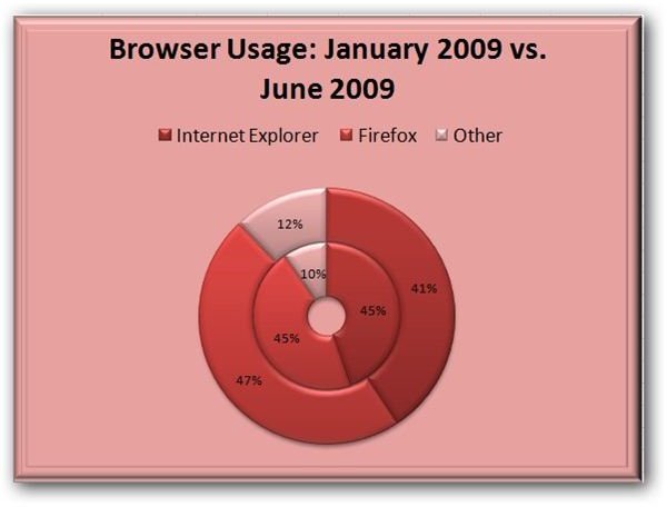
One big advantage that the doughnut chart has over the pie chart is that it allows you to graph multiple data series, so you can use the chart to show how a distribution changes when measured for different time periods, locations, or other factors. For example, in the chart shown to the left (click any image in this article for a larger view), we’ve used a doughnut chart to compare browser usage in January 2009 versus June 2009. The data for this chart comes from the monthly web statistics report at w3schools.com . By representing the data in this way, we can quickly see where any major shifts, if any, of web browser usage occurred.
Doughnut charts are best employed when the number of items in your table is on the low side. If you try to use them to compare too many things, the data quickly gets lost as the number of doughnut slices increases, especially if many of the slices are only very small percentages of the total collection. However, in this latter case, you can get a little better representation of your data if you use an exploded doughnut chart. We’ll talk more about that in the next section.
Types of Doughnut Charts in Excel 2007
There are two basic chart layouts for doughnut charts that come predesigned in Excel 2007, and it’s also possible to create your own specialized doughnut chart template . To see these, go to the Insert tab on the Excel ribbon and click on the Other Charts icon.
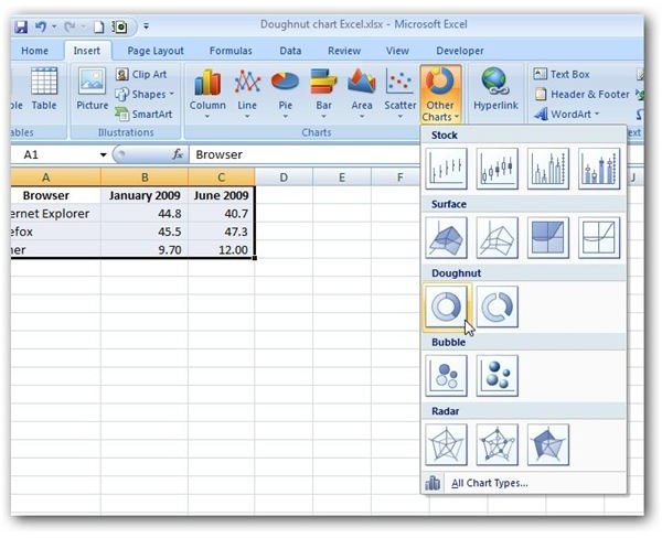
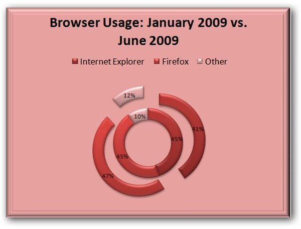
Here, you’ll see two options under Doughnut – the standard Doughnut chart and the Exploded Doughnut chart. In an exploded doughnut chart, the slices are separated as if they are basically “exploding” from the center of the graph. This is a nice option to use if some of your slices represent tiny percentages of the whole chart since the separation can make them more easily identified by the viewer. The sample below shows the same browser usage data as graphed in the previous section but uses the exploded doughnut chart option.
Creating Doughnut Charts in Excel 2007
The method used to create a doughnut chart is basically the same that you would use to create any other type of chart or graph in Excel 2007 .
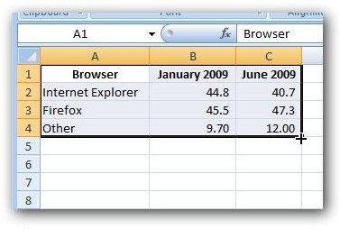
Step 1: Enter the data that you want to represent in the doughnut chart in Excel either by typing it in manually or cutting and pasting from another source.
Step 2: Select the data that you want to include in the chart.
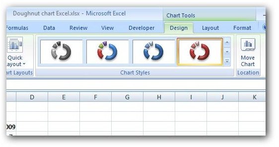
Step 3: On the Insert tab on the Excel ribbon, click on Other Charts and then select the type of Doughnut chart that you want to create (standard or exploding). The chart will appear in your Excel spreadsheet. You can now format and design it however you like using the tabs found under Chart Tools on the Excel ribbon.
If you’re looking for some tips on how to make design changes, take a look at this article on modifying the format of a histogram . Even though this tutorial focuses on histograms, the technique for making design and layout changes is the same for all charts in Excel so you can apply these tricks to doughnut charts as well.


