
Even though a pie chart is one of the simplest types of graphs you can make in Microsoft Excel 2007, there are still several ways you can customize it to better illustrate a particular point about your data.
What is a Pie Chart?
A pie chart is a circular object that represents data in terms of what portion, or piece, of the whole it encompasses. This type of visual aid is often used to represent polling results, budget information, or any other collection of data where you want the viewer to have a clear idea of how each individual slice fits into the big picture.
There are several versions of pie charts that can be created in Microsoft Excel 2007. Depending on your data and what you want to stress with that data, each type of pie chart has its own distinct advantages. In this series, we’ll look at how the same set of data can be represented in several ways through the use of various types of pie charts.
For information on other types of charts, take a look at this broader collection of Excel chart and graph tutorials .
An Example and Background Data
If you’ve ever reached the end of the month and wondered where all of your money went, you’re not alone. However, with so much information from financial accounts available online these days, it’s a lot easier to track this information than it used to be.
For all of the pie charts created in this series, we’ll use a basic monthly personal budget report as our primary data. While this data is fictional, it is similar to the type of information that you can download from online bank and credit card statements. This is certainly not the only application for pie charts, but it is one to which almost everyone can relate.
The Excel file containing the data and the pie charts created in this series has been added to the Windows Platform Media Gallery under the title Microsoft Excel 2007 Pie Charts . Feel free to download this workbook for your own personal use.
Preparing the Data
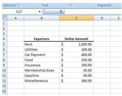
Before we can start creating a pie chart, we first need to input or copy/paste the data into an Excel spreadsheet. If you are downloading the information from an online site, there may be an option to retrieve the data in Excel format, making the whole process a lot easier. Even if this isn’t an option, you may be able to download the data as a CSV file which can easily be imported into Excel . If there is no other alternative, you can always manually input the information as we have done here with the data from our example.
Once the data has been entered, we can use it to construct a pie chart. In the next article of this series, we’ll walk through the steps of creating a basic pie chart and move on to more advanced techniques in later articles.
This post is part of the series: Pie Charts in Microsoft Excel 2007
A pie chart may look simple, but there are actually several ways you can dress it up to make it be a better visual representation of your data. In this series, we’ll take a look at all the different ways you can create and format pie charts in Microsoft Excel 2007.


