After creating a histogram, or any other chart, in Microsoft Excel 2007 or 2010, there are several ways you can modify it to make it even more visually attractive to your audience.
Chart Tools
The Chart Tools available in Microsoft Excel 2007 and 2010 provide a multitude of ways to format any chart for both functional and design purposes. In this article, we’ll show how these tools can be used to modify the histogram that we created in part three of this series . If you would like to download the sample Excel file that contains all of the data, tables, and charts used in this series of articles, it is available in the Windows Platform Media Gallery .
Changing the Histogram Chart Design
To change the overall visual appearance of this histogram (or any other chart, for that matter), make sure that the chart is selected and then open the Design tab under Chart Tools on the Word ribbon.
Click any image below for a larger view.
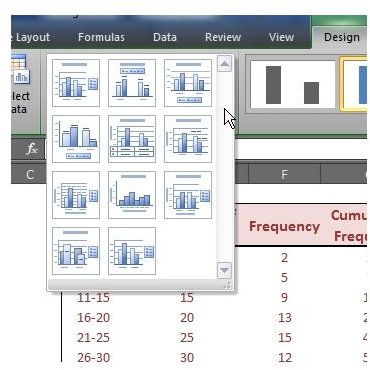
Expanding the Chart Layout options will show several layout designs that can be applied to the histogram. You can widen the width of the columns, move them closer together, and display the value associated with each column among other things.
Similarly, you can expand the Chart Styles options to see different possibilities you can choose for the color and appearance of the column bars.
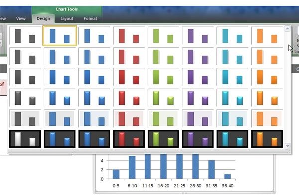
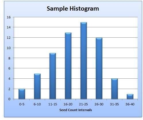
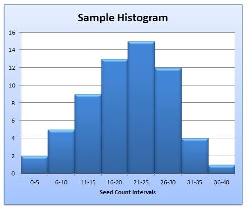
If you’re not sure about which options you want to choose, you can always apply them to see how they will appear on your particular histogram, and then Undo them if you don’t like the result. The screenshot below shows one example of a histogram with a modified layout and style.
Modifying the Legend
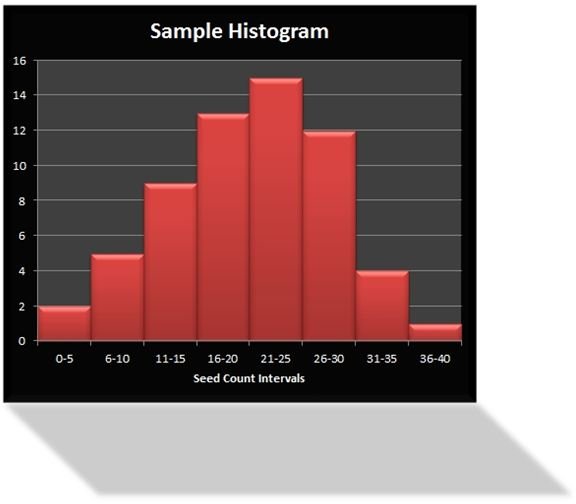
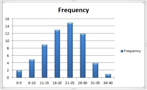
Although this may be a personal preference, one thing I hate is having any information on a histogram that doesn’t offer any added value. The whole purpose of preparing any type of chart is to make it easier for the viewer to see and understand the data. Unnecessary information detracts from this goal.
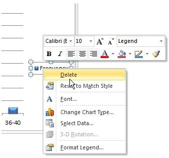
In our example, I find the legend to be one of these unneeded pieces of information. Legends are great if you have more than one item depicted on the histogram, but since we only have one, it’s already clear what our chart is representing.
To remove the legend, right-click on it and select Delete.
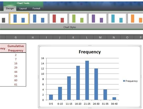
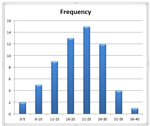
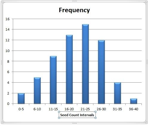
After deleting the legend, the histogram image will rescale as shown in the screenshot below.
Adding Axis Titles
Even though we’ve deleted the legend, it still may be useful to add a title to the horizontal axis to clarify exactly what the labels on that axis represent. To do this, select the histogram and then open the Layout tab under Chart Tools on Word’s ribbon.
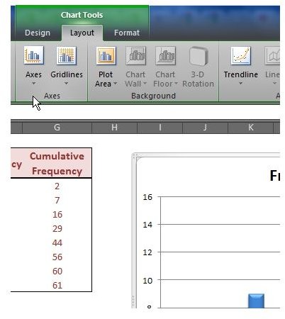
Click on the Axis Titles button, select Primary Horizontal Axis Title, and then choose the Title Below Axis option.
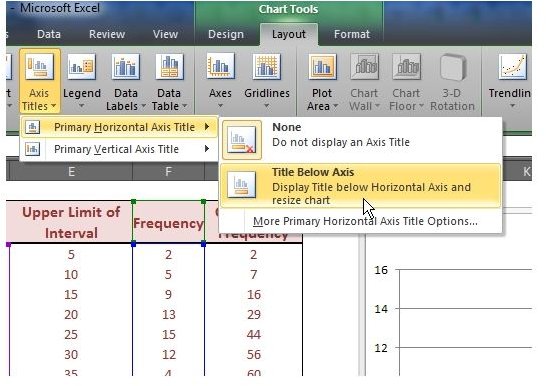
This will add the generic text ”Axis Title” underneath the horizontal axis. To modify this, click on the text box and type in your own title.
You can also adjust the font style and size here.
Other Types of Modifications
There are several other types of modifications that you can make to the histogram to make it more visually appealing, but these are mostly based on user preference. Many of these options can be found on the Format tab under Chart Tools. There are such a wide variety of options that we won’t cover them here, but most are quite self-explanatory. Just as mentioned above, you can always try an option to see if you like the look and then Undo it if it doesn’t meet your expectations.
Getting Rid of the Gaps
What if you don’t want any gaps between the bars of the histogram? You can change the gap width as follows.
Step 1: Right-click on any of the bars and select Format Data Series.
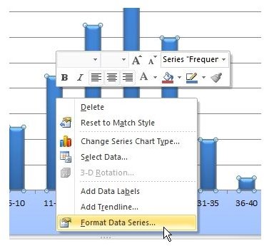
Step 2: In the Format Data Series window that appears, make sure you are on the Series Options tab. Then, move the Gap Width slider all the way to the left, setting it to No Gap.
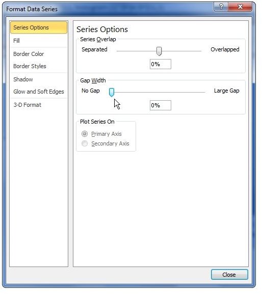
Click Close and you’ll be returned to your new gap-free histogram.
References
Microsoft Excel Official Site, https://office.microsoft.com/en-us/excel/
All screenshots taken by author.
This post is part of the series: Histograms in Microsoft Excel 2007
In this series, we’ll cover how to create a histogram in Microsoft Excel 2007. We’ll give some tips for entering your raw data into an Excel spreadsheet, show how to use the frequency function to organize your data, and then demonstrate how to construct and format the histogram from this data.


