
As we continue in this series which looks at pie charts in Microsoft Excel 2007, we show how to construct a basic two-dimensional pie chart.
Pie Chart Options in Excel
Although the pie chart may be one of the simplest graphical representations that can be created in Microsoft Excel 2007, there are still several options that you can choose from to customize the object. In this article, we will take a look at some of the more basic options and show how to create a two dimensional pie chart in Excel.
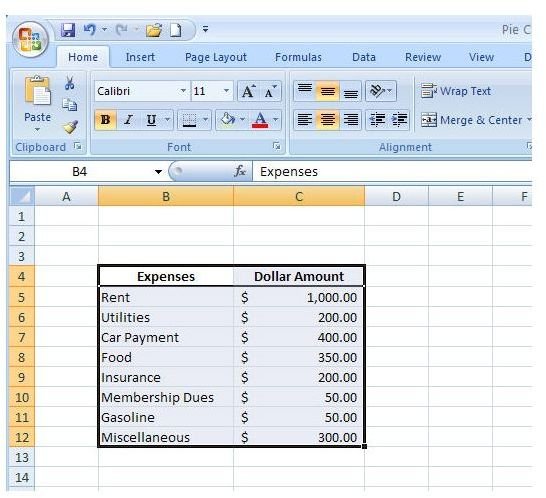
For our example, we’ll be using the monthly budget data discussed in Part 1 of this series. The Microsoft Excel 2007 workbook that contains this data and all charts created in this series is available in the Windows Platform Media Gallery under the title Microsoft Excel 2007 Pie Charts . You are welcome to download this file and use it as a reference for creating your own charts.
If you’re interested in learning how to construct other types of charts, check out this collection of Excel chart and graph tutorials here on Bright Hub’s Windows Channel.
Creating a Basic Pie Chart
Step 1: Select the data that you want to include in your pie chart. (Click the image below for a larger view.)
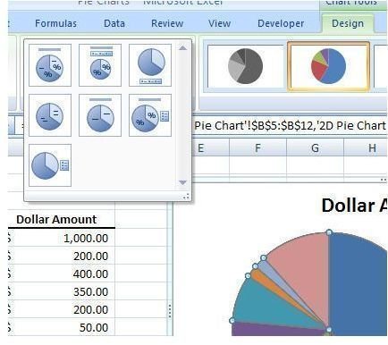
Step 2: From the Insert tab on Excel’s ribbon, click on the down arrow under Pie in the Charts section. This will expand the Pie Chart menu.
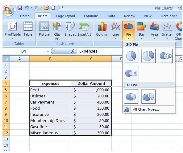
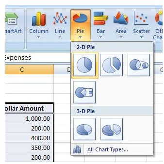
Step 3: Select the first choice in the 2-D Pie category.
The initial pie chart will be created and appear in the same spreadsheet as your data.

Modifying the Pie Chart Design
Although the chart created in the last section might work just fine for your needs, many times you’ll want to make a few design changes, depending on what type of point you’re trying to make with your data. To do this, make sure the pie chart is selected and then open the Design tab under Chart Tools on the Excel ribbon.
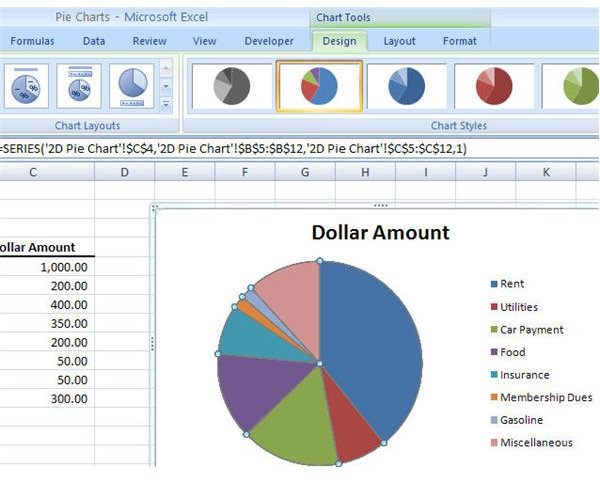
If you expand the Chart Layouts category, you’ll see several different ways to present the data on your chart. You can choose to have the amounts represented as a percentage of a whole, show labels on the chart rather than on a legend, show the original data, or any combination of these items.
For this example, we’ll choose Layout 4 which gets rid of the legend and shows the labels on the pie chart along with the original data.

There are many other options you can select to modify the formatting of both your data and chart, but we’ll dive deeper into those a little later on in this series.
One thing that I don’t like about using this particular layout with our example data is that some of the smaller portions don’t stand out very well in the pie chart. This can be fixed, however, if we break out those portions into a “sub” pie chart. We’ll talk more about how to do that in Part 3 of this series.
This post is part of the series: Pie Charts in Microsoft Excel 2007
A pie chart may look simple, but there are actually several ways you can dress it up to make it be a better visual representation of your data. In this series, we’ll take a look at all the different ways you can create and format pie charts in Microsoft Excel 2007.


