If you are looking for creative ideas for magazine layouts to complement your business idea, look no further. Whether you are in the business of parent counseling, interviewing professionals, or even heading a corporate design company you can create a winning to design to get the message across.
When you are designing trying to come up with creative ideas for magazine layouts there are many different things to consider. First of all what type of magazine layout design are you trying to create? Do you want to attract men, woman or perhaps families? Once you know what you want, then the elements to bring together the perfect design to attract your target will follow.
Scrapbooking Style
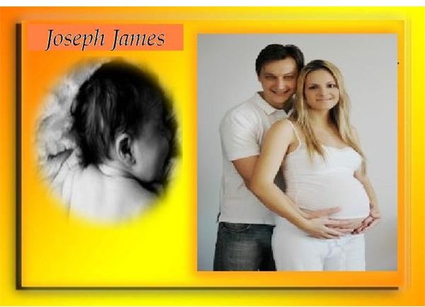
We will look at a couple of niches and compare how the different creative layout sends a different message to the viewer, and therefore attracts them in different ways. Lets look at the following image of new parents on a blog.
Image Credit: SimmBarb and Agastecheq
These type of magazine layout design ideas have a very personal feel from the beginning with the picture of the parents on the left hand side, the pink embroidered looking border placed in the middle of the page with the closeup of the newborn on the other side, draws you into the happiness the family is feeling. The pink and yellow colors of course compliment this feeling. Then the design is finished off with the child’s name in bold decorative font. Immediately the reader, who in most cases would most likely be an expecting parent, will go on to read the article.
One Subject Focus
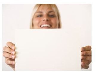
This magazine layout design was designed as an introduction to a new concept There are not too many subjects that are featured here. The focus is the woman in the center of the page holding a piece of blank paper. The composition is shown in a perspective manner that makes you focus on the woman’s face when you first look at the image. Usually with an ad like this there would be decorative font on the left hand side, with the primary visual representation being very centralized. In this case the image is supposed to prime people or in this case make them curious about the subject at hand.
Image Credit: WillSun
Superimposing Images and Graphics
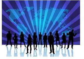
This image is a pretty basic idea for a business owner. The group of people in the center of the page are conveying a sense of teamwork spirit. The triad of colors behind them brings out the group stance. When it comes to showcasing body motion or stances with silouhettes on a magazine layout you can get away with a couple of images that say it all, particularly in the body posture. Once you have that established then you can add either fonts, or even a cloud backdrop to possibly show scenes of which would add a entirely different mood to the scene. The main objective is that the primary message of being overwhelmed must be shown graphically.
Image Credit: Duchessa
These are some of the creative ideas for magazine layouts that can be approached depending on your market and of course your theme. The key is to explore how you want to best approach the subject to make your visual message crystal clear from the beginning.


