Whether you want to make a small letter or become the next press baron, there’s no excuse for putting together shoddy pages. Learn the simple design principles used by the magazine industry that will give your publications a touch of class.
Introduction
Designing a good magazine layout is all about presenting the content in the best way possible. While there are varying schools of thought when it comes to page layout, there are certain universal principles that you would do well to familiarize yourself with when learning how to make a magazine layout. In order to demonstrate these principles, this tutorial will walk you through the creation of a basic layout that will show these principles in action. Once you have grasped the concepts, you will find that they fit easily into almost any magazine style spread you may want to make.
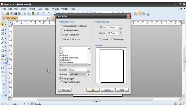
Page Setup
Most magazines work on the principle of “Spreads” rather than “Pages,” as most articles encompass more than just a single page. Set your page preferences to show “Facing Pages” so you can see both pages at once, without any gap between the two. You should also set consistent margins around the edges. Your page preferences should have an option to “Mirror Margins” so they remain balanced on each side.
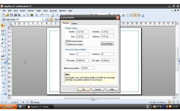
Most magazines use what is known as a grid system – a series of guides that allow the designer to quickly design pages that will all join together coherently within the publication. Grid systems range from very simple to extremely complicated. In this case, the focus is on setting a simple grid system to indicate where the text columns should go. Grid systems can also help you place images, so they fit into the general proportions of the page. On a standard letter-sized or A4 page, you will probably want no more than four columns. Most DTP software allows you to insert non-printing layout guides, either in document properties or via a special command in the “File” menu.
Placing Images
The main image of your article should grab the reader’s attention, but not be so busy that it distracts from the rest of the article or makes it difficult to read. In an ideal world, each should complement the other. Try to use high-resolution images (600dpi or higher) wherever possible in order to provide flexibility in how you use it. If the picture dimensions do not fit with the page you are working on, you can crop and trim the image. However, you must never ever stretch or squash the picture to make it fit into a space. It instantly marks you out as an amateur and makes the page look unspeakably ugly.
When dealing with any smaller images that may interact with text, it is important to get your text wrap settings right. The last thing you want is for the article text to be hidden by a picture, so set the wrapping to flow around the image.
If you don’t have a high-resolution image, websites such as stock.xchange allow you to download high-resolution photos for free.
Type Styles
Despite the fact that our computers are stuffed with all manner of fonts, it is best not to use too many at once. Pick a legible typeface with a variety of weights and it will serve you well for copy, mastheads and box-outs alike. If you find that too restrictive, then pick one – and only one – additional font that you can use for decorative text such as headlines, subheadings and captions. It should still be readable at a wide range of point sizes.
Rather than adjust each typographic element individually, it is best to set up consistent paragraph styles that enable you to make quick changes that will update throughout the document. As a starting point, define custom paragraph styles for the following elements:
- Headline - the large heading that introduces the article
- Subheading - a smaller headline that adds depth
- Lead paragraph - the first paragraph of the story, which is often set in a larger point size and may have a drop capital at the beginning.
- Body copy - the style used for the bulk of the article.
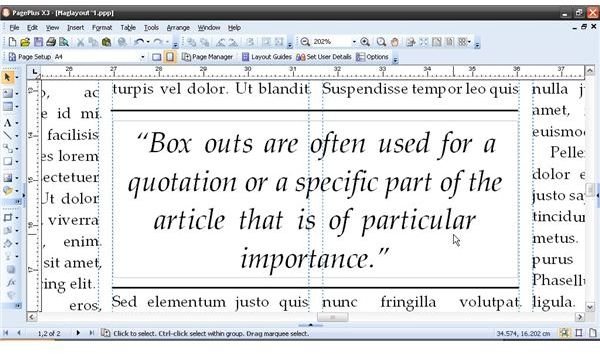
- Box-out - a particular quote or paragraph that might catch the eye of a reader skimming through the magazine and encourage them to read the full article, or sums up the spirit of the piece.
- Caption - for adding details to any pictures or diagrams.
Obviously, this list isn’t exhaustive, but it covers the basic elements of magazine design. As you make your own spreads, you will find other elements that are specific to your work. Defining type styles ensures consistent formatting throughout.
This example uses Eras for headlines and Garamond Linotype for the body text. Serif fonts (such as Times, Palatino and Garamond) are typically easier to read in large blocks, whereas sans-serif fonts (such as Arial, Verdana and Helvetica) are cleaner and more visually appealing for headlines and the like. Have a look at this article to find out more about which typefaces work well together.
Laying Down Text
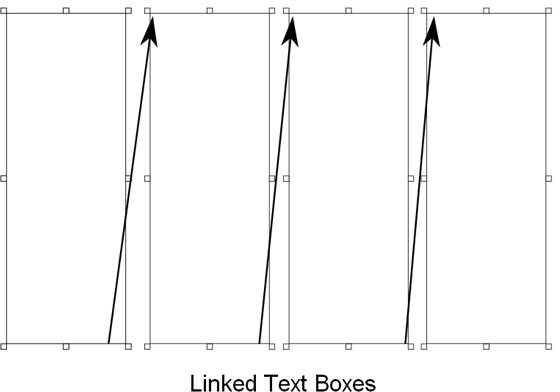
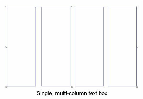
Use the lines on your grid to lay down a text box that will contain your article. It is a good idea to do this first in order to get an idea of how much space the article text takes up. It is, after all, the main focus of the page. Making text flow into columns is generally done in one of two ways – either by laying down several long, thin text frames and linking them, or by placing one text frame and specifying that it contains several columns. Either method may be appropriate, depending on your layout. You may find you need to use both techniques in order to make your page work.
While most current software defaults to a font size of 12pt, magazines usually use a size of around 10pt. Traditionally, flush justification was used, although that is less common nowadays. Place the text on to the page and experiment with the point size, line spacing and justification settings in order to find the right balance.
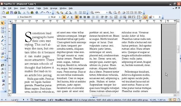
Some magazines use a larger point size for the first paragraph of an article. The use of drop capitals is also common practice.
Additional images prevent the main article from looking like a wall of text. If you do not have any more images, use box-out quotes to keep the reader engaged.
Arranging Page Elements
A person’s eye generally goes from the top left of the page to the bottom left, so try not to deviate too far from this pattern when laying out your page elements. DTP software allows for a huge amount of creative freedom and it can sometimes be tempting to try out wacky, experimental ideas. That is all well and good, but do not be afraid to keep things simple. Give all your elements room to breathe. If page elements are clashing, separate them or perhaps even get rid of them entirely.
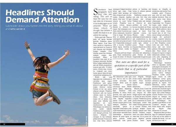
This example layout is not going to win any awards, but it makes every page element available to the reader. Remember that magazines are meant to be read, not framed and put on the wall. Give every element the space it requires and don’t try to cram too much onto the page. Familiarize yourself with the principles of page layout and you will find yourself making better designs immediately.
The great thing about Desktop Publishing is the fact that you can save variations on a layout before committing it to print, so do not be afraid to try laying out a few variations of a spread and see which one appeals to you most. Learning how to make a magazine layout will teach you about the fundamentals of page layout and see you in good stead for any other print projects you may wish to undertake.


