Learn more about the basic elements that go into the anatomy of typography. From crossbars to main lines, there are many things that combine to create everyday letter forms.
Elements of Typography Anatomy
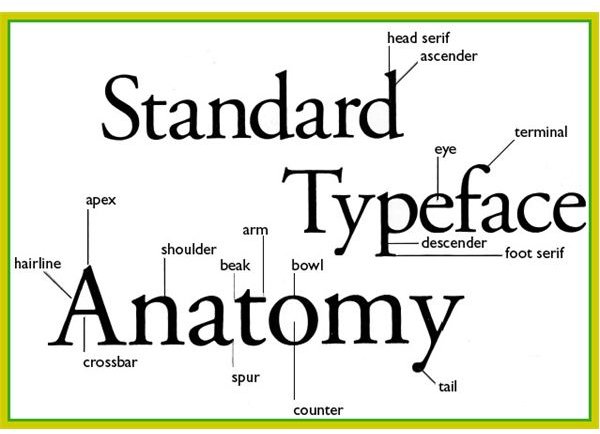
There are many elements that go into the letters used for typography. Each letter of every font contains a full anatomy made from a set of measurements and parts. The measurements contain up to five different elements, while the parts contain up to nine basic elements. It is important to note that there are more than the parts and measurements listed here which are used to create typography. The measurements and parts that combine to create the letter froms, also play a role in creating the look for full lines and forms of type.
Anatomy of Typography Example
Measurements of Anatomy
Under the measurements in the anatomy of typography are the six elements. These elements can either all play a part in letter and line formation at once or can play a partial part in type creation. There will always be, however, some measurement elements in each letter and line formation that is used.
The following are the five elements that go into the measurements:
- Mean Line/X-Height: This is the distance between the midline and baseline of the alphabet. This is generally gauged by using the height of the lowercase letters along with the height of the extended lowercase letters. An example of plain lowercase letters would be a,e and c while the extended lowercase letters would be b, k and p.
- Cap Line: This is an invisible line used to represent the top height of capital letters.
- Ascent Line: This is also an invisble line but it is used to mark the top point of ascenders. This line is also located above the cap line.
- Descent Line: This is the invisible line that marks the lowest point of descending extenders such as letter y, p and q.
- Baseline: This is the invisible line that all letters and type forms sit on.
Parts of Anatomy
There are more than these nine parts of typography anatomy but the ones that are defined here form a basis. Each section of a letter and line of type are made from parts. Just like the use of measurements not always being put into to play, the same can be said of the parts. Not all parts or components of these elements will be used in each letter or line form that is created but there will be some of these parts that are used. Font sets, individual letters and all forms of type will use some aspect of both measurements and parts.
The following are just some basic elements that make up parts for the anatomy of typography:
- Ascender: This is the part of a lowercase letter that rises above the main line or x-height. Such letters like b, k and are considered ascenders.
- Descender: This is part of a lowercase letter that falls below the main line or x-height. These letters include q, p and g.
- Counter: This is the white space that partly encloses or fully encloses a letter.
- Ligature: This is where there are two or more letters connected together into a single letter. An example of this would be fl or fi, where the letters fit together.
- Serif: These are the strokes that are added to the start or end of letters themselves.
- Sans-serif: This term means letters that do not have the strokes that are added to the start or the end of letters.
- Spur: This is a small stroke that is smaller than a serif stroke but that emphasizes a larger stroke. A good example of a spur can be seen in the capital letter G.
- Stem: This is a vertical only stroke that creates the letter. The capital letter I is a good example of stems.
- Crossbar: This is a horizontal only stroke that connects two stems. The letters H and A are examples of stems being connected by a crossbar.
This post is part of the series: Understanding Typography
Learn more about the many aspects of typography. From keening to letter design, this series will help give a better understanding of what typography is and what role it plays in desktop publishing.


