Words can make all the difference when trying to make a point. Find out how to catch the readers eye by using the emphasis of message through typography.
Typography Works
Words are everywhere; On TV, online, mobile devices, brochures, newspapers, magazines and various forms of correspondence from email to letters, the almighty word is what can make the difference. The key to having any words you use be effective is in the type of text used and how the overall message comes across to the reader. Typography is where everything blends to round out a design.
A good example of this concept would be the popular Coca-Cola advertising that has been used through the years. By placing their company name in the right place on an advertisement, and by bringing the focus to the name through font and placement, they have completed an important goal – the goal of having people worldwide be familiar with the company name and look of their logo.
Emphasizing your design using typography can focus the eye directly to the point of the design. Simple things can be done to accomplish this goal and here we take a closer look at each aspect of bringing that focus in.
Word Placement
One way to create emphasis on a certain idea in text would be with the placement. The right placement can mean the difference between the reader remembering the message or if the eye stays on the item long enough to remember it.
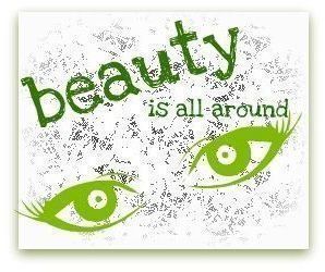
The point is to have the text be in an area that the eye will catch. An example of this can be seen in the image to the left. In this white space the message that needs to be conveyed is that of beauty. Instead of just relying heavily on graphic images to get the point across, the actual word “beauty” is used at a main point of placement for added
emphasis.
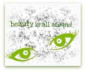
In the image to the right, is an example of bad typography in terms of word placement. The word beauty is placed in an area that is neither eye catching or very readable. This example shows how easy it is to miss the point of the message by typographic word placement alone.
Font Choice

Using the right type of font in typography is just as important as word placement when you are looking to make a point. Sometimes when you are dealing with white space and just text, it can be beneficial to use two different fonts in order to have the eye be caught by one word. Different fonts can break up the line of words and can offer the reader an efficient way to pick out the most useful information, without running through the entire text grouping. An example of how this is done cane be seen in the image to the left.
When working with different fonts, it is important not to go overboard and use to many. It can be very easy to lose

the point of the message through bad design when there are so many conflicting fonts that the eye just skims across the information and is unable to pick out the important pieces. A bad example of this can be seen in the image at the right, remember that this is the example that you want to stay away from when working on your font choice.
Color

An easy way to emphasize your message through typography is the use of color. Color can make standard text pop. This means that if you have a paragraph, or more, of information, that you can draw the eye to certain words using color. Color can allow for emphasis in the places that need to be both noticed and remembered by the reader. An example of this can be seen in the image to the left. Notice that though there is good information in the whole of the quote, the eye is immediately drawn to the text with contrasting color.
A poor example of color use goes hand-in-hand with font choice. The general rule is that if you use to much, or overdo the design, then none of the message that you want to get across is going to be received by the reader. Too much of any element in typography usage, or standard design for that matter, can ruin an entire project. This

concept can be seen in the image to the right.
It is also important to note that using the right color for the design is just as important as using a contrasting color to make an impact. This means that if the whole body of the text is light blue, and the words that need to stand out are a shade darker than the original blue, then the contrast won’t really stand out and would have the same effect as if the area had just been set to bold. Drawing the eye to the message for emphasis is key, distracting the eye with too much contrast is not.
References
Alex W. White, Advertising Design and Typography, Allworth Press, 2006
Northeastern University, https://www.northeastern.edu/guidelines/standards/graphic _standards/typography.html
Image Credit: created by author for article purposes


