If you’ve ever seen a bad piece of typography you’ll no doubt remember it. Whether it’s a strange font, squashed wording, or a rogue comma, these examples are all around us from flyers and posters, to adverts and signs and everything in between. Avoid being one of the lousy examples with these tips.
Bad typography is easy to avoid; for the most part you just need to follow some design basics and then give it a thorough proofread when you are done. You don’t need to be a professional proofreader or typesetter to make your publication stand out as one of quality, rather than just plain stand-out.
There are some really common mistakes that are made over and over again, so read on to make sure your publication doesn’t become a victim; unlike some of the following examples that will have you shaking your head in despair.
1. Font Be So Silly
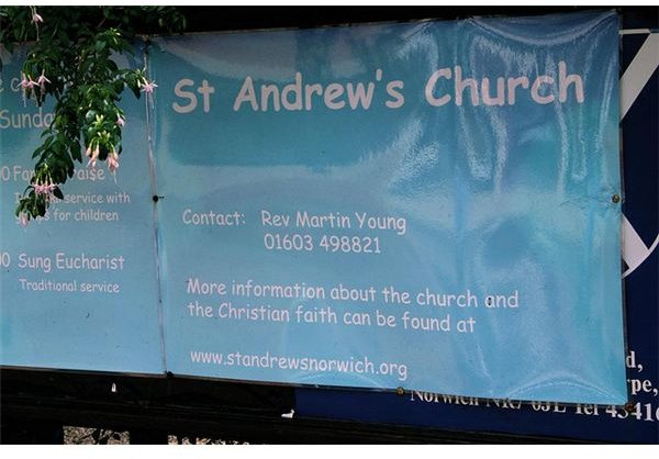
I know it’s not just me, but Comic Sans has become somewhat of a bugbear of mine. It seems to be used everywhere, especially if the message is supposed to be fun, upbeat and youthful. Doesn’t seem hugely appropriate then, that it appears on this church sign. Use Comic Sans if you must, but make sure the font fits the theme; a school newsletter for example, would be perfect.
Equally a child’s birthday invitation probably wouldn’t have much use for an Edwardian script font, but would be perfect for wedding stationery. An upmarket venue should portray its sophistication with a naturally clean and elegant font, rather than a chalkboard or tattoo font. These are extremes, but your choice of font is one of the most crucial decisions when designing your publication. And you have no excuse at not finding one that is exactly perfect, as there are so many free fonts available online.
2. Upside Down You Turn Me
There are a few characters to look out for in the upside down-wrong way around game: 8, S, B, H, K, X, and even Ds and Os can look particularly different if used the wrong way around. And watch out for using Os (letter O) rather than 0s (zeros) – it shows up much more than you’d think.
You know this typography doesn’t look quite right, but aren’t sure why? Well, the letters aren’t aligned or spaced very well and some of the Ns have been shaved on the right edge, but if you turned those Os 90 degrees the whole thing would look a whole lot better.
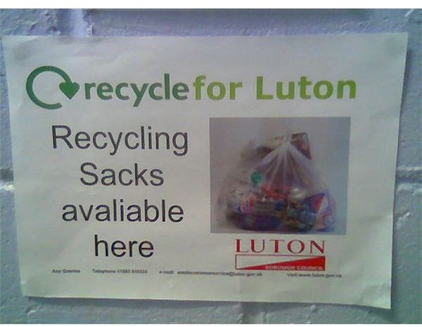
3. The One and Only… Plus More
Exaggerated or incorrect claims about a product or service, are likely to lead to trouble, so stay away from hyperbole or phrases that just

make no sense.
Common mistakes here are things like “specializing in”… followed by a whole list of things, leading the would-be customer to assume that a company that specializes in so many things in reality probably doesn’t specialize in any. Keep it to one to two specialties and emphasize those instead. Another one is claiming you are “The only place for… " and then adding something further down saying “Also at our sister store.” So you aren’t the only place then. Or one of my favorites “Closed Today - Open 7 Days a Week”, or “Open Seven Days a Week (apart from Friday).”
Make sure you read through your text once it’s complete, to make sure you aren’t contradicting yourself anywhere, remembering insets or graphics too.
4. Mixing It Up
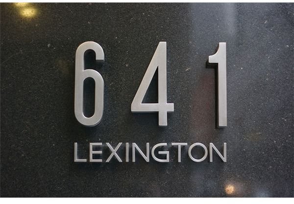
Mixing up fonts on the same line is a big faux pas and can happen more often than you realize – especially if you’ve been playing around with different fonts and don’t apply your final choice to the entire text. The 4 in this simple sign is much wider than the 6 and 1, and not nearly as elegant.
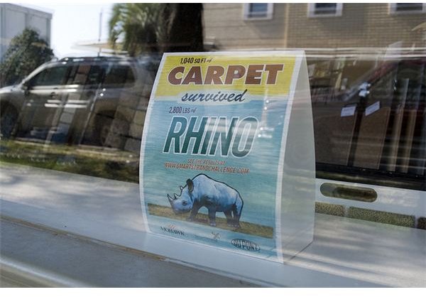
A similar problem is using too many fonts on one piece as show in the rhino carpet ad here. If you click on the image to get a larger view you’ll notice this small piece is using six different fonts, including a mix of block fonts, elongated fonts and brush script fonts.
5. Apostrophes & Typos - Small But Important
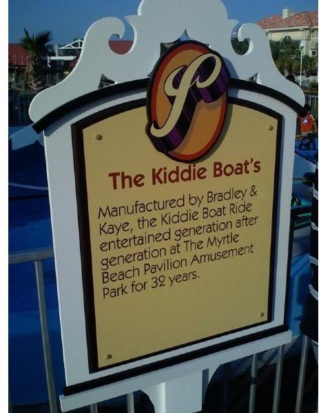
Now I don’t expect everyone to be such an apostrophe vigilante as myself, but these little marks are important and can change the entire meaning of what you are trying to say. Here are some examples to show what I mean:
- Normans Fruit and Veg - I wonder how many Normans work there? Should be Norman’s Fruit and Veg.
- Enjoy Yourself, Your on Holiday - Your what’s on holiday? Should be You’re On Holiday.
- Its Time for a Change - Should be It’s Time for a Change (this is a really common one to look out for).
An apostrophe is used in place of another letter, or to show ownership of
something. If you’re unsure, there are plenty of great places online to get information on grammar to help you along your way (one such resource is listed in the references).
Also make sure you not only spell check, but read through your text a couple of times – a great trick proofreaders use is to scan lines from the middle to the end, and the beginning to the middle, or to read in columns, as mistakes often are easier to spot this way. Nothing kills a publication more than a glaring typo.
Continue to page 2 for more examples of bad typography and how to avoid them.
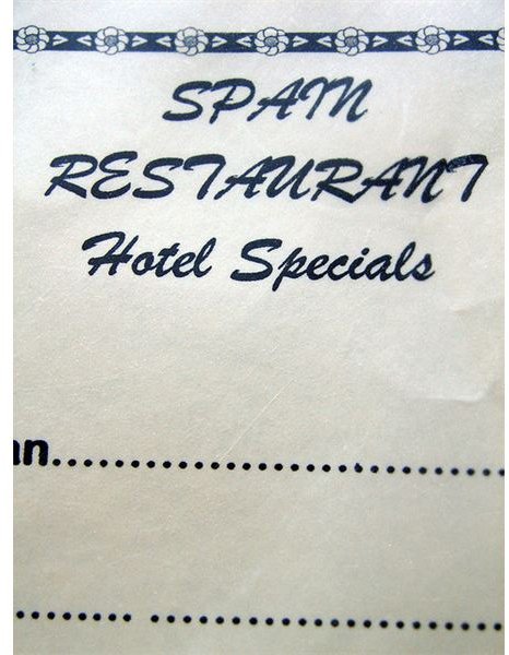
6. Mind the G ap
A lot of bad typography can be avoided by using just a small measure of common sense. Be careful where you break words/sentences; not only can this look really bad, it can also lead to completely changing the meaning of what you are trying to say. Either move the last word down a line, hyphenate, widen your margins slightly, or use a font at just a point or two less to fit it on one line. Some classic examples seen have been:
- Desperate Ho
usewives - The house was broken
into. - This was the perfect car to put my mother in
law in a good mood.
Equally be mindful of spacing within words – this can often be down to your choice of font as shown here. Actually ‘SPAM’ is a type of canned meat, so feasibly could be a (limited) restaurant, however the sign is supposed to read ‘Spain’ restaurant, but the I and N are joined, so resemble an M. To be honest, a ‘Spain Restaurant’ still isn’t the greatest wording as ‘Spanish Restaurant’ would sound better, so there are a few faults with the typography here.
7. Stretch & Squash
For text that is of equal importance in your publication, it should all use the same size font (or very similar). When dealing with the problems in point 6 above, it can be easy to go overboard in squashing your text in a box to make sure the text makes sense.
In the example pictured, the font has been condensed vertically and feels very squashed, yet to keep it all justified and neat, the second line has insane justified margins leaving a really stretched line with a massive gap between “center” and “to.”
Don’t be tempted to stretch and squash your text to fit in with your margins; add more lines and alter the font size accordingly. And don’t be a slave to ‘justified’ margins when you only have a few words to a line.
8. Too Many Gimmicks
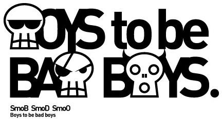
Using gimmicky images to make you publication stand out is a great idea to keep it in people’s minds (especially for posters and flyers), but you can overdo it. Using musical notes as an ‘N’, a hammer as a ‘T’ etc., is great, but don’t be tempted to use it for any more than two or three of your headline text letters.
Also make sure this brilliant design idea isn’t used at the expense of the letter being clear. The example pictured is using skulls to represent B, D and O. Although you can work out what it’s supposed to say, it would be better used for just one of the letters.
9. CAPITAL IDEA
YOU KNOW HOW WHEN PEOPLE WRITE AN EMAIL ALL IN CAPS IT’S LIKE SHOUTING? Annoying isn’t it? So be sure to carry the same protocol over to your DTP projects too.
Using all caps not only reeks of it being unprofessional, it also looks pretty unimpressive visually too. Certainly headlines could be all in capital letters, but you can get your message across more effectively by using Title Case (capitalizing only the first letter of each word).
10. Background Noise
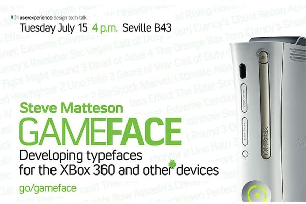
For the most part, this visual example is an OK piece of technical typography , and the background graphics have been made transparent enough to stay in the background without interfering with the text. However, look closer and you’ll notice a rogue Google Android graphic appearing right over the top of the ‘r’ on ‘other’ – no doubt this was meant to be more in the background too.
Background and rogue graphics can get in the way, so either move your text around, change the color of the text, alter the transparency of the background to be paler, or pick a different background. No matter how much you love a background and you think it’s perfect for the piece, getting rid of it can often be the best course of action. Sometimes not only will the background make text unreadable, it can lead the reader to find letters that aren’t even meant to be there; such as an overhanging tree branch graphic being mistaken for a C.
So, there are my top ten typographical mistakes to avoid, but of course there are plenty more. Bad typography is everywhere – leave a comment if you have a particularly juicy example to share.
References
Grammarphobia - https://www.grammarphobia.com/blog/
Image Credits:
- Church Comic Sans - Leeky/Flickr
- Seven Days a Week - unit0918/photobucket
- Luton recycling - Lutonboy/Flickr
- Kiddie Boat’s - antena99/photobucket
- Spain Restaurant - quinn.anya/Flickr
- JFK Airport - Marcin Wichary/Flickr
- Do Not Lean - Marcin Wichary/Flickr
- 641 Lexington - Marchin Wichary/Flickr
- Rhino carpet - buyalex/Flickr
- Boys to be Boys - Joker Smoj/Flickr
- Coach - Brett Jordan/Flickr
- GameFace - Marchin Wichary/Flickr


