
If you’re looking a way to spice up your Blogger, rounded corners are easy! Rounded corners are both classy and trendy and becoming of any blog. Learn how to give your Blogger theme an ultra-quick make-over and introduce the rounded corner elegance.
Rounded corners used to be something hard to achieve. If you wanted that elegant look it used to take either several images with excessive html markup or resorting to JavaScript trickery. Now with wider and wider usage of CSS3 the effect is easy to achieve, and only a little help is required for the Internet Explorer browsers.
This has also affected Blogger. If you are starting from scratch some of the default themes already come with rounded corners on them:
- Picture Window - first and second variant
- Awesome Inc. - the fifth (pink) variant
However if you are interested in how to customize your own Blogger theme to include rounded corners read on!
Blogger rounded corner templates
Blogger rounded corners with CSS 3
Adding rounded corners with CSS3 is extremely easy. To demonstrate, let us take one of the non rounded Blogger templates, like for example “Simple” by Josh Peterson, the fifth variant (with the bookshelf image), and modify it.
Adding css is really easy with the new Template Designer. Simply click on the design tab in you Blogger admin, next go to the Template Designer, once it loads click on the Advanced tab, and at the bottom of the element list you will find the “Add CSS” option.
The code below will add roundedness to the main container.
div.content-inner {
-moz-border-radius: 10px; /*Firefox*/
-webkit-border-radius: 10px; /*Safari & Chrome*/
-khtml-border-radius: 10px;
border-radius: 10px; /*Standard CSS3 declarations & IE9*/
}
The class content-inner is how we target the container div and the three declarations will cover all the major browsers as noted in the css comments.
This will create symmetric rounded corners, however if you would like to define each corner individually the standard css parameter short hand structure applies and the other possible options are:
border-radius: TOP-LEFT TOP-RIGHT BOTTOM-RIGHT BOTTOM-LEFT;
If you would like to know more about available rounded corners and borders, as well as browser compatibility for each case there is a good summary here .
Following the code above you can now also round the header’s corners:
div.header-outer {
-moz-border-radius: 10px; /*Firefox*/
-webkit-border-radius: 10px; /*Safari & Chrome*/
-khtml-border-radius: 10px;
border-radius: 10px; /*Standard CSS3 declarations & IE9*/
}
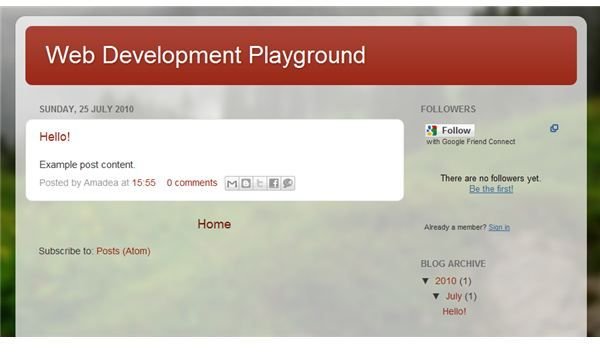
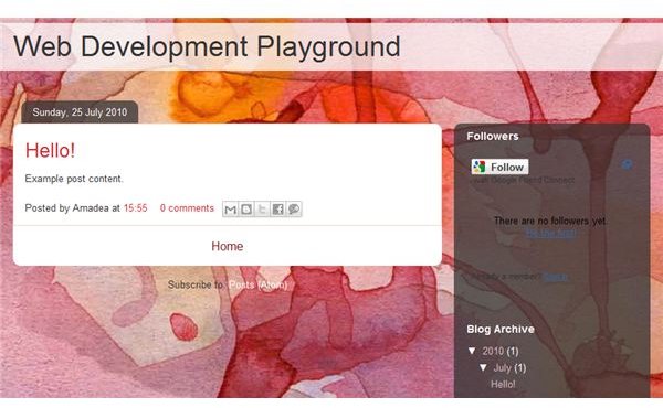
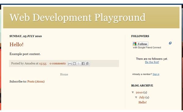
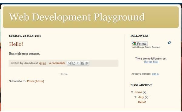
Before and After Screenshots
Dealing With Old Browsers
Now for the tricky part. As mentioned before using CSS3 has the unfortunate downside of not being supported by older browsers (mostly Internet Explorer, all the way up till version 8). Now there are two choices - either provide a fall-back solution or accept the fact that the page will look different in less capable browsers.
For quite a while now there has been a growing trend to actually do the latter. Just like we provide progressive enhancement for JavaScript functionality, same approach can be taken with CSS. Rather than create a pixel perfect, lowest denominator design across all browsers, we us the optimal way for achieving the desired effect, and allow he design to degrade gracefully to a simpler version.
Alternatively if you would like to dazzle your old-browser-fashioned audience you can use JavaScript and/or extra markup and images that would work everywhere. You could try using Curvy Corners or Spiffy Corners .