Although Microsoft OneNote came in a 2003 version, it has really come into its own in the 2007 version. But, is this note taking application from Microsoft the way to go?
(5 out of 5)
The Microsoft Office OneNote 2007 interface is overly cluttered, with toolbars, buttons, icons, tabs within tabs, and colors. I absolutely LOVE IT!
For too long, applications have babied users as incapable of deciphering more than a few visual items at a time, so menu bars hide frequently needed functions three levels deep, and icons have to be added to the default toolbars in order to have all of “your buttons.” But, OneNote 2007 is different. Sure, its cluttered and overwhelming, but as you get used to it, it just may be the most functional application you have on your computer.
T
he entire concept around OneNote is to mimic a real world notebook. It is easier to understand if we are little more specific. The OneNote interface actually is designed to look like a bookshelf of three ring binders. Or, to be even more specific, the OneNote interface is designed to approximate a well organized and labeled set of three-ring binders. I’ll have to take their word for it, because I’ve never seen such a thing in my fast-paced offices.
The toolbars are indeed busy, but like all Office toolbars, they can be customized by removing unneeded icons, or even entire toolbars, so there really is no problem with them.
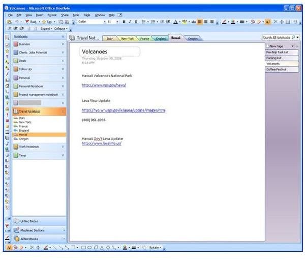
The best way to get to know OneNote is to ignore the toolbars and jump right into the notebook part of the screen. Down the left hand side of the screen is the Notebooks section. These represent the individual three ring binders on the shelf. These notebooks can be expanded and collapsed for easy navigation. Additionally, the color of the notebook can be set as well, so several related notebooks can all have the same color, or each can have its own color.
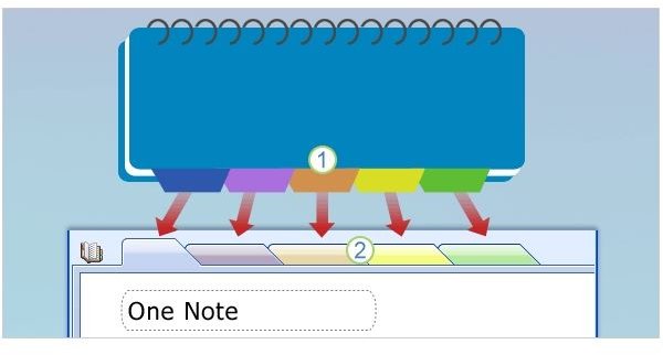
Selecting a notebook opens it. Across the top of the notebook interface are the Sections which mimic those little dividers with tabs that stick out in a regular notebook. These sections can be added, deleted, and edited easily. Right clicking on a tab gives you options relating to that tab, ranging from delete to rename. Dragging a tab across the top re-orders it, so if you decide your third section should really be your fifth section, it is an easy drag and drop operation. Tab colors can be set as well to help with organization. Further organization can be achieved by grouping sections together into section groups.
Within each section, of course, are pages. The pages are displayed down the right hand side of the notebook interface, and like sections can be re-ordered via simple drag and drop. They can also be quickly renamed, deleted, or colored according to the user’s desire. New pages can be added via a button, right clicking the page tabs area, or via keyboard shortcut (CTRL-N). This prevents the need for a new page from slowing down your thoughts.
A nice feature not available in the physical world notebooks is the ability to create subpages which are then displayed beneath the parent page as shorter tabs. So, those ideas that pop into your head while working that you want to capture, but don’t really belong on the page you are using, can quickly and easily be captured and linked so that they are neither lost, nor taken out of context.
The final stroke of genius in the notebook interface is the admission that life isn’t always as neat as we hope it will be. Notes that are started and abandoned, or notes that are taken, but not organized are stored in the “Unfiled Notes” section where they can be found and organized later (if ever). Either way, there is no need to clutter the interface with dozens of “temp” notebooks.
Up Next: Using OneNote 2007 Review (Click Part 2 Below)
This post is part of the series: Microsoft Office OneNote 2007 Review
Take a look at Microsoft’s powerful note taking application and see how it measures up to the best note taking and organization software available. Does OneNote have what it takes to be a top note tool?


