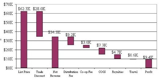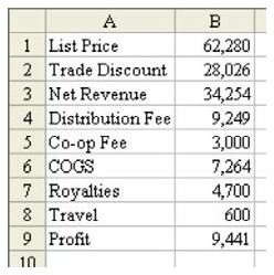
Problem: Your sales team is ready to make a large sale. You have done an analysis of the list price, discount, revenue, and all the internal costs of the sale, as shown in Fig. 1109. You would like to present this in a meaningful chart.
Strategy: Use a Profit Waterfall Chart. This chart has three solid bars, representing List Price, Net Revenue, and Profit. Between those bars are floating bars that show how each individual expense item eats away the profit of the deal, as shown in Fig. 1110.
The trick to make the middle bars float is to use a stacked bar chart. The first series of bars will be changed into an invisible color without any lines in order to make the bars in the second series appear to float. The second series is that of the actual bars that will appear on the chart.
-
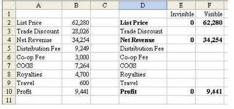
Set up a new range that will be used to create the chart. Copy the labels from column A to this range.
-
There are three bars that will need to touch the x-axis. For these three bars, the invisible series needs to be zero. The height of the bar is the same as the value in column B, as shown in Fig. 1111.
Advertisement -
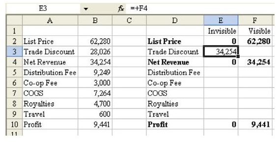
The goal for Trade Discount is to have a floating bar that extends from 62,280 down to 34,254. In order to have the bar float at this level, you will need an invisible bar that is 34,254 tall. In cell E3, enter the formula of =F4, as shown in Fig. 1112.
-
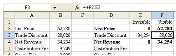
The height of the floating bar needs to extend from 34,254 to 62,280. Set the formula in F3 to =F2–E3, as shown in Fig. 1113.
Advertisement
-
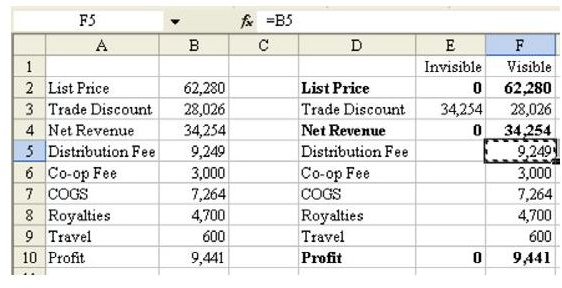
After the Net Revenue bar come all the SG&A expenses. The height of each floating bar will be the amount of the expense. In F5 enter a formula of =B5. Copy this down to cells F6:F9, as shown in Fig. 1114.
-
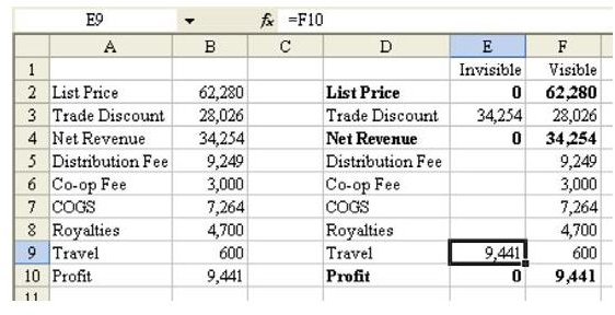
The formula for the invisible portion of the bars always seems hard to figure out. In this case, if you start at the final bar, it might be easier. The Travel expense bar, representing $600, needs to float just above the profit level of 9441. Thus, the formula in E9 will be =F10, as shown in Fig. 1115.
Advertisement -
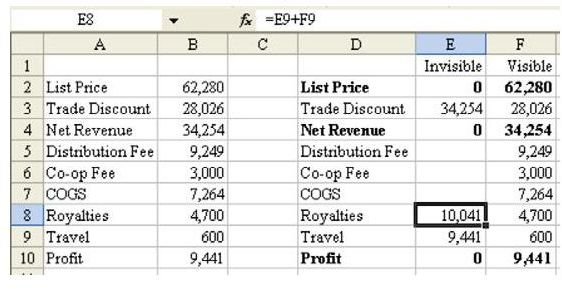
The Royalties bar of $4700 needs to float just above the level of the Travel bar. The height of the Travel bar is the height of the invisible bar (9441 in E9) and the height of the visible bar (500 in F9). The formula for E8 is =E9+F9, as shown in Fig. 1116.
-
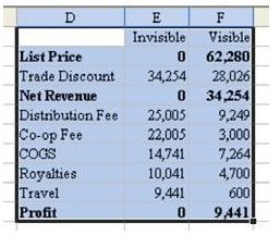
You now have a formula that can be copied. Copy E8 to the blank cells in E7:E5.
Advertisement -
Select the range of data from D1 to F10, as shown in Fig. 1117.
-
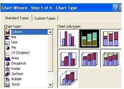
From the menu, select Insert – Chart. Choose a Column chart and then in the Chart Sub-type box choose a Stacked chart, as shown in Fig. 1118.
Advertisement -
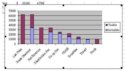
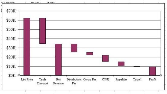
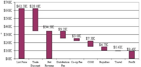
Choose Finish to accept the remaining default settings. The following chart, as shown in Fig. 1119, will appear. The point of the Profit Waterfall Chart is to illustrate to your VP of sales that, although this is a $60K deal, the net profit is less than $10K.
Additional Details: There are a number of steps to make the chart look more presentable.
-
Remove the legend. Click in the legend and hit the Delete key on the keyboard.
-
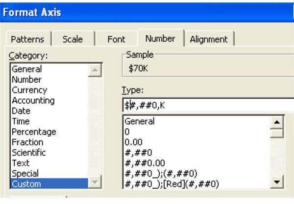
Format the y-axis in thousands. Right-click the numbers along the side of the chart. Choose Format Axis. In the Number tab, change to a custom format of $#,##0,K, as shown in Fig. 1122.
Advertisement
-
Get rid of the gray background. Right-click on the chart but in a blank area. Do not click on a gridline, a line, or a bar. Choose Format Plot Area. Change the Area to None.
-
Make the chart larger. Click just inside the chart border. Grab a Fill handle and make the chart wider.
Advertisement -
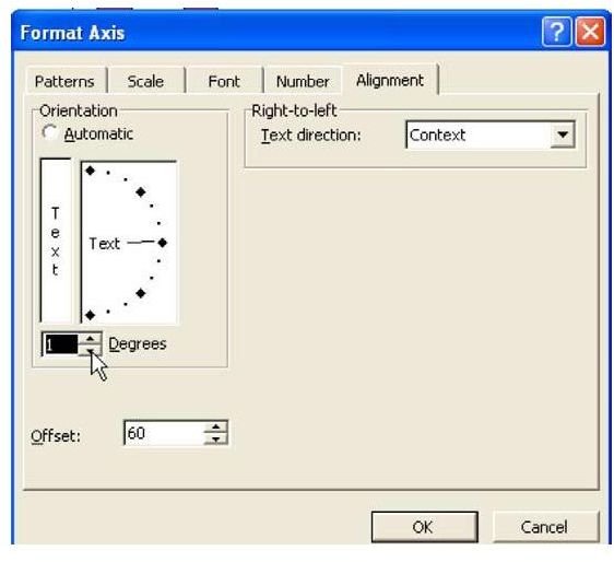
Fix the labels along the bottom of the chart. Right-click the labels along the x-axis and choose Format Axis.
-
On the Font tab, change the font to 8 points. On the Alignment tab, you want to turn off the Automatic rotation. The only way to do this is to use the spin button to move the rotation percentage up to 1 degree and then back down to 0 degrees, as shown in Fig. 1123. This will force the labels to appear horizontal instead of at an angle.
Advertisement
Gotcha: Excel might decide to display only every other label along the x-axis. Keep making the chart larger horizontally until you can see all of the labels.
Result: As shown in Fig. 1124, you get a Profit Waterfall Chart that demonstrates the true profit on the deal.
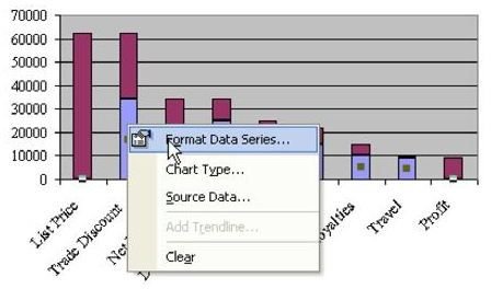
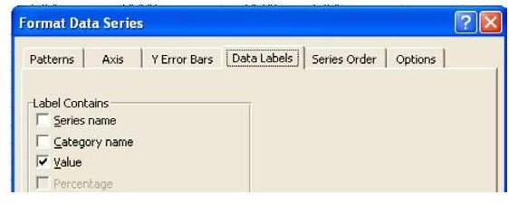
Additional Details: Normally, you would want to display values on top of each bar. In a regular bar chart, you would select the visible series and then right-click to choose Format Series. On the Data Labels tab, choose the Value setting, as shown in Fig. 1125. However, because this chart is actually a stacked column chart, Excel does not display the values on top of each bar. Instead, it displays the values in the middle of each bar. This is frustrating. It can be fixed, although it is a bit tedious. Follow these steps.
-
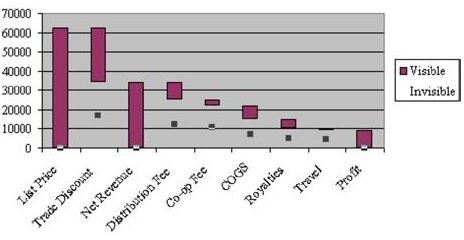
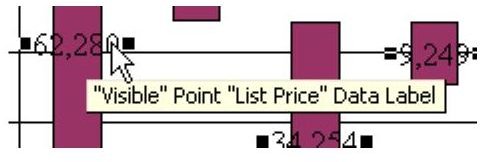
First, change the format of the data labels as a group. Left-click on one of the numbers that extend beyond the edge of a bar. This will select the data labels as a group, as shown in Fig. 1126.
Advertisement -
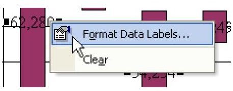
Right-click and choose Format Data Labels…, as shown in Fig. 1127.
-
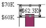
On the Number tab, choose the Custom category and type a custom number format of $#,##0.0,K. This will display precision to the nearest one hundred dollars in the format of $62.3K.
Advertisement
-
Choose OK.
-
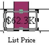
You will still have all of the labels selected. With all of the labels selected, left-click on one label. Just that one label will be selected, as shown in Fig. 1128.
-
You can now grab the border of the label and drag it to the proper location above the bar, as shown in Fig. 1129.
-
Click the next label. Drag it to the proper location. Repeat for each data label. You will eventually have this chart, as shown in Fig. 1130.
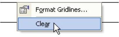
Optional: Some people prefer the Waterfall chart without gridlines and with lines from one bar to the next.
-
To remove gridlines, right-click on a gridline and choose Clear, as shown in Fig. 1131.
-
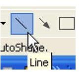
Display the Drawing toolbar with View – Toolbars – Drawing. From the Drawing toolbar, click on the Line tool, as shown in Fig. 1132.
-
Carefully draw a line from one bar to the next. Hold down the Shift key while you draw to force the line to be horizontal.
-
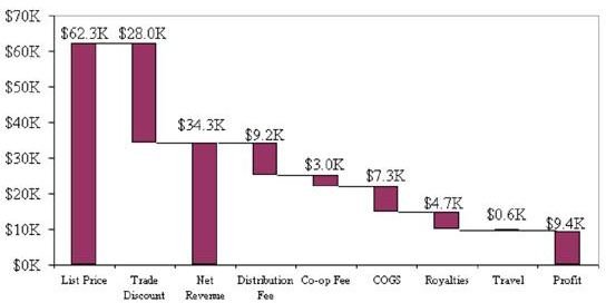
Repeat the process for each bar: click on the Line tool, hold down the Shift key, and draw the line. When you are finished, you will have lines connecting each bar, as shown in Fig. 1133.
Summary: The process of creating a Profit Waterfall Chart is somewhat tedious, but it is possible to do.
Commands Discussed: Insert – Chart
Images