Make Quick Changes to Your Excel Chart by Right-Clicking to Customize
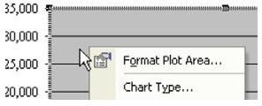
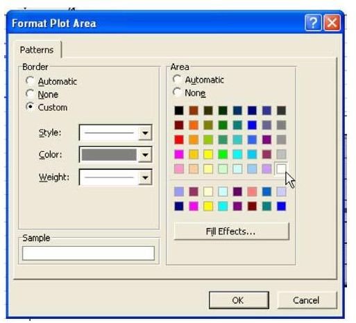
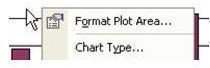
Strategy: Everything on a chart can be customized. Right-click the item and choose customize. To get rid of the gray plot area, right-click on the middle of nothing in the chart and choose Format Plot Area, as shown in Fig. 1070.
In the Format dialog, choose the white color to eliminate the gray background, as shown in Fig. 1071.
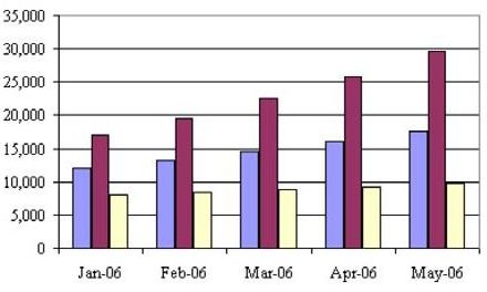
Result: As shown in Fig. 1072, the gray background is gone.
Additional Details: Just about everything on the chart can be customized using this method. Additional examples follow.To change the numeric format on the y-axis:
-
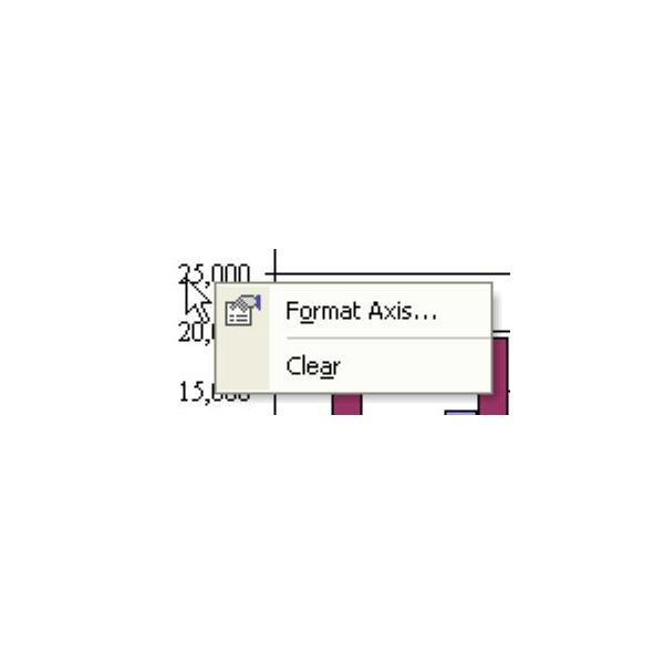
Right-click and choose Format Axis, as shown in Fig. 1073.
-
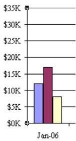
In the Format Axis dialog, choose the Number tab. Choose the Custom category and use a custom number format of $#,##0,K to eliminate the extra zeroes in the display of numbers along the axis, as shown in Fig. 1074.
-
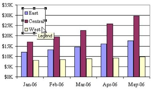
You can drag the legend from its location along the side and drop it in a blank area of the chart, as shown in Fig. 1075.
-
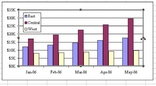
You can then drag the right edge of the chart to the right, to fill the area that used to be taken up by the legend, as shown in Fig. 1076.
To change the background on the plot area:
-
Instead of a boring white plot area, you can use an interesting gradient. Right-click on nothing in the middle of the chart and choose Format Plot Area…, as shown in Fig. 1077.
-
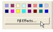
Choose the Fill Effects… button, as shown in Fig. 1078.
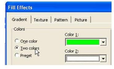
- In the Fill Effects dialog, choose the Gradient tab. Choose Two Colors. I like a gradient from green to white for revenue charts, as shown in Fig. 1079.
To change the look of the data series:
-
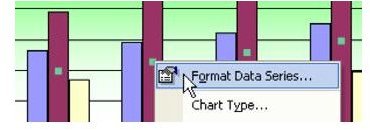
Single-click any bar to select the entire data series. Right-click and choose Format Data Series, as shown in Fig. 1080.
-
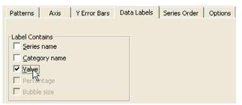
You can now change the color for that series of bars. Or, you can add a data label to the bar, as shown in Fig. 1081.
To change the look of a data point and its label:
-
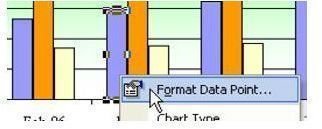
What if there is one single bar that needs explaining? Single-click the bar to select the whole series. Then, do a second single click to select just the data point. You can right-click and select Format Data Point…, as shown in Fig. 1082.
-
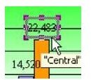
If the data labels run into the axis, you can easily move them. The first click on a data label will select all of the data labels for that series, as shown in Fig. 1083.
-
A second single-click on the one data label will select just that label, as shown in Fig. 1084.
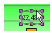
-
You can now grab the bounding box and nudge the label up or down, so it does not appear on the gridline, as shown in Fig. 1085.
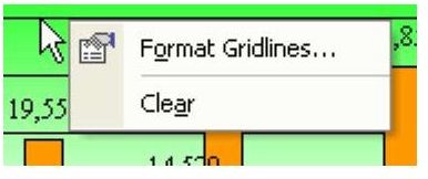
To control gridline formatting:
-
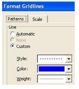
As you might expect, you can change the gridlines by right-clicking on a gridline and choosing format gridlines, as shown in Fig. 1086.
-
Change the gridlines to be dotted lines instead of solid, as shown in Fig. 1087.
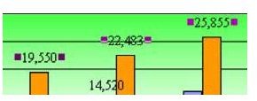
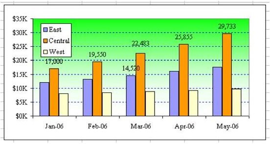
As shown in Fig. 1088, the resulting chart may be even more hideous than the default Excel chart, but at least you can take pride that it is hideousness that you created, instead of being forced to accept the Excel default.
Summary: You have ultimate control of nearly everything on a chart. Few of these choices can be changed through the Chart menu. You have to right-click around the chart.
Commands Discussed: Chart – Customize
Images