Print advertising is not dead! Get the most out of your print ad design by creating ads that are naturally appealing. You don’t want a cluttered print ad design, nor do you want a print ad design that is hard to read or seemingly random. Compel your readers to respond by using the tips listed here.
Print Ad Design
If you create newsletters, magazines, fliers, programs, or newspapers as part of your job,
you know that people still advertise in print. Therefore, using effective print ad design concepts is very important. Convert readers of your publications into customers for your advertisers by using the following tips to make the most out of your advertising space.
- Establish your objective. A key to an effective print ad design is communicating to the reader what you want them to do. If a print ad is unclear, meaningless or random, it will have no effect because no one will feel compelled to act as a result of reading it.
- Use good software. If you do not want your print ad design to look like Mickey Mouse did it, get some professional software tools so you can get professional results.
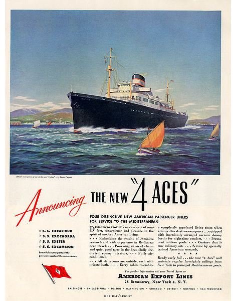
- Use a picture. One rule of thumb is that advertisements with photos or illustrations are more effective than those that contain text only. Don’t use small graphics either. You want something big enough to avoid a cluttered look and to attract the reader’s eye. As a rule, fill a minimum of 25% of the space in your print ad design with a picture.
- Use contrast. This means that you need to make the ad easy to read. To maintain good contrast, limit the number of fonts in your print ad design to one or two. Another way to improve legibility is to avoid using words that contain all capital letters. White space is also important when it comes to contrast: use it to liberate the text in your ad so readers can comfortably read it.
- Use visual balancing to guide the eyes of your readers. Do not make the mistake of putting everything in your print ad design in the center of the space. You can make things interesting by putting text on one side with graphics on the other to balance it out. By making your ad flow naturally, you make it more visually attractive and easier to read.
- Cater to physiology. A good assumption when working with print ad design is that readers read from the top left, across toward the right and then diagonally down and across to the lower left and then over to the lower right. Position your most important elements along this pattern and you will have a better chance of getting your message across.
Now that you know some good practices for print ad design, think about some mistakes that you should carefully avoid.
- Don’t let mistakes get through. You are probably like most people: in a rush. Sometimes or need to get things done causes us to overlook embarrassing errors. In your print ad design, be sure you have accurate information and that all the words are spelled correctly. While many readers probably will not even notice a typo, it only takes one potential customer to see it and be turned off by it. If you have the opportunity, have someone else review your print ad design. A fresh set of eyes can make a big difference.
- Include contact information. Few things are as frustrating as luring in a reader with an effective print ad design only to discover that no contact information was included! People cannot respond if they do not know how to respond or who to respond to, so make sure you list a Web site, email address, phone number or street address so readers can follow through.
Use these simple concepts for effective print ad design and you will make the ads in your publications get better results.
Image Credit: Wikimedia Commons/Wjwalrus


