Create professional business cards using these simple, classic design principles. You don’t need any special program; you can get an amazing-looking card even in Microsoft Word!
Your business card is the tangible evidence of your existence. Clients and potential clients stuff them in pockets, scan them into e-readers, and paste them in Rolodexes. It’s the little piece of cardstock that reminds them of you, which is always good, and it’s often what they hunt for when they need to get a hold of you.
Because the business card is often your first and most lasting line of communication with your clients, it’s important to set it up properly, and I’m going to tell you how to do that. We’re not going to get into fancy designs or unusual materials (I was once given a really cool clear plastic business card by an associate). Instead, this article is going to tell you how to use classic design principles that can be applied in even a word processing program to create professional business cards your clients will refer to and give you that so-important call.
The Three Things That Should Be on Every Business Card
What do you want to immediately see when you look at someone’s business card? You want to see their name, their business, and their phone number, and occasionally their address. All other information is incidental. You want to know who they are, what they do, and how to contact them.
- Who - Your name and your business name should be prominent and easy to find. Make the one you want people to remember most important. Do you want them to remember that Jane Smith works at Holland Graphics or that Jane Smith works at Holland Graphics?
- What - What is it that you do? What service do you provide? You should be able to describe it in five words or less, the fewer the possible. Are you a plumber? A tutor? A virtual assistant? A physical therapist? A hiring consultant? A life coach? An actor? A copywriter? Put that on the card. You’d be surprised how often people think their business name is descriptive enough, but it often isn’t.
- How - You hand out your business card to build relationships and get business. To help with the latter, provide as much information as possible about how they can contact you. Telephone, email, website, Twitter handle, business/mailing address, fax; these are all critical depending on your business. A plumber probably isn’t going to use Twitter much, but a copywriter might.
Those three pieces of information should be clear and easy to find on your business card. Because once your client sees that information jump out at them from the business card or Rolodex file, they’re then ready to read further to learn or remember your web site, email address, business address, more detail on what you do, and so on.
Simple Design Principles Anyone Can Use
How do you make sure people can easily find your name, company, and phone number? Use the design principles of alignment and contrast.
- Alignment means making sure everything is lined up to the left, right, or both. Don’t center your business card information unless you really are going to put only your name, business, and phone on it, because more than that will make it cluttered.
- Contrast means more than black and white. Contrast is also found in type weights and sizes. (Your business will usually be represented by your logo, so that will stand out on its own.) But you can use type to make your name and phone number stand out: set them in a larger type size or a bold version of the font, or both. If your cards will be full color, consider setting your name and phone number in a different color. Pick a color used in your logo to do this, for consistency.
In fact, consistency is the key here. You don’t want to use several different fonts, or more than two weights/sizes, or more than a couple colors. It seems almost too simple — use fonts weights and sizes sparingly, align everything, use contrast to make the most important information stand out (in this case, name and phone), and use only one or two colors.The eye and the brain love simplicity, and using these principles will create a harmonious, balanced business card design that will be pleasing to the eye and draw the reader in. And that’s the entire goal, isn’t it?
References
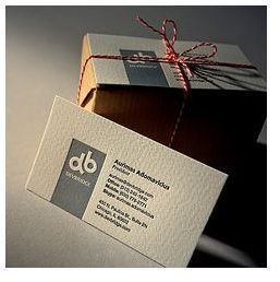
- Image by needoptic on Flickr, used under a Creative Commons license
- Author’s professional experience


