
A bright-neutral color, white can be added to color schemes to achieve tons of effects. Not only will it brighten up sleepy neutral schemes, it’ll help tone down the saturation of bright color schemes as well. Learn a little more about the symbolic meaning of the color white with these helpful tips!
Positives & Negatives of the Color White
As with most colors, there are benefits to using white, as well as downfalls. However, it is debatable as to whether white has as many downfalls as other colors, such as the color yellow, or even the color blue . However, take a moment to consider these points when using white in designs:
Positives of White: White is a fantastic color for many different situations. White is traditionally a very pure, calming color. The color of newborn babies and blushing brides, white symbolizes purity, innocence, maturity, cleanliness, balance and new beginnings. When it comes to overall designs, white can help tone down bright designs, or even brighten muted designs. White has the quality of being able to fit into almost any design and can enhance it.
Utilizing off-whites and creams can be a great way to add warmth, as well as elegance. Cream colors pair beautifully with jewel tones such as ruby reds, sapphire blues, and emerald greens. If you’re looking for a way to showcase professionalism, cream might just be the shade for you!
Negatives of white: Because white is extremely bright, designs that utilize too much white can sometimes cause headaches. You also need to be sure that if you are including text, the colors need to be dark and muted to provide enough contrast as not to make it too hard to read. Designs that utilize too much white might come off as overly sterile and impersonal. If you’re going to use a white-heavy design, you should include accent colors to help give your overall design a warmer feeling. This is especially important for website and graphic designs.
When to use White, and What Whites to Use
White does not clash with other colors, meaning that you can effortlessly incorporate it when you need to dilute a concentrated scheme. White has the ability to make minimalistic designs pop and deliver a very nice feeling overall. It can lend itself well to both informational designs and futuristic, stylish designs. In advertising, bright, stark white is used to market household cleaning supplies, as it shares a strong correlation with cleanliness. Below is a list of different shades and tones of white, as well as the symbolic meaning of the color white. Take these into consideration when you are working on your next desktop publishing projects!
Pure White: This white does not fall to either the warm or the cool spectrum, and generally is associated with purity, new beginnings, and innocence.This white is generally devoid of any “emotion” and therefore should not be the focus of designs that are expected to resonate with the viewer on an emotional level.
Cool White: This white falls slightly to the cool - or blue - side of the color spectrum. This is generally thought to be a cool, calming white. However, when used in excess, this color can feel too sterile or devoid of any emotion, much like pure white, or it can even feel mildly gloomy!
Warm White: This white falls to the warm - or red - side of the color spectrum. This is a great color for adding subtle tones of emotion to existing designs.
Cream: Cream is often associated with maturity, elegance, and professionalism. The downside of cream is that in excess, it can provide a “dirty” feel to designs and does not pair well with bright, playful colors.
White in Color Schemes
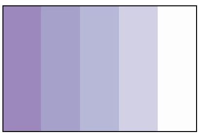
Monochromatic Color Schemes
White can be used to create a variety of monochromatic color schemes , as shown below. By adding white to the end of a monotone scheme, you help to round out a scheme by giving it a lighter, brighter end of the spectrum. This works well for both muted colors as well as bright colors, and even gray and black monotone color schemes can benefit from a brightening boost!
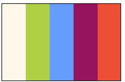
Bright Color Schemes
When added to a bright color scheme, white helps colors pop! Not to mention, while helping to accentuate the brightness, white also manages to keep the colors from becoming too jarring – a common problem when you add high saturated colors together. In the spectrum below, you can see how white would make a great background for the playful summer colors, although it could easily be used as an accent color as well!
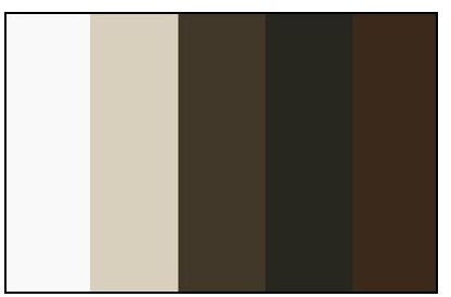
Muted Color Schemes
When you add white to a muted color scheme can help to brighten it. The example below showcases how a bright pop of white can help lighten a set of brown and tan swatches. This is a great way to help create a relaxing scheme that doesn’t feel too sleepy.
References
- All images and information are provided by Amber Neely, who has seven years professional experience in graphic design.


