Creating a color scheme yourself can be a difficult task, what with all the options out there. How are you supposed to know what colors look good together? That’s where analogous colors come in. No matter the project, they always seem to look great, and now you can learn how to design your own.
What It Is…
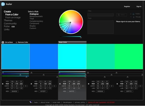
When looking at the color wheel, analogous colors are colors that are adjacent, or next to each other on the color wheel. These color schemes usually are comprised of three to five colors, a main hue and two to four supporting hues. A great example? Yellow, orange, and red, like the example to the left. Of course, there are a ton of different analogous color schemes, and the important thing to remember is that they are closely related colors on the color wheel.
Set Your Mood & Target Your Audience
An analogous color scheme tends to be a fantastic choice for most projects. The lack of extreme contrast makes for a cohesive design, but the varying hues help to add visual interest. Not only can you use these types of color schemes for any project, they work great for almost any target audience. They feel far more energetic than a sleepy monochromatic color scheme, but far more soothing than the urgent feel of a complementary color scheme. Just remember, instead of trying to distribute the three colors evenly, it’s a far better idea to pick your center hue as your main focus, and use the hues on either side to add in accents.
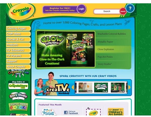
Of course, by changing how far you separate each color from each other, you can achieve different feelings . By expanding the distance between the spots on the color wheel, you can create a higher contrast and make it more eye-catching. The example to the right is Crayola’s website, which uses a triadic color scheme of blue, yellow, and green to appeal to children.
Helpful Tools for Creating Color Schemes
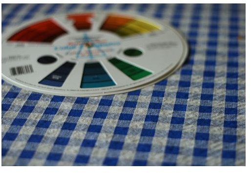
Color wheels can be purchased from home improvement centers, art supply stores, and some hardware stores, and they offer a person the ability to compare color schemes while looking at a physical object. Not only is this an accurate way of doing it, it allows you to accurately match things like paint samples and ink colors for products that are going to be viewed in print, rather than on the Internet. If you’re looking at picking colors for fashion design or interior design, this might be the method for you.
Kuler is Adobe’s brainchild, a Flash-based program that has been offered freely to the public. One of the nicest things about Kuler is that the design is relatively simple, providing users with few options and a set five-color color scheme output. It has many settings, including the ability to help you pick out analogous color schemes with the click of a button.
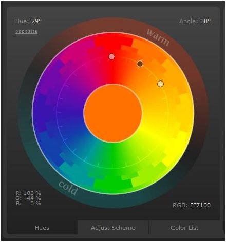
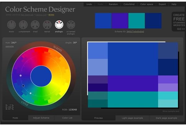
Color Scheme Designer is a more robust program that is also offered freely to the public, but offers quite a bit more in the customization process, as well as the different schemes that are created. Not to mention, Color Scheme Designer even offers you the ability to apply the theme to sample websites, so you can get a general idea of what it might look like when applied to your website, taking the headache out of designing and redesigning layouts.
Credits
Resources:
Image Credits:
- Color Wheel by madalinetosh
- Screenshot of Crayola website taken by Amber Neely
- Screenshots taken of Adobe’s Kuler and Color Scheme Designer and their color pickers by Amber Neely


