
The General Electric Logo has an intriguing history that dates back over a century involving a rather famous character you might not have been aware of. We’ll take a look at the origins of this simple, classic logo along with how it has evolved with changing trends in graphic design.
A Marriage of Economy
The epic American inventor Thomas Alva Edison formed a company to sell his creation that brought non gas-powered light to the world in the form of the incandescent electric lamp. Most Americans are well versed from grade school regarding his abilities to create and design the first light bulbs, but not as many know what an adept business man he was too. The company he incorporated in 1890 was called the Edison General Electric Company. It represented all the diverse enterprises that had spawned from his lab in Menlo Park, New Jersey.
Around the same time, a rival company was operating under the name of Thomson-Houston Company was creating its share of patents and innovations in the budding age of electrical products and innovations. Since they both essentially needed each other to proverbially and literally connect circuits, they merged in 1892. So it is in that year that we can trace back to the origin of General Electric logo history.
Image credit/commons.wikimedia.org
Two Simple Letters Spearheading Innovation in the World
Not much has changed in terms of the font face since the first GE Logo was devised in 1890. The small case script writing depicting the “g” and “e” is still virtually the same. This is a testament to the maxim in logo design circles that simple is better which you will recognize as a recurrent theme in many of the creative and memorable logo designs that stand the test of time .
Even in the beginning, GE was a diversified company involved in a broad spectrum of industries including lighting, industrial products, appliances (they rolled out the first fans on the market) transportation, power transmission, and medical equipment. Later, GE became huge players in an even wider array of products and services such as locomotives, health care, finance, energy, and the latest in nanotechnology development.
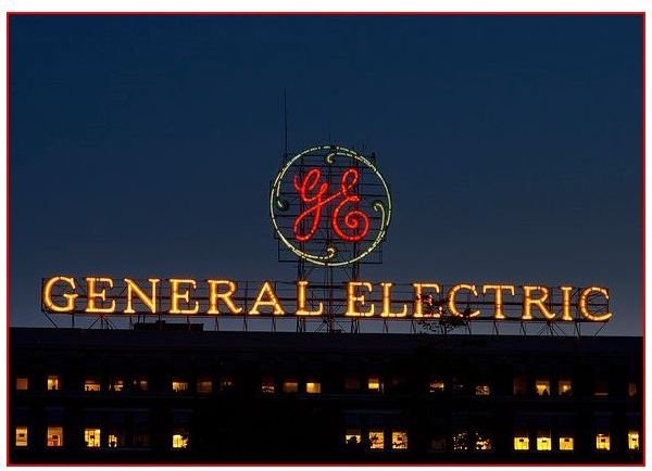
Still, with that tremendous breadth of expansion and evolution spanning more than a century, the logo really never changed. No matter how tempting it must have been to overhaul the logo to match a new direction or venture that the corporation was heading in, they stuck to the original, save for very minor tweaks. The circle added around those letters likely signified the company’s increasingly familiar world-wide presence. In fact today, according to Business Week, GE is the 4th most recognized brand in the world.
The GE logo bucked most of the trends in logo design over the latter half of the last century including incorporating art deco, art nouveau, or funky fonts, for example. The round, simple logo design was a winner from the beginning and they were smart in changing what worked. In fact, the latest trend in logo design is that round form which is uncomplicated, friendly, and yet sleek and sophisticated.
The GE logo swirls that bend in at each navigational direction on a compass can certainly be interpreted as GE’s endeavors to cover every direction the world over with their ceaseless innovations and technological advancements across the board. All those years the white font against the black background created an aura of stability, fostering confidence in investors and customers alike.
Image Credit/Flickr.com/chuckthewriter
The Present Day Version
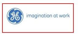
CEO Jeffrey Immelt commissioned changes to the logo in 2004, resulting in the brand we still see today. His vision encapsulated a trend which can be summed up as an effort to coalesce the corporations far-flung enterprises under one unifying banner, so to speak. These modifications, designed by Wolff Olins, included the new light blue color palette, and the new slogan, “imagination at work” replacing the one so familiar from the bevy of commercials created toward the end of the last century which was “we bring good things to life.” That motto was created by David Lucas.
These changes were meant to convey an open company that perhaps has a commitment to maintaining a healthy, big blue world through all of its eco-friendly practices. Of course logos, like art, are open to your own interpretation. You can find circles that feel the cursive font of GE leaves many loops that represent massive corporate loop holes that the U.S. government provides GE.
References
https://www.ge.com/company/history/index.html
Business Week. 2009. Retrieved December 25, 2009.
https://www.instantshift.com/2009/01/29/20-corporate-brand-logo-evolution/


