Through its history, Pantone colors have played a big part in the printing, publishing, fashion and cosmetics industries. These colors provide a standard way for designers and employers to agree upon a certain color.
Pantone Colors
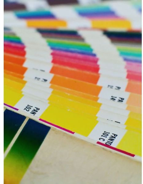
Pantone colors are the internationally recognized system of identifying, matching, selecting and controlling ink colors. This system is used in all kinds of industries that require specific and precise color identification and matching like the publishing industry, the printing industry and the packaging industry. It helps designers easily control and identify the colors they need for their projects. It also provides them with a way to match colors that can produce other colors, all contained in pantone color charts and books that can be purchased anywhere. Its authority when it comes to ink colors is recognized all over the world. Pantone colors have been essential tools for different kinds of people throughout its history, and it all started with a small business employee who bought the company he was working for and provided it with a new vision.
Lawrence Herbert
Even before joining Pantone – back then just a small business that produce color cards for companies in the cosmetics industry – Lawrence Herbert already believed that a standard system for describing and measuring color was needed. This kind of system would put designers and companies on the same page when they are talking about color. He joined the company in 1956 and was still adamant about his belief in the standard color system.
In 1962, he bought out the company. Retaining its name, he changed the whole vision of the company by introducing a color matching scheme that puts a unique identification number on every color in their library, which at the time was up to 1,114 colors; a number that went up from the original 500 colors. The Pantone Color Matching System immediately garnered the recognition of designers and companies everywhere. By the following year, he had already sold licensing for his color matching system to 20 companies.
Who Uses Pantone Colors?
Every type of business that involves precise colors got into the whole color matching scheme. From individual designers who are plotting their next graphic design and desktop publishing assignments , to large companies that are involved in different industries like photography, ink manufacturing, publishing, cosmetics, fashion and printing, took Pantone on board.
This solved a simple yet rampant problem in a wide spectrum of industries. Take for example Kodak’s problem of offering film products in packages that feature their trademark yellow color. They worked with different printing companies so boxes of film featured different shades of yellow. This proved problematic when users opted to buy film products with brighter yellow packaging, thinking that darker yellow boxes contained film that were old and not fresh. Using the Pantone color system, working with different printing companies, produced the same shade of yellow, eliminating confusion among the public.
The Panton Color Matching System
Throughout its history, Pantone has relied on one of its earliest and best assets: its color matching system. The system relies on the CMYK color reproduction process which involves the process of printing colors by using four ink colors: Cyan, Magenta, Yellow and Black. Not all kinds of colors can be produced through the CMYK process, but generally, this is what the Pantone Color Matching System uses to identify specific colors.
References
Forbes, https://www.forbes.com/global/2003/1124/056.html
Pantone, https://www.pantone.com/pages/pantone/pantone.aspx?pg=19295&ca=10
Photo Courtesy of Wikimedia Commons / Supplied by Carlos Paes


