Color theory basics are not always a part of a graphic design curriculum - especially if that curriculum focuses on home learning. Learn the basics of color theory and color meaning, and how knowing about some of the symbolic properties of colors can help you in your desktop publishing efforts.
Introduction to Color Theory Basics
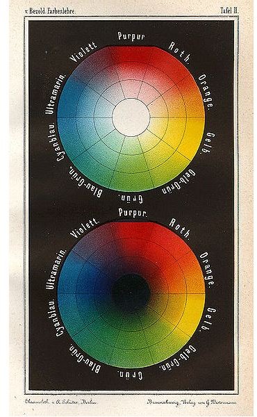
Color theory basics center on the color wheel. Most likely, you have traditionally been taught that the three primary colors are red, white, and blue. Mixing these colors in different combinations produces new colors. In graphic design, colors take on new properties.
First, when talking about graphic design, rather than talk about color theory the way an artist might (there are three colors from which all other colors come), colors are discussed as they belong to the light spectrum. The historical development of color theory has changed with the advent of physics. There are seven colors in the light spectrum. These are:
- Red
- Orange
- Yellow
- Green
- Blue
- Indigo
- Violet
When we see color, what we see is the color that is being reflected back to us. For instance, when you see the color red, what you are really seeing is the reflection of red and the absorption of the other colors in the spectrum. When all the colors are reflected, what you see is white light. When none of the colors are reflected, what you see is black.
When talking about color theory, it’s important to understand that there are a few different systems that describe what happens - and color will behave according to different properties depending on whether you are looking at CMYK color theory or RGB color theory - RGB colors send color data to your eye from a device, while CMYK colors are used in printing.
Color Theory Terms
Before discussing color theory and color meaning, you should understand some key terms that are involved. Chroma refers to the ratio of gray to the color it is mixed with. When creating your graphic design projects, you’ll also be interested in saturation: how pure a hue is. More saturation means fewer colors have been mixed in with it. Intensity describes the brightness of a color. Intensity is increased and decreased through adding white or black to a hue. When adding white to a hue, the color is said to be tinted; and when adding black to a hue, the color is said to be shaded.
A primary color is a color like red, blue, or yellow; a secondary color is a color like green, purple, or orange (where two colors were mixed together to create it); and a tertiary color is the result of mixing three colors together.
When talking about color, you might also refer to a color scheme . There are monochromatic color schemes where all the colors appearing are various intensities of one hue; analogous color schemes where the colors are those appearing next to each other on the color wheel (yellow and orange, for example), complementary color schemes where two colors across the wheel from one another are paired together, and triadic color schemes where the colors are evenly spaced around the wheel.
Red Color Theory and Color Meaning
Red is a dynamic color. When you select red to use in desktop publishing projects , it sends a definite message. Red is the first color the brain is able to perceive, which explains why it’s always the red car that gets pulled over on the freeway even if there are other cars around it that were speeding. Red signifies danger, caution, and risk. Red can also have positive implications such as increasing appetite, demonstrating passion, and adding a bit of a sexy tone. Use red in projects where you want to catch someone’s attention or get their adrenaline pumping.
Orange and You
Orange is a blend of red and yellow hues, and it’s a bit more subtle than its cousins. Orange is often used when the designer wants to create a more playful vibe to the desktop publishing projects he or she is working on. Orange is often a signal of good health - and some cultures consider orange to be a color that signifies sexiness. Orange is often associated with the fall months, and is also associated with Halloween and Thanksgiving. For this reason, be aware that if you are using orange and black together you are conjuring thoughts of Halloween in your audience’s mind and if you use orange with other fall hues, you may cause people to think about walking through leaves on a brisk morning.
Using Yellow in Your Projects
When I see yellow, I feel cheerful. When using yellow in desktop publishing projects , though, carefully consider why you are using it. Because yellow tends to be a very bright hue, it can be overwhelming and it can even overpower a desktop publishing project. Yellow can signify the sun - so it’s often used in spring or summer scenes, but it also can wear out the eye if too much is used. Yellow can be used in projects where you want to celebrate youth - but it can also be used to indicate decadence. Whatever you use yellow for, it is eye-catching, clean, and can even be considered to be a sophisticated color.
Blue and Color Meaning
Blue: when most people think about this color, they think of a calming hue, the color of the ocean, and yes, the color of the sky. Blue signifies much more than that when used in desktop publishing projects . Blue can signify power - especially navy blue hues. Blue is also symbolic of faith, healing, knowledge, and experience. If used in other situations, especially blue with a high chroma ratio, blue can signify depression and sadness. When selecting your colors, it is important to keep this in mind as brighter blues tend to signify more positive aspects of the color while more muted hues signify negative aspects.
Green’s Color Theory
The color meaning of green tends to be associated with gardens and with elegance. When using green in desktop publishing , keep in mind that green does well with other colors and alone. Green can signify both elegance and children. While there are many positive traits associated with green, unfortunately there are also negative traits. “Green with envy,” and “He’s green” (meaning he’s new) are two ways of expressing the more negative connotations.
Purple and Graphic Design
Purple in graphic design is a tricky color, as when it appears in the natural world, it is often on flowers like tulips and violets. Purple has long been associated with royalty, so you’ll often find purple used in advertisements and business cards where a sense of prestige is desired. Purple also has connotations of a more nostalgic time, and can even signify newer technologies or ways of thinking. Be careful when using purple, as sometimes this color can have political implications as well. Be sure you are sending the message you wish to send.
Choosing Colors in Your Designs
Finally, when you are choosing colors and their various tints and shades to use in your graphic design work, it is always important that you keep in mind the intent of the work. Are you trying to grab attention? Are you trying to portray power or intelligence? Do you want to introduce a new concept? By watching the colors you use and carefully playing with color to create a general feel in a project, you can find that knowing about color theory basics is quite helpful to all your graphic design projects.
References:
Chapman, C. “Color Theory for Designers” Smashing Magazine. https://www.smashingmagazine.com/2010/01/28/color-theory-for-designers-part-1-the-meaning-of-color/
Ronda Roberts Levine holds a certificate in Graphic Arts and Printing.
Image Courtesy of Wikimedia Commons https://en.wikipedia.org/wiki/File:Bezold _Farbentafel_1874.jpg


