
If you want to create your own business card, looking at examples can be very helpful. This guide will showcase several great examples of personal business cards and explain the design strategies that can be used to make your own card both eye-catching and functional.
Tips for Eye-Catching Personal Business Cards
In a world where business cards are freely exchanged, handing out another plain white piece of cardstock with your name on it isn’t going to get you noticed. Taking the initiative to incorporate elements of design into a business card that are both functional, as well as eye-catching, will go a long way in helping you draw in customers. What makes a personal business card eye-catching? Fortunately (or unfortunately) there are several answers to that question. It mostly boils down to what you personally like, combined with a few safe standbys. Read for for some tried and true tips.
Using Color Properly
**
A simple splash of color can go a long way. Keep in mind that this does not mean that you should try to put every color in the spectrum on your business card. There’s no limit to the amount of colors you can use, but there’s no shame in using just one or two. Just remember, the more colors you use, the more the cards will cost to print, so make sure to keep it simple if you’re budget-minded.
The card here shows how a simple arrangement of color in the corner or along the edge of the card adds visual interest and draws the eye in. If you like the card to the left, you can download the pack of Free Customizable Business Cards and customize it to your needs. It comes in four-color schemes, including melon, granite, bamboo, and country.
Picking Professional Fonts
Choose your fonts wisely. While you might think that Comic Sans looks really neat, it’s generally thought to be very unprofessional. The same goes for fonts like Papyrus and Kurlz MT. Not sure where to get started? Check out Verdana and Helvetica which are commonly used fonts that give off a professional feel, but feel free to explore fonts like Georgia, Baskerville, and Sanford.
Looking for even more professional fonts? Why not try Free Fonts for Professionals , it’s sure to help you get started. The example here shows how a card can still feel fun without sacrificing a professional typeface.
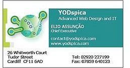
Use Your Logos
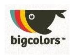
Logos can make all the difference. You’re going to want to use something simple that can very clearly be seen on a business card. Remember that you’re going to be printing on a card that is three inches wide by two inches tall. Not very big at all, which means that large elaborate logos will become confusing when shrunk to a smaller size. Here is an example of a small logo by Nadir Balcikli which showcases the perfect balance of eye-catching and simplicity.
Using Artwork on Personal Business Cards

Give ’em the ol’ razzle-dazzle. If you do happen to be in a business where people expect you to be a little flashier, such as art and design, you can treat your card as a mini piece of art. Just make sure that it fits your overall theme and matches your business. People are much more likely to hold on to a business card if they find that it looks interesting. The card shown here is both professional and very artistic, providing a good balance of art to provided information.
Image Credits & References
Images:
Sew Sweet Business Card by Amber Neely
Business Card by Ello Assunaco - https://www.flickr.com/photos/yodspica/4127020662/
Business Card by Homegrown Skinny - https://www.flickr.com/photos/homegrownskinny/544443187/
Big Colors Whale by Nadir Balcikli - https://www.logorado.com/
References: Author’s experience in design.


