Background: Orange Backgrounds for Projects
Orange Backgrounds in Desktop Publishing Projects
Orange is a secondary color that is created when red and yellow mix. It gains a lot of qualities from both red and yellow making it warm without being too hot like red and mellow like yellow but a lot milder on the eyes. Orange happens to be one of my two favorite colors and I try to incorporate it a lot into design and art in general.
I picked out a lot of really fun and interesting backgrounds that are available and I hope that you are able to enjoy and utilize them as much as I had looking for them.
(Click on images for a larger preview or visit the source listed in the credits of this article for several different resolutions.)
Vista Inspired: Orange by will-yen
Let’s start this article off right with this fine orange background. It’s incredibly simple but ethereal and cloud-like. It has a lot of orange going on but it’s still pleasant because you see a bunch of different shades and hues that orange can take on. I would say that its most practical use would be as a desktop background but by all means use it in whatever way you might think of.
Orange Sunset by estudyante15

Orange Sunset is really cool because this sort of design really hooks and interests me as I happen to be a sucker for anything with stripes. But it’s crisp and clean and you will likely find a lot of uses for it in your Desktop Publishing projects as a card or background for art.
. pink + orange vector. by intoXxXinfinity

Working with vectors will leave you with some of the cleanest and prettiest designs out there and this orange background is no exception. While there is some other colors amongst this background orange is still feature prominently. Like a lot of the backgrounds I’ve provided this one is very open to make it easily customizable to your needs.
Orange Background by Orseis
Here is another example of a vector orange background that is beautiful and simple. It’s interesting because a lot of the elements are located on the left side which means you will have to put some emphasis on the right side to either even it out or not cover up and of design. Or you can leave it as is and just use it as a desktop background.
Orange by Aggowaffle
Emphasis on the simple here. I picked this background because it reminds me of a video-game loading screen’s background and as the dotted lines fall they are surrounded by very faint lighter colored squares. Regardless of what it reminds me of it feels like there is some movement here which is really eye-catching and can be used in lots of different ways.
Big City Nights. by jugga-lizzle
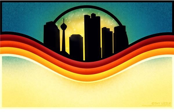
Silhouettes are probably the classiest form of graphics design that I’ve seen so when I saw this I had to include it in the article. It’s beautiful and simple but it has depth, texture, and contrast to it which makes it a really complete background that is both unique and draws the eye towards it.
The Right Direction? by jugga-lizzle
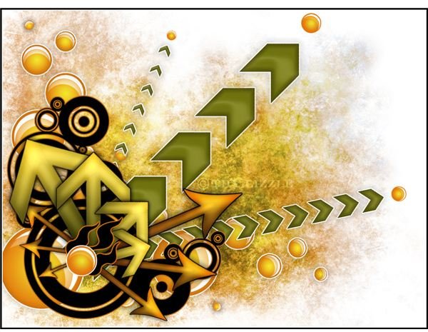
Another great vector design by jugga-lizzle which combines orange and green together and creates something very organic and fun looking when combined with the vector art. This orange background is not dominantly orange but I feel like the orange elements really pop and that it is a good fit.
Orange by Silencesys
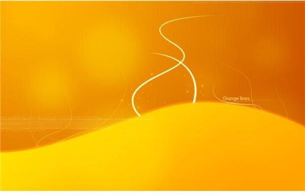
Orange or Orange Lines reminds me a lot of a lava lamp. It’s incorporation of really smooth gradients and testing elements are simple, but effective at being eye-catching. Since orange is used very gently in this background it’s easy on the eyes and soothing making it a lot of great things at once. Its simplicity also lends itself to being applied to a lot of different projects
Orange Gold by Vicki and Chuck Rogers
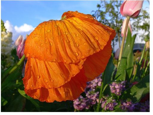
Macro shots provide some of the most beautiful images out there and it’s hard to disagree with the fact that this orange flower isn’t beautiful. In terms of backgrounds this works surprisingly well as a card with some text, perhaps for a holiday like Mother’s Day or Valentine’s Day where flowers are a common theme.
Orange 5 by YanivG
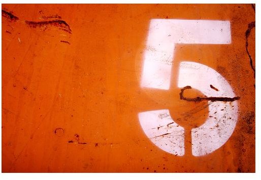
YanivG has an expansive gallery of photos though provoking, beautiful, and a lot of them happen to feature orange primarily. There were simply too many to choose from and I finally settled on this particular piece as a proper background, though I do encourage you to take a look and see the rest of their gallery.
This piece in particular is industrial and gritty looking which is something I wanted to incorporate into this article. This piece can work as incredibly good background in lots of different projects you might have.
Orange Door by tanakawho

Getting back to the smooth and clean of things we have this really nice door that is so well photographed that it provides a lot of room to incorporate a lot of design elements and text. If you are a fan of using real world photography as back drops but can never really commit because of how dirty and weird looking some walls end up looking try out this door.
Autumn Leaves by xoxoryan
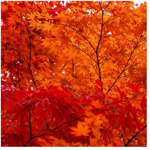
Autumn and orange go hand in hand. This picture has a lot of really beautiful things going on especially all the mixes of orange and red that play off the dark branches of the tree. I would say hold off until Fall to use this orange background and maybe incorporate it into a card for someone with a Fall birthday or just someone who loves Autumn leaves.
Light Through a Canvas by net_efekt
This is an interesting, simple orange background since it’s more like a texture than anything. But it’s dirty and grungey looking which makes it interesting so I thought I would include it to help give some variety.
Orange by muShy Soup
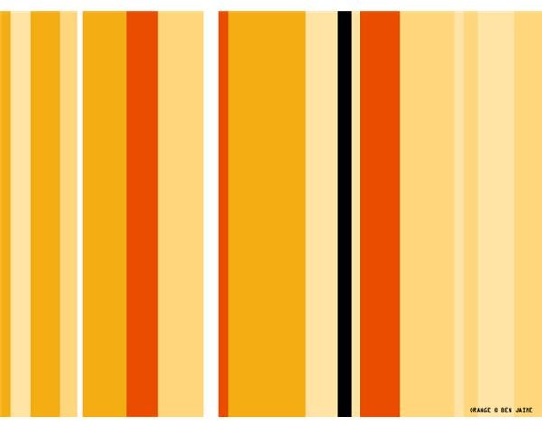
This striped background is really nice looking because it has a lot good orange and creme colors and provides a sort of retro wallpaper look to it. I would say use it as a desktop background, a card cover, or wrapping paper if you have the ability to create personal wrapping paper.
Orange Vines by Me

I created this background to add something a bit more regal and fancy looking and while I don’t think it looks incredibly fancy it’s definitely interesting and simple to make it easier to make your own additions. I would say maybe fold along where the white and orange meet and make an interesting looking card.
Credits
All images are used for promotional purposes and are listed in the order they appear.
https://commons.wikimedia.org/wiki/File:Color_icon_orange.png
https://www.flickr.com/photos/two-wrongs/115720738/sizes/l/in/photostream/
https://www.flickr.com/photos/yanivg/64298062/sizes/l/in/photostream/
https://www.flickr.com/photos/28481088@N00/1136610313/sizes/m/in/photostream/
https://www.flickr.com/photos/xoxoryan/307650400/sizes/m/in/photostream/
https://www.flickr.com/photos/wheatfields/526607708/sizes/m/in/photostream/
