Incorporating Color Theory in Your Website Design

What Is Color Theory?
Color theory is a relatively simple idea – basically, it’s the practice of mixing colors and using color palettes to achieve your desired effects. These ideas are hardly new, showing up in even the notebooks of one Leonardo da Vinci, and have been practiced ever since. Color theory also seeks to define why colors have the visual impact that they do, such as the soothing effect of natural colors (blacks, whites, greys, tans and pastels) and the energetic feeling of vibrant primary colors (reds, blues and yellows).
Warm vs. Cool
Warm colors are those that exclude blue in any form. This means that there are no blues, greens or violets in the warm color spectrum. They always have some form of red, meaning that reds, oranges and orange-yellows tend to be thought of when it comes to warmer colors.
Cooler colors are colors that always include blues, and exclude reds. When choosing your design for your website, you can choose to work within a warm or cool color spectrum, and achieve a different feel with each.
Both spectrums can feel soothing, but in different ways. Cool colors can be likened to the peacefulness of a cold winter day, while warm colors would feel more like enjoying the evening in front of the fireplace. Cool colors, if used too heavily can feel a little gloomy, so that is something to keep in mind.
Energy Levels
When it comes to energy levels, the most important attribute tends to be the saturation of the colors. The higher the saturation, the more energetic the color. For example, tans, greys, and pastels all give off a sleepy, soothing feeling whereas bright, primary colors help to add energy to the feeling. Take a look at the three color palettes below.
The first color palette is highly energetic, albeit a little juvenile. This is a very informal color palette, that could easily be used to market a website to children or a fun and free website. Colors at full saturation have the drawback of sometimes causing the feeling of anxiety in adults, as well as sometimes being too high-contrast which can make them harder to read. You’ll want to keep this in mind when designing websites that hold a lot of content or text.

The second color palette is what you could call the mid-road between sleepy and energetic. Colors within this palette still stand out, but they blend well together. This palette could easily be used to market any number of websites from a personal blog to a professional restaurant’s menu page.

The third palette has a much more relaxing and professional feel. The colors don’t contrast highly with each other, making it ideal for a website that is looking to create a soothing feel, such as a website for a spa.

Helpful Online Tools
Now that you have some important tricks up your sleeve, isn’t it time that you add a few helpful tools to your arsenal of web design tricks? Of course it is!
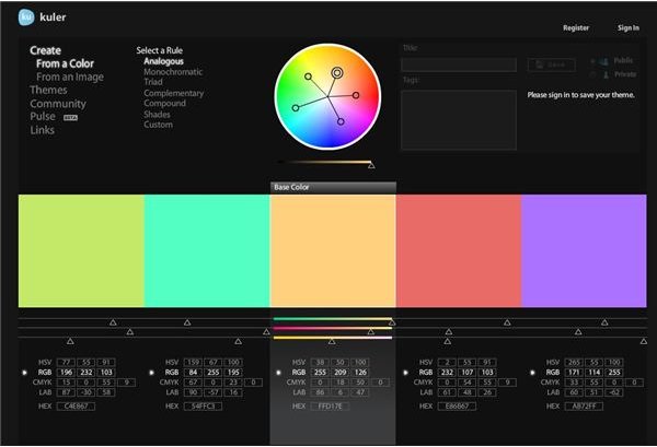
The first invaluable program I bring you is Kuler. This is the brainchild of design mastermind Adobe. Contained within this fantastic (and free) program are a variety of tools that are geared toward taking the headache out of design. For example, you can create your own palettes from their advanced color picker, you can generate your own color palettes from photographs, and if all else fails, you can browse the community-made color palettes for some inspiration.
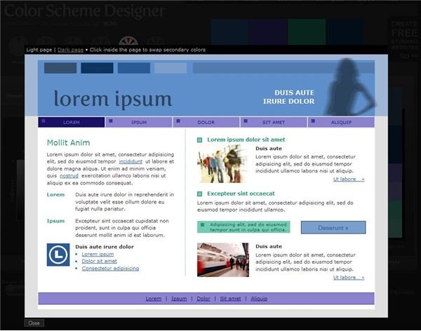
The second fantastic program is my personal favorite, and it goes by the name of Color Scheme Designer. This wonderful tool helps you design your own color palettes based on popular color schemes, as well as giving you the option of previewing them on a sample website design. Talk about making it easy for you.
References and Resources
Great Online Color Scheme Tools:
Image Credits:
- Complementary Colors Orange & Blue by Sarah Spaulding
- Color Palettes by Amber Neely
- Screenshots of Adobe Kuler and Color Scheme Designer taken by Amber Neely