What’s that bar mean? How much is that? These are the types of questions you’re likely to hear if you haven’t properly labeled your Excel chart. We’ll take a look at the different labeling options found in Excel 2007 and how to use them.
The Importance of Chart Labels
A picture may be worth a thousand words… but it can also invoke a thousand questions. One of the main purposes of adding an Excel chart to your document or presentation is to allow people to quickly get an understanding of the data you’re trying to present. To make this visual representation as meaningful as possible, it’s important to label the significant items in your chart so that the graph doesn’t cause more questions than it answers.
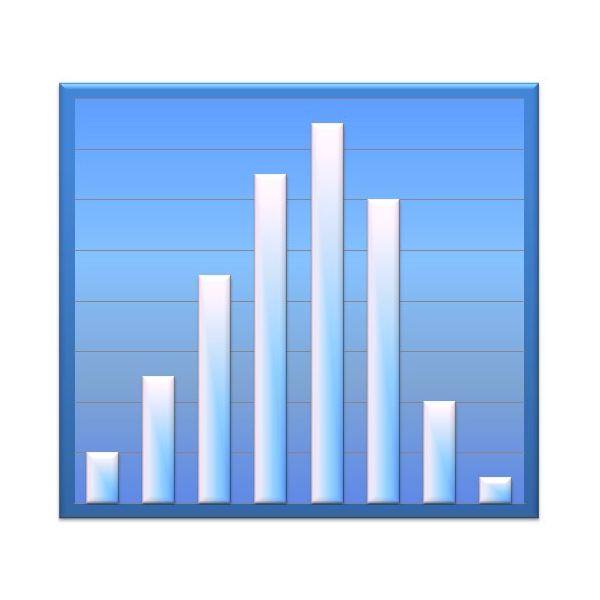
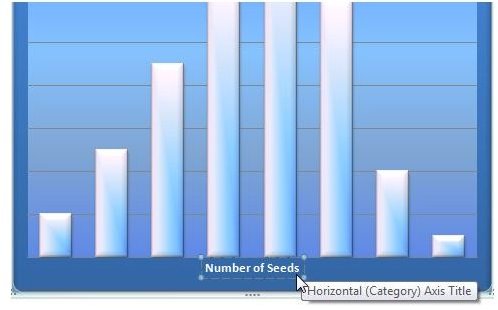
For instance, take a look at the histogram shown in the image to the right. (Click any image in this article for a larger view.) The chart has been formatted to look all nice and pretty, but who knows what it means or what it is trying to represent? We’ll take a look at how to add different types of labels to the chart in Excel so that this histogram is actually useful for viewers.
Adding a Chart Title
It’s true that not every chart needs a title, but it’s hard to go wrong by adding one. To add a title to a chart in Excel 2007, first makes sure that the chart is selected in your spreadsheet. Then, go to Layout tab under Chart Tools on the Excel ribbon. Click on the Chart Title icon in the Labels grouping.
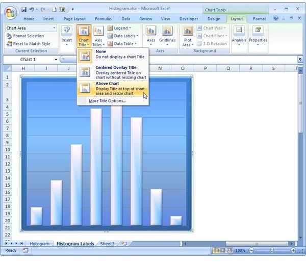
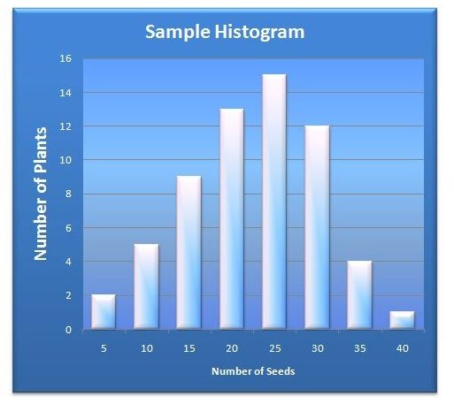
Select the particular format that you want to use for your title. In this case, we’ll choose Above Chart. A default title will be placed on your chart. Now, just click on that title area and change the text to read anything you like. Here, we’ll just change the name to Sample Histogram
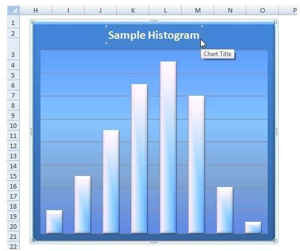
When you’re done editing the title, click anywhere outside the text box and the changes will be applied. If you’re making several changes to your chart, you may want to save your spreadsheet at this time so you don’t lose any of your work.
Adding Chart Axis Labels
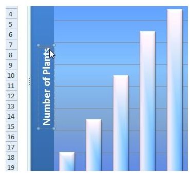
There are several ways that you can add labels to an axis in Excel 2007. This particular histogram is supposed to be depicting the number of plants that contain a certain quantity of seeds. The number of plants is represented by the column height which corresponds to the vertical axis, and the number of seeds corresponds to the horizontal axis. First, let’s look at how to add an axis title to make this information clearer to viewers.
To add a horizontal axis title, make sure that your chart is selected again and return to the Layout tab on the Excel ribbon. Click on Axis Titles and then select Primary Horizontal Axis Title. For this axis, you’ll only have one option other than None so we’ll select Title Below Axis.
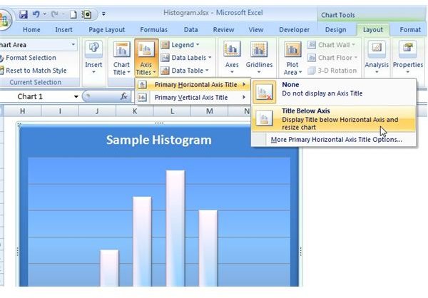
Just as with the chart title in the previous section, a default title will now appear below the horizontal axis. Click on this text to edit it.
To add a vertical axis title, we’ll have more choices. Click on Axis Titles again and select Primary Vertical Axis Title. Select the format that you would like to use.
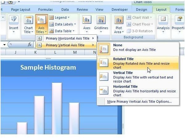
For this example, we’ll use the Rotated Title option. Again, a default title will appear that you can click on and edit.
Note: To add markers to either axis, click on Axis in the Axes grouping on the Layout tab. You’ll again have several options to choose from. If you want to make changes to the way the axis information is presented, refer to the tutorial on how to change axis labels in Excel 2007 .
Other Types of Chart Labels
Depending on the type of chart you’re creating, you may want to add other type of labels to the graph, such as a legend or data labels. You’ll find the options for including these items on the Layout tab as well. Just click on the type of label you want to add and select from the available options.
For more tips and tricks, take a look at the other Excel chart and graph tutorials available at Bright Hub. New and updated items are added on a regular basis, so bookmark us and check back often.


