Ever get asked, “What is kerning?” Not kurling… that’s an Olympic sport. We’re talking about type fonts and how to make them more beautiful and easier to read. If you use type fonts very often, you’ve noticed that sometimes letters don’t fit together very well. Kerning lets us overcome that issue.
What Kerning Is – And Isn’t
When using a typewriter, each character is allowed the same amount of space. But type characters aren’t shaped the same and don’t use space in the same ways. Some letters are narrow at the top. Others are narrow at the bottom. Round characters crowd their neighbors. If words use characters that leave open space together, such as a capital “A” and a lower case “v”, the result is a noticeable gap. Sometimes the gap is as large as a word space, providing the confusing appearance of two words where only one exists. Today’s type fonts have built-in variable spacing that helps characters nest together and avoid cases of bad typography .
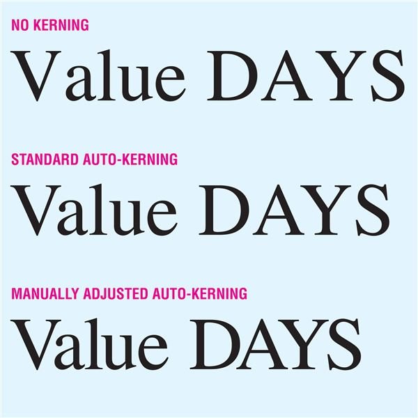
Kerning is a way to adjust the amount of space between pairs of characters. Digital fonts are programmed with auto-kerning, making the most obvious adjustments for us. This is done by identifying kerning pairs, characters that fit together in a special way, and assigning them with adjustment values.
Most graphic arts applications provide manual kerning tools to fine-tune the appearance of our type. Zoom in to get a close look at the lettering. The rule of thumb in typography is to kern tighter as the type gets larger. Auto-kerning may appear very readable in text sizes, up to 12 point or so. But as the size grows to headlines, uneven gaps between characters become more distracting to readers.
Many people confuse kerning with other spacing adjustments, such as tracking or scaling. Kerning only refers to adjustment of space between pairs of characters. Tracking makes adjustment to the overall spacing of type blocks, adding the same amount of space between each character of a whole word, entire line or paragraph. Kerning is not the same as scaling either, where a percentage of the horizontal width is selected.
A Look Back At Kerning Techniques
From the ancient time when books were hand copied by monks, right up to the work of pre-vinyl sign painters, kerning was not difficult. The artisans had both the desire and the talent to draw each word as a unit. It was not unusual to see variation in each “s” on a sign, for example, as the illustrator drew letters to fit a particular word more beautifully.
In the early days of offset printing, letters were cast in metal and mounted onto square chunks of wood that were locked in a chase for printing. In those early days typography was a tedious craft. Care was taken to prepare beautiful lettering for the expensive books produced. Printers would kern their type by using a saw to trim wood off the blocks, allowing characters to fit together better.
For some really ugly kerning, take a look at some early 20th century newspapers. Lead slugs from linotype machines didn’t allow for kerning. The tiny letter-shaped molds were pulled from type magazines and cast into lead as each line filled, then shuffled back into place for reuse. Each mold was the width of the character it set, whether a period or a capital “W.” The quick production of the linotype allowed newsmen to present the latest news each morning, even if it wasn’t pretty to read.
But when phototypesetting arrived mid-century, kerning once again returned to the typographer’s repertoire. It was a skill that required practice and judgment since most typesetting equipment of the time did not have viewing screens. Kerning errors were corrected by running a new galley, which cost time and materials.
Auto-kerning was not available until the computer age and Adobe postscript fonts entered the scene around 1980. At first, computers opened the world of typography to consumers who had no knowledge of graphic arts or type characteristics. There was a learning curve for consumers to understand typography and for typesetters to learn about computers and software. As software improved and the Internet aided learning, the artistic qualities of type selection and kerning returned.
Understanding Kerning Pairs
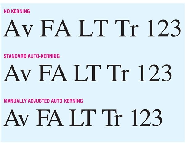
Now we know what kerning is, what is a kerning pair? A kerning pair is two letters that don’t nest well using standard spacing. One reason for poor fit is that auto-kerning generally spaces for capitals preceded by a word space and followed by a lower-case character. Although that’s the most common use, all-caps may be used. Adobe provides a list of the standard 283 kerning pairs from the AFM file of a Roman OpenType Font. Some font developers include as many as 4,000 kerning pairs for headline or decorative fonts likely to be used in large sizes.
The pre-set adjustment of kerning pairs in fonts can be permanently changed using font editing software such as Fontographer or FontCreator. FontForge is a free alternative to consider. However, if you send a file to another viewer, you will need to embed your customized fonts to lock-in the same kerning. For small amounts of text, such as a headline, manual kerning techniques may be faster.
Some software doesn’t recognize the auto-kerning features of type fonts. Word processors space type without kerning and Microsoft Word supports auto-kerning for True Type fonts but not Type 1 fonts. Consult your software documentation and tutorials to learn their kerning options.
Auto-Kerning Enters The World-Wide Web
I’m betting that all graphic designers have experienced disappointment when the appearance of their work changes on websites viewed with different platforms and browsers. It may seem pointless to be concerned with kerning of type, even big type, for a website. But a new code for Cascading Style Sheets (CSS) makes instant improvement in kerning for Safari, Webkit and Firefox browsers. Insert the code: text-rendering: optimizeLegibility; and watch the magical transformation of your online text. Sorry Internet-Explorer users… Macs win big on this one. Hopefully a future release will activate this feature for Windows users.
References
Adobe Kerning Pairs, https://partners.adobe.com/public/developer/opentype/index_kerning1.html
Font Forge, https://fontforge.sourceforge.net/
Graphics by Gwen Hagaman


