IE9 Comparison – IE9 Versus IE8
IE9 Comparison – The User Interface
I will begin IE9 comparison with the user interface. Among the first things that people notice about any software or operating system is the user interface. Why do you think people hung to Windows Vista even though it was almost a mess? It was just because of the user interface. Coming to IE9 comparison (IE9 versus IE8), the most significant thing you will notice is the change in Internet Explorer’s user interface.
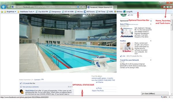
The IE9 drops the multi bar system. It relieves itself from the traditional menu bar and places all important items on a single bar. This is to offer more canvas for websites as per Microsoft, the software giant. In other words, placing all important things – the Address bar, the Tabs, and icons for Favorites, Home, and Tools – on a single bar offers more space for websites. It looks that Microsoft finally acknowledges that web browsers are meant for viewing the websites and not the design of web browser. Hence, it made the bookmarks bar, command bar, and even the status bar, optional.
This means that by default, you see only a single bar at the top where you can type in the URL or open new tabs. If you wish to go to a bookmarked URL, you can use the Favorites icon on the same bar. If you wish to see the status bar, or favorites bar, just right click at any empty space on the address bar and select the option in Internet Explorer context menu (see image).
The new tab page presents you with squares (thumbnails of pages that you surfed recently). It also offers an indicator on each square to show how frequently you used these websites: A strange but interesting method of presenting browsing history!
Tip: If at anytime, you feel the need for the traditional menu bar, press ALT key. This is a hidden shortcut that presents the traditional menu bar until you press ALT again or until you click on the webpage.
IE9 Comparison - Negatives of IE9 User Interface in Beta Version
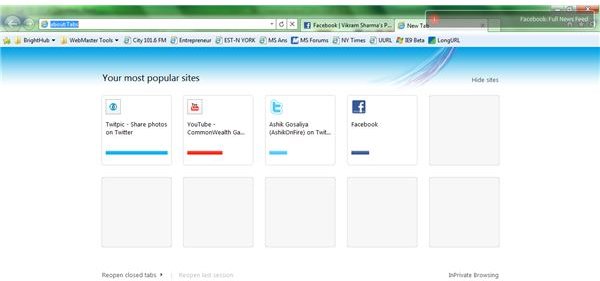
While comparing IE9 with IE8, the beta release does not include the ‘PIN’ feature. The PIN feature as in Internet Explorer 8 or in Chrome 6, allows you to pin the squares (the thumbnails of recently visited websites) so that they are shown every time you open the new tab page (see image).
Another drawback I see here is that if you select Delete Temporary Files on Exit in the Advanced tab of Internet Options, the new tab page contains all blank squares in place of website thumbnails after you restart Internet Explorer 9.
While the status bar is optional as explained above, it does not include the progress bar. Talking of IE9 versus IE8, in IE8 and previous versions, you could see if the page is still loading. In IE9, there is no way you can tell if the page is still loading or stuck in some cases. Try the following example and see it for yourself. For most people, Facebook would not run properly in IE9. The text overlaps images/videos. Click on the Compatibility View button (just next to address bar) and for a while, you would not know if the page is reloading or is it stuck.
IE9 Comparison – Faster Speed
IE9 is probably the fastest browser at the moment (at least until Google Chrome hits back with its proposed 60x faster version 7). Speaking of IE9 versus IE8, Microsoft removed most of the default (built-in) add-ons and components. It also compiled IE9 to use hardware acceleration wherever possible. So in effect, the browser employs GPU rendering instead of software based rendering. These reasons make it the fastest browser. In this IE9 comparison, I would like to say that not only does IE9 present you with the home page within split-second, you also experience great speed even on feature rich sites such as eBay.
Of course, the software giant may include built-in plugins or offer plenty more as additions to the browser in future to counter Firefox plug-ins and that of Chrome. If users try to experiment and install most of these proposed IE9 plugins, they may end up slowing down the browser. I recommend using only the add-ons and accelerators that you think you can’t do without - unless you wish to get back to the speed of the kind that IE8 delivered.
Note: If you install too many add-ons that slow up IE9 beta, you are automatically presented by a message box at the bottom of the IE that asks you if you wish to disable any add-on. Clicking on the message presents you with currently enabled add-ons and their load time. This helps you in disabling any add-on that you think is slowing down your computer. This is a great feature and the IE team confirms that it will remain in the final version too.
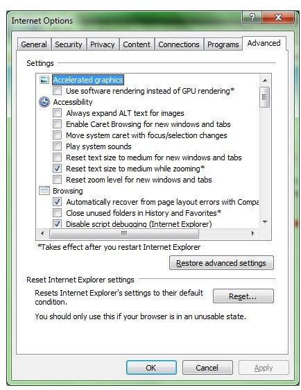
On older computers, users may feel the browser to be slow. This is because the IE9 employs software rendering in case their graphic cards are not compatible. You can check this in the Internet Options -> Advanced Tab. The very first option listed is Use Software Rendering instead of GPU Rendering (see image). If the box is grayed out, your graphic card does not support GPU rendering. If you do not wish to put pressure on your graphics card and enable the option, you will experience slow speed as then there is no difference in speed comparison of IE9 and IE8. You can notice the difference of computer resources’ usage by using IE9 before and after enabling the software rendering option. Open the Task bar to check out how much computer resources are used in each case.
Internet Explorer 9 - Other Features
One of the best features, which was never present in previous versions of Internet Explorer is the ability of IE9 to allow you pin websites to the Start menu and the Taskbar (if you are using Windows 7). IE9 is completely designed to go hand in hand with Windows 7 and hence it is possible for you to launch a website from your Start menu or from the Taskbar. To pin a website to the Windows Taskbar, just drag the favicon of the website (the “website logo/image” preceding the URL in address bar) to an empty space on the Taskbar. To pin the website to your Start menu, just drag the website favicon to the Start menu icon. The menu will open up automatically and you can release the shortcut to pin it there (see image). Please read our article on How to Pin Websites to Start Menu for details.
This IE9 comparison offered details on user interface and speed factors. For more details on the new browser, please read our article IE9 Beta Review. If you feel you can add something to this article on IE9 versus IE8, please feel free to use the comments section.
This post is part of the series: Exploring IE9: Reviews and Features
IE9 beta is Microsoft’s new, fast and innovative version of Internet Explorer. In this series we review the IE9 beta browser, and some of the special features capable through the browser. We teach you to pin tabs on the taskbar in IE9 to act like applications, uninstall it, and more.