Pie of Pie Charts in Excel 2007: How to Break Out Small Groups of Data or Small Percentages

Problems With Small Portions of Data
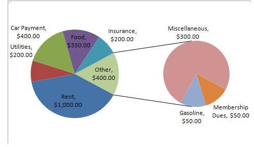
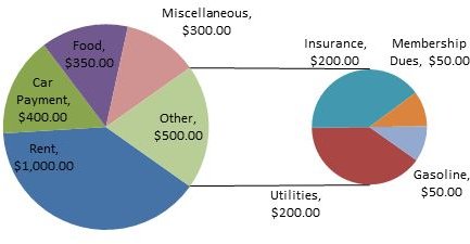
It’s not unusual for a pie chart to be dominated by several large categories within a data set and have a few smaller ones clumped together in a manner that makes them hard to recognize. Not only are these cluttered parts on a pie chart hard for the viewer to see, but they can also make the entire graphic look sloppy and unprofessional.
In order to accommodate data of this sort, Microsoft Excel 2007 offers a “pie of pie” option when creating a pie chart. This feature lets you break out these small groups of data into a separate smaller pie chart that is represented as a sub-part of the original whole object. The instructions in the next section will show how to create this type of pie chart.
The example used in this guide is based on data from a monthly budget report that was described in Part 1 of this series. All data and charts created in this series can be found in the file Microsoft Excel 2007 Pie Charts which has been uploaded to the Windows Platform Media Gallery. Feel free to download this workbook and modify it to use for your own projects.
Creating a “Pie of Pie” Chart
Method 1 – Creating Directly From Data
This first method describes how to create a “pie of pie” chart directly from data entered into a spreadsheet.
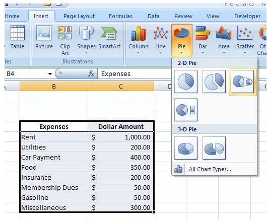
Highlight the data that you want to use to create your chart. Open the Insert tab on the Excel ribbon, and expand the Pie menu in the Charts section. Select the Pie of Pie chart in the 2-D Pie portion of the menu. (Click image below for a larger view.)
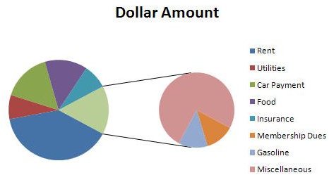
This action will create a basic “pie of pie” chart like the one shown in the following screenshot.
If you don’t like this presentation, the layout and design can be modified using the same process as described in Part 2 of this series.
Method 2 – Creating From Another Pie Chart
This second method of creation is more common, because you don’t usually realize you need a “pie of pie” chart until you have tried to create a basic pie chart and found that you don’t like the way it looks.
Assume you already have created another type of pie chart and want to convert it to a “pie of pie” chart. As an example, we’ll use the pie chart constructed in Part 2 of this article.

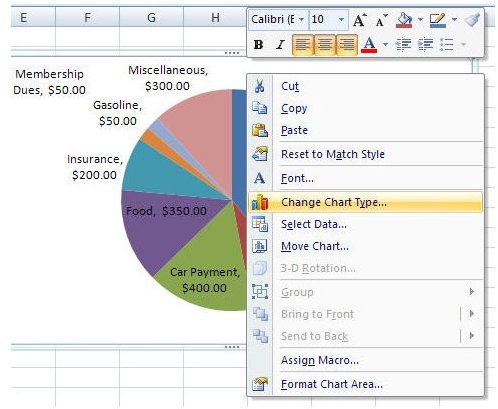
Right-click anywhere on the pie chart and select Change Chart Type.
In the new window that opens, select the Pie of Pie chart.
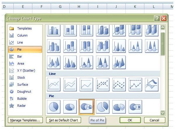
The new chart will replace the old one in your Excel spreadsheet.
Again, as above, if you want to make any changes to the layout or design, you can use the same methods described in Part 2 of this series.
If you’re interested in learning more about creating other types of charts, be sure to browse through the collection of Excel chart and graph tutorials found here at Bright Hub.
For more details on how to modify what data is shown in the second pie chart, continue on to the next page.
Selecting Data for the Pie of Pie Chart
When using either of the methods described on the previous page to create a secondary pie chart, Excel will use certain default settings to decide which data is included in that second chart. However, sometimes that data isn’t quite what you want to be shown. It is possible to change what’s shown in a couple of different ways.
First, we’ll look at using the Format Data Series tool to give Excel different instruction on which data to choose – this method is particularly useful for pie charts with several categories as well for those that regularly are updated with new data. Second, we’ll show how to use the Select Data tool to manually select the specific categories you’d like to include in the secondary pie chart.
Method 1: Format Data Series Option
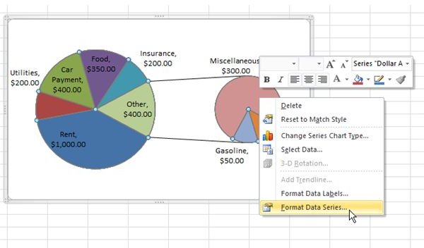
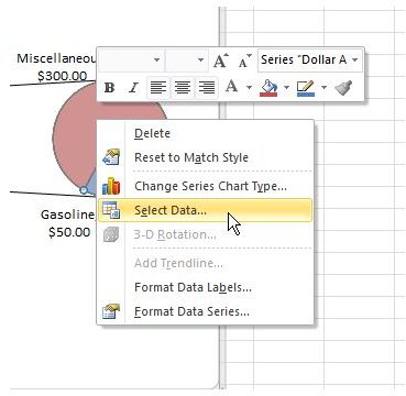
Step 1: Right-click on the secondary pie chart and select Format Data Series, as shown in the image below. (Click image to enlarge.)
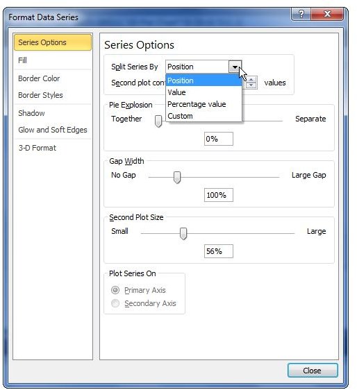
Step 2: In the Format Data Series window that appears, first make sure that the first option – Series Options – is highlighted in the list shown in the left panel of the window. The first field for this option is a drop down box labeled Split Series By. Use this option to tell Excel how you want it to choose the values that will be split out.
For instance, if you want all values less than 250 to show in the second pie chart, select Value. If you want all categories that make up less than a certain percentage of the overall total to be included in the pie of pie chart, select Percentage value. Or, if you just want the last few items in your data table to be shown, no matter what value they have, choose Position.
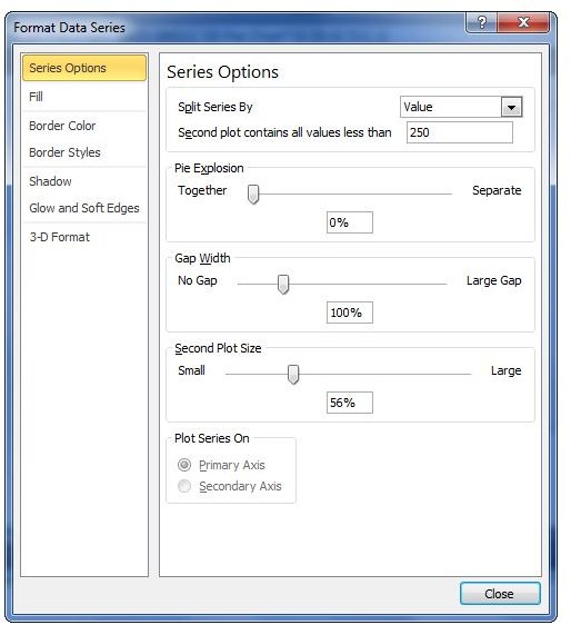
Step 3: Once you make a choice for the Split Series By field, another option will show up directly under it – the label for that option will depend on which method of splitting is chosen.
As an example, if you choose Value (see image to the left), a new field will show up asking you to enter the value for Second plot contains all values less than. Let’s enter 250 to demonstrate.
Step 4: Click the Close button to return to your pie chart, and it will be updated based on the options chosen.
The image below shows how the new pie chart will appear with the options chosen in Step 3.
Method 2: Select Data
Alternatively, if there are certain specific fields you want shown in the second pie chart regardless of value or position, you can use the Select Data option to manually choose those fields.
Step 1: Right-click on the second pie chart and choose Select Data.
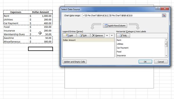
Step 2: When the Select Data Source window appears, first drag it out of the way so that you can clearly see your data table.
Step 3: Hold down the CTRL key on your keyboard and manually select the items (along with their values) that you want to show in the second pie chart. For instance, we’ll just select Food, Insurance, and Membership Dues as shown in the image to the right.
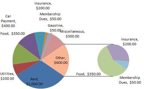
Step 4: Click OK when done to return to your pie chart. The result is shown below.
References and Image Credits
References: Author’s personal experience with Excel.
All screenshots created by author.
This post is part of the series: Pie Charts in Microsoft Excel 2007
A pie chart may look simple, but there are actually several ways you can dress it up to make it be a better visual representation of your data. In this series, we’ll take a look at all the different ways you can create and format pie charts in Microsoft Excel 2007.