Learn how to use Apple Color to raise the level of contrast between light and dark in your video images.
Color Grading in Color
Flat images are the first sign of a rookie director of photography or simply a shoot that did not go according to plan. Balancing the light and dark in an image is a crucial part of framing digital video images and is part of what makes an image be effective and “pop.” If this did not work in production it is up to the post-production staff to really put in the work and make it come out in the end. Color 1.5 , which is part of the Final Cut Studio in the workflow with Final Cut Pro , is professional color grading software that allows you to really go in and take image control over that color. Adding contrast is a key part of this process, and really all color grading in Color. Here is the basic method for adding contrast to any digital video image in Color, though every image is different and there may be more advanced techniques required to make yours work.
What is Contrast?
Contrast in general refers to the difference in the light and dark areas of an image. If an image does not have much of this difference between light and dark, where most of the color intensity is somewhere in the middle, the image will often look flat an muddied. To alter that you must try and create a variance in the scale of color over all. To do this you can begin by trying to lighten up the whites, or gain, and lower the black, or lift. There is a standard format for doing that in Color 1.5.
Raising Color Contrast in Color
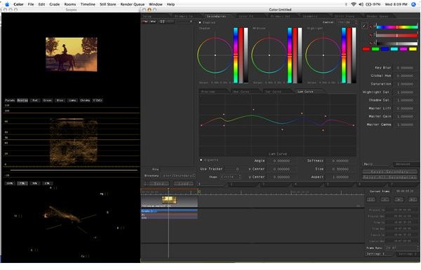
When you are looking at your clips in Color make sure that you have the ones you want to color grade in the timeline. Select one of the clips to begin the color grade. Above you are going to see several available tabs, or “rooms,” and you will want to select the Primary Inone. Primary color correction is the first line when color grading, right before Secondary Color Correction and Primary Out. Here you will take a look at your joy balls or color wheels and to the right of each one will be a light to dark ratio that you can change. On the far left you are going to have the color ball for blacks and on the far right is the one for whites. The middle one is for mids. Begin by lowering the one for blacks, taking a look at the vector scope and trying to get the black reading down to the lowest bar. After you have lowered the blacks in the image to match a true black color you can begin raising the whites. Try to balance back and forth until you have a fairly nice contrast that you like. You can also do this with the numeric readings for life and gain by simply raising the gain and lowering the lift.
This post is part of the series: Apple Color Tutorials
Here are some tutorials with tips and tricks for using Apple Color.


