Magazines have a distinct look to them. Some might say they were the first websites before the Internet was created. Even though the Internet has overtaken the print market, magazines are still fairly common among a lot of communities and will likely continue to do very well for years to come.
Magazine Layouts
It’s often said that web design often takes elements from magazine design and I can easily see where the similarities can be drawn. Magazines have and will likely always provide some of the most beautiful and unique designs available because they are able to utilize two full, horizontal pages with both images and text while Internet design will, more than likely, always be confined to a more vertical design because it reads easier. It may seem difficult to keep up with a medium that has no specific guidelines on what a good layout is because aside from the obvious elements (pictures and articles) there really isn’t really a right or wrong way to layout a magazine’s design.
There are some common designs out there that I have featured in this article that should help you to find a jumping off point for your designs, but I encourage you to use them as inspiration and come up with your own unique designs.
Picture Spread with Text Overlay
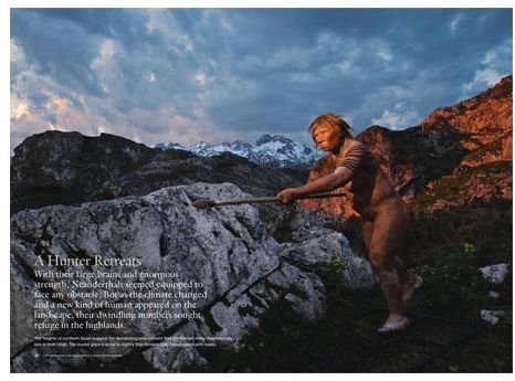
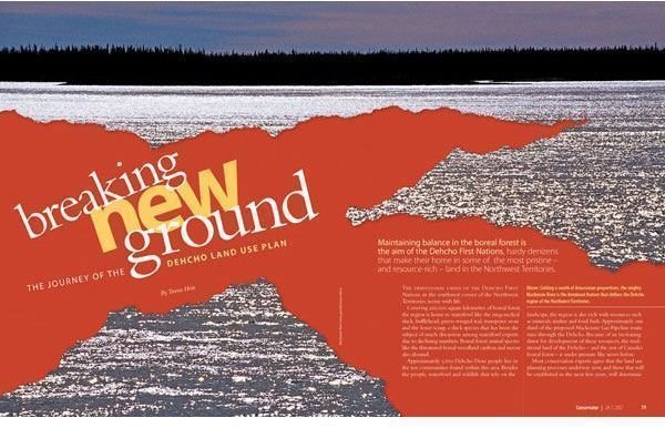
This layout it’s probably my favorite layout style in magazines but probably one of the most common ones (that I’ve seen anyways). It’s a layout that creates a beautiful symmetry with high-resolution picture as well as the article that accompanies it. You’ll mostly likely see this type of layout in like a science, exploration, or nature magazine where the picture is not overshadowed by the words.
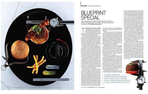
3/4th Picture Spread
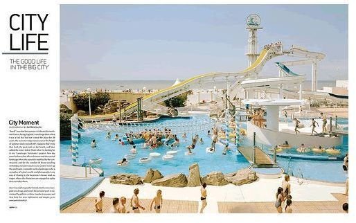
Too much text over a picture or photograph can really detract from the overall scope of what the image is about. So, unlike a full, two page, picture spread this allows for both the information and picture to co-exist without stepping on their toes, so to speak. I believe it provides the best of both worlds when creating a layout for a story that needs both of these elements to be told properly.
Framing
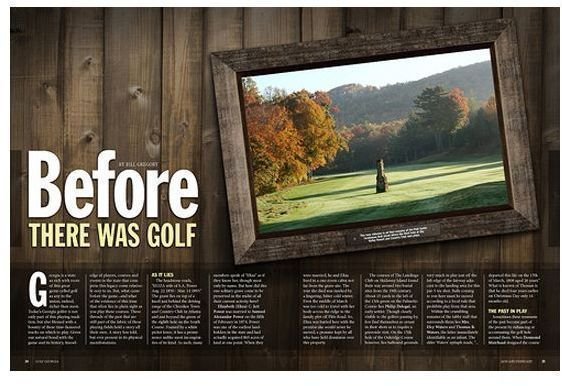
There are a lot of way that you can achieve a good looking frame layout. Basically, the overall goal is to block the picture in, in someway be it design elements on the page (such as the literal frame they used in my example), or in the more traditional sense where the text wraps around the picture sort of like in newspapers . This is a pretty good way to incorporate pictures that don’t have to be high-resolution or aren’t directly related to the event being described by your article.
Picture Article Split
You might often find that the best way to lay out an article is simple to put a full-page picture opposite to a full-page article. The picture will likely be on the left side to create the illusion of a cover to your article. Just remember to make sure that this picture is directly relevant to your article, otherwise it will end up looking like a full-page ad next to a wall of text.
Stylized Spread
It’s difficult to put into words exactly what this design is supposed to look like, but if you can imagine for a moment a mixture of the Picture Spread With Text and Framing you have something similar to this design. It’s more often a title page one the left with the first couple of paragraphs in the article on the next page on the right, over top a two page picture with some design elements to separate the text and picture. Albeit confusing, you can create magic with this layout that is very eye-catching.
Credits
All images were used for promotional purposes only and can be found at these websites which feature several other examples of layout designs and typography from magazines.
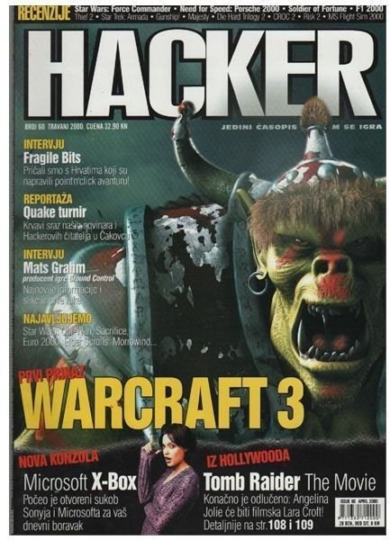
https://commons.wikimedia.org/wiki/File:Hacker _broj_60.jpg
https://www.nationalgeographic.com/
https://speckyboy.com/2008/06/15/32-inspirational-examples-of-amazing-layout-and-typography/


