
The Tombola font is surprisingly plain for a font with such a weird name. It’s likely to see this san serif font next to fonts like Arial, Times New Roman, or Helvetica. If you’re looking for something similar to the Tombola font have a look at these alternatives.
Finding Tombola Alternatives
Finding alternatives to Tombola was kind of a challenge because it’s a unique looking font that is still very plain. If you’re looking for any sort of alternatives to Tombola you might consider looking for a hand-written, print typeface. I did find seven different examples of alternatives to Tombola that are completely free to use and I’m sure there are many more out there.
(Click the images in this article for a larger preview of each font.)
Aircut-OneHundredAndOne

Aircut is a freeware typeface created in 1995, that has some elements of being hand-written but has definitely been cleaned up to fit into modern design some. It’s a little more goofy than Tombola and not exactly plain, but it isn’t breaking the mold where as a graffiti font might. Honestly, this font would look pretty good for a simple Halloween project because the sharp edges that it utilizes create a sense of creepiness but is also good for other projects that need a modern, almost sci-fi look to them.
Source: https://www.fontstock.net/9083/aircut-onehundedandone.html
Architect
Architect is a fairly thin and smooth font. I find this alternative to Tombola to be pretty close to what it’s trying to replace in that it is noticeably shifted to the right slightly (particularly noticeable around the lowercase o’s) and is relatively safe but not very traditional. It’s a very clearly designed font that I could see doing well in whatever projects you might use the Tombola font.
Source: https://www.fontstock.net/9891/architect.html
Asenine

Asenine is a font that is noticeably digital, but otherwise fits into the realm of plain and printed. It has a fairly new and elegant style to it and would likely do well as a font for maybe a salon or fashion related piece’s logo or header typeface. Give it a look is you find that Tombola isn’t clean or modern looking enough for your tastes.
Source: https://www.fontstock.net/7882/asenine.html
Bisque

Bisque is pretty similar to the Asenine font but a bit thinner and more modern looking. The font has a bit more edges than some of the fonts listed but that’s what makes it cleaner and modern feel to it. This is an ideal choice for projects that need a sharp, clean feel to it as opposed to something more hand-written.
Source: https://www.fontstock.net/3897/bisque.html
Castorgate-Distort

Castorgate is probably the weirdest out of the seven I’ve listed in this article. It’s close to looking like a calligraphic font that is a bit thicker than Tombola. It features some chunks missing from certain letters that give the illusion that the font is sort of leaning to the right like Tombola or Architect. If you liked the hand-written, stylization of Tombola it’s a choice substitute.
Source: https://www.fontstock.net/7013/castorgate---distort.html
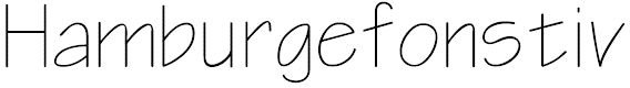
Diego-Regular
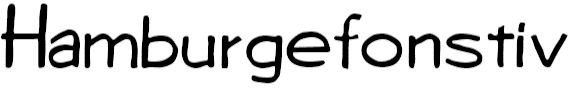
And bringing up the rear is Diego Regular. Which isn’t to say that this is a bad font, it isn’t. It’s the most hand-written looking font in this article that isn’t calligraphic or cleaned up. It’s simple, oddly shaped letters are a lot like Tombola in a lot of ways but it’s definitely it’s own entity and should be a great replacement if you don’t need something so smooth, clean, or plain looking.
Source: https://www.fontstock.net/4470/diego-regular.html


