Pairing typefaces is often hit or miss. Typefaces that work together are easier to find when you know the basics about typefaces.
The Wonderful World of Typefaces
Typefaces do more than allow you to put words on a page. When used correctly, they can communicate the tone of a piece and affect the reader’s mindset.
With thousands of typefaces to choose from, you can communicate any message imaginable. However, it’s important to choose the best tools for the job. Viewing examples of typefaces that work together helps you recognize if a pairing is appropriate or not.
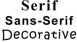
Serif, Sans-Serif and Decorative
Most typefaces belong in one of three categories: serif, sans-serif and decorative. Serif typefaces have curls or “little feet” on the ends of each letter. Sans-serif typefaces are those without curls or “little feet” on the ends of each letter. Decorative typefaces are those that don’t qualify as serif or sans-serif.
Understanding the differences between these categories makes it easier to narrow your sel
ection when choosing typefaces. Generally, you pair serif typefaces with sans-serif typefaces.
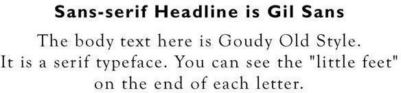
For example, many designers like to pair Arial and Times New Roman in print projects. Arial is sans-serif and Times New Roman is serif. The two typefaces go well together because they are clearly different, and it creates a nice, clean contrast. Click the image to your right for an example.
As a rule of thumb, avoid pairing two different sans-serif typefaces together or two different serif typefaces. Using typefaces that are too similar, but not exactly alike looks like an error. Pairing serif with sans-serif looks different enough to let viewers know it was a conscious decision.

Decorative typefaces are creative, and do well when you want to express certain emotions. It’s easy to get overwhelmed looking at all the interesting decorative choices available. You might want to use many decorative fonts, but it’s best to use them sparingly, if at all.
Normally, decorative typefaces are for small areas of text. Examples include headlines for invitations, on ads or on flyers. However, it’s not a good idea to use decorative typefaces for large chunks of text. It might prove difficult to read for an extended period. When using decorative headlines, consider pairing them with sans-serif body text. Click the image to your left for an example.
Stay within the Family
Sometimes it’s useful to pair two sans-serif typefaces or two serif typefaces as long as they are from the exact same family. For example,
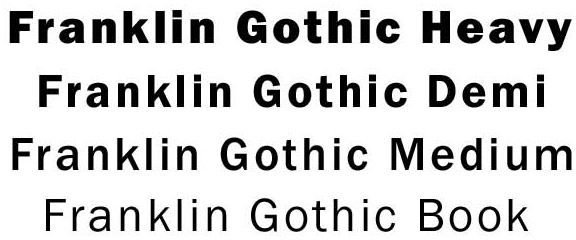
Franklin Gothic Book, Franklin Gothic Medium, Franklin Gothic Demi and Franklin Gothic Heavy work well together because they are related.
Finding typefaces that work together is often a matter of trial and error. You might come across an odd pairing that would perfectly fit your project. Most designers have printed lists so they know what has worked before, and what the pairing looks like. A list makes it easier to choose typefaces for new projects. If you prefer the trial and error method, remember that typefaces should complement each other and not clash.


