
Read how adjusting the spacing of characters and lines of text improve the artistry, readability of spacial fit of type. Examples are shown of kerning, tracking, leading and baseline shift controls.
Introduction
Some software applications, such as Adobe InDesign and QuarkXpress , offer full control of character spacing with both automatic and manual controls. Check the manual and tutorials for your favorite software to determine its available spacing options and how to use them.
The spacing of characters in a typeface are controlled by kerning, tracking, leading and baseline shift settings. The spacing of characters is important for visual appeal, readability and optimum fit for the space available. Kerning and leading examples are shown in the graphics below.
Horizontal Spacing
Kerning and tracking are often confused, as they both control horizontal spacing between characters. By kerning your type, you are adjusting the amount of space between two characters without affecting the rest of the text. Kerning is most effective when the letters in a word form a void, appearing as a gap. By drawing the two letters closer together, or kerning, the word becomes a visual unit.
In the early days of printing, type characters were carved from metal and mounted on wooden blocks. To kern type, they had to saw away part of the wooden blocks so letters could fit closer together. Because of the time it took, most early letterpress work only has kerning on the larger headlines.
Today kerning is easy to do, but graphics professionals are the primary industry with concern for the artistry of well-kerned type. Most consumer software, such as Microsoft Word , does not offer manual control of kerning.
Tracking allows changes in the space between all characters in a body of text. For example, if you want all the letters to squeeze together, you would tighten the tracking. Or, to spread the line so it appears there is a word space between each letter, you would loosen the tracking. The rule of thumb is to tighten tracking as type gets larger in size.

Vertical Spacing
Leading and baseline shift controls set the amount of vertical space. Leading controls the amount of space between lines of text. Most software allows allocating additional leading between paragraphs. Some provide limited leading controls that use the terms single-, space and a half-, or double spacing. The term “leading” comes from thin strips of lead that were used in early printing to add space between lines of type.
Default leading is generally 20 percent more than the point size of the type. This amount of space allows ascenders (tops of caps and other tall characters) and descenders (tails of characters like g and y) to rest without touching. See the kerning and leading examples shown in the graphics.
“Under-leading” is a term used for having a leading amount that is less than the point size of the type. Doing so can provide dramatic results, allowing the tails of letters to fall near or cross over characters in the line below.
Leading is measured from the baseline of a line of text to the baseline of the line of text above it. If you were to draw a line across the bottom of the type characters, that would be the “baseline”. Baseline shift allows single letters, words, or a group of words to be raised or lowered from the level where the rest of the type is sitting.

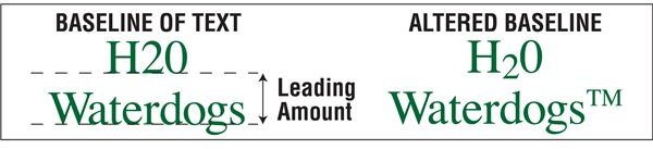
Image credits: Screenshots by Gwen Hagaman


