Learn about serif typefaces and the four design groups of serif fonts, including examples of old style serif fonts, transitional or baroque serif fonts, modern or didone serif fonts, and slab or Egyptian serif fonts.
Serif Typefaces: A Little History
Serif typefaces, or font families , display thick and thin artistically drawn characters with embellishments at the stroke ends. These “legs”, “hooks” or “loops” add weight, contrast and print readability to the typefaces. There are four basic groupings of serif typefaces: old style, transitional, modern and slab serif. Typefaces without serifs are called sans serif (“sans” translates as “without” in Romance languages). Sans serif fonts are generally considered more readable online.
The practice of using serifs in typeface design is generally believed to have roots in the Roman age, when lettering was chiseled into stone for signage. Around 1460 a transformation in printing technology, from handset blocks of type to linotype systems using hot lead to create strips of type, created opportunities for design of new typefaces. The new faces were easy to read, even in very small sizes. Today’s selection of serif typefaces numbers in the thousands.
Old Style Serif Typefaces
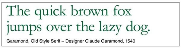
Artfully crafted, old style fonts have bracketed serifs and slight weight differences between the thick and thin parts of the letters (low line contrast). The thinner sections tend to be the angular lines (diagonal stress). Old style serif fonts are documented in use in the early 1420s.
Garamond is one of the most widely used old style font. It was designed by Claude Garamond for use by French King Francis I in 1540. Other old style fonts include Bembo, Goudy, Jenson and Palatino.
Click any image for a larger view.
Transitional (Baroque) Serif Typefaces
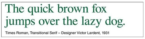
Transitional serif fonts, also called baroque fonts, became popular in the mid 1700s. Similar to old style typefaces, they have higher contrast between the weights of thick and thin lines.
Times Roman is a popular typeface that represents transitional serif fonts. It is often the default typeface for software applications. The British newspaper, “The Times”, commissioned the Monotype Corporation to design the font in 1931 to update the paper’s image. The typeface was drawn by Victor Lardent under the supervision of Stanley Morison.
Other transitional fonts include Adriane Text, Baskerville, Esprit and Fleischman.
Modern (Didone) Serif Typefaces
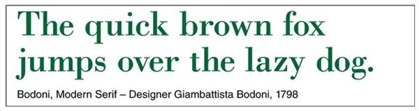
Modern serif fonts display extreme contrast with long thin serifs and vertical stress. This group of typefaces, which became popular in the late 1700s, is less readable and normally used in larger sizes. Also known as didone serit, this style departure was influenced by the work of French type founder Firmin Didot.
Bodoni is a widely used example of modern serif fonts. It was designed by Giambattista Bodoni in 1798. Other modern serif typefaces include Aster, Bell, Didot and Ellington.
Slab (Egyptian) Serif Typefaces
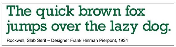
Slab serif fonts became popular in the early 1800s. The serifs are squared and similar in weight to the lines of character bodies. The slab style reflects the popularity of everything Egyptian during that time period. Major archaeological discoveries, including the Rosetta Stone in 1798, had resulted in “Egyptomania” across the U.S. and Europe.
Rockwell is an example of slab serif fonts. It was designed at the Monotype Foundry under the supervision of designer Frank Hinman Pierpont in 1934. Slab serif typefaces are most often used as display or headline fonts. Other slab serif fonts include Clarendon, Lubalin Graph, Memphis and Stymie.


