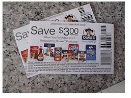
When designing a coupon, you’re trying to fit a lot of information into a very small area. Learn the requirements for typeface sizes on coupons to ensure that your offer gets results.
There aren’t any hard and fast requirements for typeface sizes on coupons. However, there are several softer guidelines to keep in mind when designing coupons in order to improve readability and response.
After all, response is what we’re after when creating coupons — they’re designed to elicit action. Placing a coupon in an ad is a time-tested method to get customers into a store or to get them to buy items. Usually you’re incorporating a coupon into an ad, which attempts a double whammy: the advertisement tells the reader about your business, while the coupon gets them moving.
The Fine Print
While this is likely the last part of the coupon you’ll lay out, we’re addressing it first here because, well, it’s the most annoying part to lay out. Might as well get it over with.
The fine print of the coupon varies depending on the business. For national accounts such as grocery coupons, the fine print will contain detailed information for the grocer on how to redeem the coupon and how to be reimbursed for the cost. Smaller, local business’ fine print might list items excluded from the coupon’s promotion or other limitations on the coupon.
How to fit all that fine print copy into such a small space:
- Use a typeface of 6 points or larger for the fine print. That’s considered the minimum type size for readability.
- Use a sans-serif typeface to improve legibility.
- Use a condensed version of a typeface, e.g. Univers Condensed — not something fake-condensed in your page layout program — to help fit in all the copy, if necessary.
- Use at minimum 1:1 ratio for leading, e.g. 6/6 Univers Condensed.
- As a last resort, track the type tighter to get it to fit. Eyeball it and make sure it’s still readable.
Headlines and Subheadlines
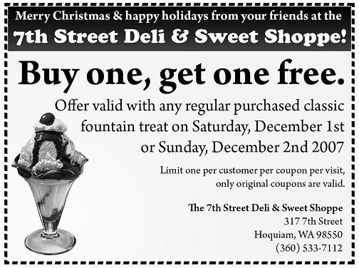
Designing coupon headlines is simple: make it as big as you possibly can. This is where branding comes in. Use the business’ standard font, the one they use in all their marketing materials, and make a big honkin’ headline to crow about the coupon’s offer, such as “50% Off All Birdhouses” or “Buy 1 Sandwich, Get One Free.” Give the headline some air (white space) if at all possible — this is the part of the coupon that we want to attract attention.
Coupon subheads simply expound upon the headline. The fine print takes care of the job that body copy normally would. They should be set larger than the fine print but smaller than the headline. For instance, the sandwich coupon might add in a subhead, “Offer good through September.”
In short, the requirements for typeface sizes on coupons could be summed up as: nothing smaller than 6 point type, and go big on the headline to grab attention. There are many other considerations to keep in mind when designing coupons, but as far as typeface size selection goes, this article should give you a grand head start.
References
- Image Credit to HotCouponWorld.Com
- Image Credit to CouponAudit.Com