There are many elements of design in the world of typography. Here we take a closer look at the element of repetition and why this element plays an important role when creating typographical-based projects.
What is Repetition?
The action of repeating something over and over is called repetition. This is true for any item that needs to be remembered or needs to make an impact on someone. Our minds learn through the repetition of thoughts, ideas, and visual clues, which is what makes the technique of repetition a valuable learning and communication tool.
Visual repetition through design styling is where repetition typography comes in. Through the repeated use of bold lines or bold text with aligned font families, the element of repetition in type can be very useful in leading the viewer’s eye directly where the graphic designer wants it to go. You can learn about other basic elements of typography that are beyond repetition in Anatomy of Typography , under the Understanding Typography series.
Repetition in Typography
Many people who view repetition typography don’t recognize this often-used design element. Repetition is everywhere both in older and more modern graphic typography styles. In fact most typography uses in graphic design and desktop publishing are built from repetition with the other elements of typography added in afterward.
A good example of this type of beginning repetition is at the start of a project. Design elements such as using typography that is uniform in size, alignment, and weight can be the starting point. Adding in matching bullet points, boldness, and underlined areas one after another is also part of the creation of repetition.
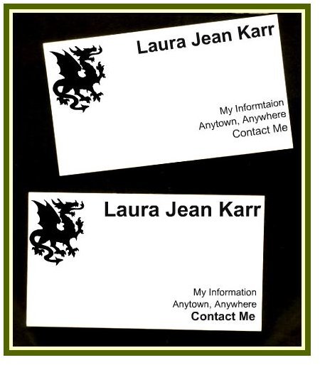
Using Repetition
The end goal of using repetition typography is to make the eye follow through where the designer needs the eye to go. One good example of this dynamic is in the use of bold text for repetition. In the example at the left you can see basic general information at the top of the business card. Notice that in the first example, the only bold type is at the top. By using just the bold element at the top, the design allows the eye to fall away from the text and move on in search of something else to focus on.
In the bottom example, we see that the bold text has been repeated. By using the bold text again with the bottom type it allows the eye to focus on the bold element and, in doing so, makes the eye flow back up to focus on the bold text at the top. Repeating the bold element in this fashion creates a focus loop for the eye where it will repeatedly go between the top and bottom text. To get a better view of this example, click on the image and it will open a new window.
Other examples of repetition typography are repeating the same word or letters throughout a design, repeating the same color scheme for certain letters and words, and forcing the eye to search for bold strokes within text by repeating the element of special ascenders or descenders in letter characters.
For more information on the use of repetition typography and other design elements that can be used through typography, see the article series Understanding Typography, which begins by answering the question What is Typography? and will lead to the explanation of ascenders and descenders in typography.
*Image used was created and edited by the author using Picnik.


