So, how do we create a newsletter layout that is easy to update while at the same time provides a fresh look from time to time? By bringing the newsletter layout design back a notch, we make rearranging the blocks so easy a caveman could do it. (Hello? Legal department? What trademark?)
Simplify
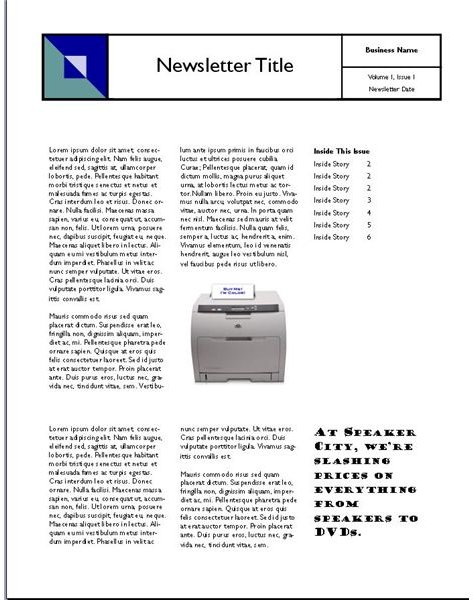
With Part 1 and Part 2 of this series we’ve covered the need for Dynamic Reusable Newsletter Templates (DRNT) and the definition of a DRNT . Now, it’s time to look at the how. Let’s start by taking another look at the example template from Microsoft Publisher. For those of you who have spent some time in the world of desktop publishing, this probably looks pretty familiar. There is a header or banner across the entire top of the page. There is a table of contents down the right hand side, and then a two-thirds-height news article over a one-third-height article.
This makes for a solid design that is easy on the eyes and easy to read. It also makes it a little bit harder to rearrange our template. Keep in mind, there is nothing wrong with this template. In fact, it is a very good one. It just happens to be designed without reusability in mind, which is probably fine for 80 percent of Microsoft Publisher users. But, we want to be able to take a newsletter template and use it over and over again without getting repetitive, while at the same time having a fresh look for each new newsletter. How can this be accomplished?
Grid Design and Reusability
In the world of website design, many modern websites are constructed using something called Cascading Style Sheets or (CSS). CSS is a complex topic, but the essence is that you can apply formatting and layout to a webpage without actually ever seeing the webpage. You do this by defining attributes of items in CSS and then using those attributes in the actual website. For example, it’s like using BOLD in a word processor. Bold has been defined before type a single word. When you use bold, it does the same thing no matter where it is in your document. With CSS, the same thing can be done with the layout. For example, a header can be defined as 1 inch tall and 8 inches wide. Taken to its logical end, you get a grid type design where everything is defined as 1 column wide, 2 columns wide, etc. Sound familiar?
We are going to borrow the grid concept in a very basic form. By dividing our newsletter template in 3 columns horizontally and vertically, we can create numerous easily changeable newsletters from a single template by using the same concepts as the CSS grids. We can have 3 columns each 3 rows high, or we can have 3 columns each 2 rows high, or we can have 3 columns each 1 row high, and so on. In order to keep our template with maximum reusabitlity, all we have to do is use the same for all 3. Want rows that go all the way across the screen? Great, 3 rows all 1/3 of the page high.
If you are thinking about 2 columns each 3 rows high and 1 column that is 2 rows high and another 1 row high underneath, then you’ve gone off the maximum reusability reservation. For our purposes, you want three of the same. That is what makes them so easy to move around.
There is no need to re-invent the wheel here, so we’ll start with the same basic layout as our Microsoft Publisher template example using our new rules. There are 3 columns each with one row 2 high and one row 1 high.
It looks slightly different because we are working with thirds instead of fourths, but the basic concept is the same. So far, so good.
New Month New Layout
Now, for the fun part. For the next month, we can use the same template, with the same elements in the same way. All we have to do is move them around. Let’s put the table of contents on the left. Now, everything is the same, but the look is definitely different enough to be fresh.
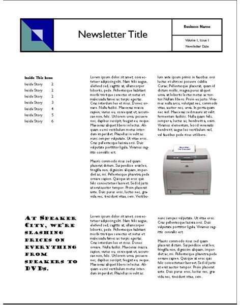
How about month three? Just moved the columns again (Table of contents in center)
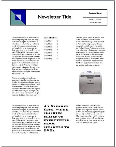
Month four? (3 columns all 3 rows high - Simplest)
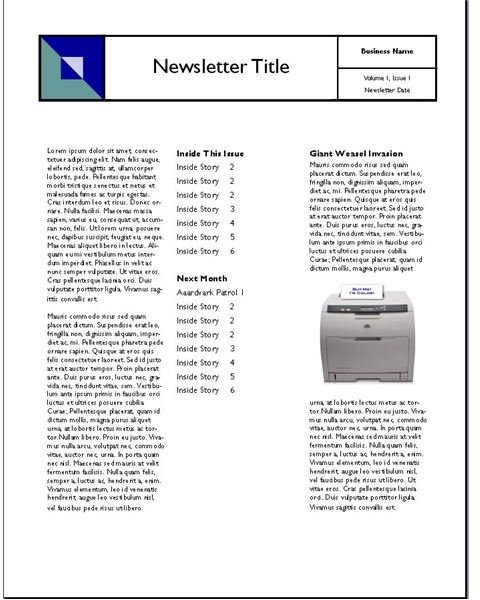
Month five? (3 rows all 1/3 height)
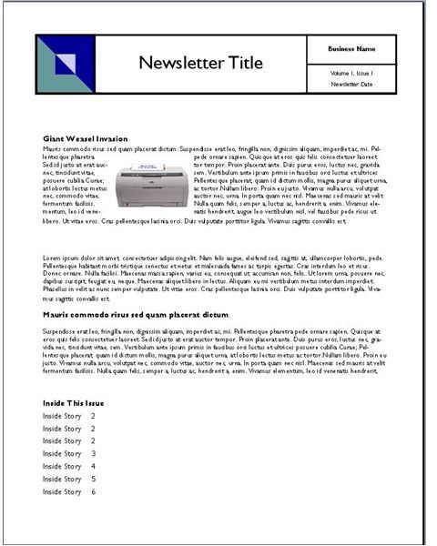
You get the idea. We’ve got maybe 9 or 10 layouts here all easily achieved with our template.
Now, if you are looking at some of these and thinking that they aren’t very pleasing on the eyes, you are right. Keep in mind that this is reusing the same text and graphics to illustrate the concept. Obviously, you would want different header placement or different sized graphics to make each look work. Don’t worry. We aren’t going to leave you hanging. We’ll cover that coming up later.
Next Up: Taking it to the next level - Colors and Boxes
This post is part of the series: Dynamic Reusable Newsletter Templates
Using pre-built newsletter templates help relieve some of the burden of generating a regularly published newsletter. But, unless you want to change templates every time, your newsletter will always look the same. The solution? Dynamic Reusable Newsletter Templates.