Learn more about what typography design is, including common terms used that go into creating the design of using type.
A Closer Look at Typography Design
Since the early days of the written word, lettering and the creation of each letter has been a form of art. Typography is the art of type (letter) design and the arranging of that type.
The work of arranging the type includes the use and knowledge of line spacing, line tracking, line length, typefaces, point size, pica size and keening.
Line Spacing
Line spacing is the distance used between one line of type and another line of type. A simple sounding ideal, line spacing is very important when it comes to the readability of the type being used for communication.
The typical standard of line spacing is generally set at one hundred and twenty percent, which makes the line spacing slightly larger than that of the cap height in the type being used. Together the use of line spacing with that of line tracking, which is overall letter spacing both play important parts in typography design.
Line Length
In line length, the general length of the type used in conjunction with the communication purpose shows the reader where lines, paragraphs and other sections of type begin and end. For example, when creating type that is of two columns the line length is what will control the look of the information in each column.
Should an ending paragraph or statement in the first column end with orphan type that defaults at the top of the next column, then that would a line length issue in need of correction.
Typefaces and Fonts
Typefaces are what the type font family is. There are also sets of one or more fonts used under the term “typeface” that can be used together for typography projects. For instance, the typeface that is being used for the rough draft of this article is Times New Roman, which is a default font in many word programs.
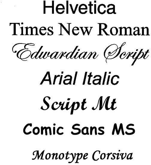
Typefaces can change the overall look of type with various styles that can attract attention and enhance many type projects. To the left is an image of various common and popular typefaces being used the world over. Click on the image to get a better view of each one.
Space Measurement
Point size in typography does not refer to the type itself but rather to the spacing around the type. There are seventy-two points in an inch and they are used as the smallest form of measurement when creating a lay out for type. Along with points, the second measuring system used is picas. A pica is a larger form of measurement that consists of 12 full points. Typographers use points and picas mainly in news type prints where some measurements are called for but are too small to be labeled as fractions of an inch.
Keening is another form of spacing that often gets confused with tracking. Keening is like tracking in that it deals with letter spacing but it specifically deals with selective spacing and not overall type spacing. With keening typographers, graphic designers and desktop publishers can adjust the spacing between pairs of letters. Doing so can make full areas of type less awkward by subtracting or adding the space between letters to give the type being used an overall level of easier readability.
Overall, typography is all about the design and placement of various forms of type, from the creation of letters and characters to the use of type placement and type choice. Since the digitization of type and design, typography has become easier to manipulate in all forms of used type that span the communication range from newsletters, web pages, press releases and advertisements.
This post is part of the series: Understanding Typography
Learn more about the many aspects of typography. From keening to letter design, this series will help give a better understanding of what typography is and what role it plays in desktop publishing.


