When designing your own font you must follow professional and legal guidelines. A primary objective is font uniformity through basic measurements. Giving personality to every letter you draw assures an original piece of work.
Creative Work
When designing a font, you help promote typography as a creative work. Important terms and guidelines about designing your own font have roots in Gutenberg’s process. You no longer have to cut a new font for each font size anymore. Instead, create digital outlines to scale that depict the shape of any size letters. But how can you begin your own novel font design?
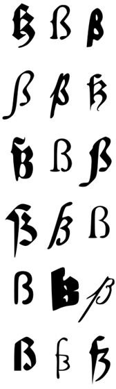
First, you must remain cognizant of the rights of other type designers, and respect their creations – produce your own original work. However, you certainly have the right to duplicate an existing font if you simply want to design a “revival.” If you decide to base your font on another typeface’s outlines, you are designing a “remix” or “derivative typeface.”
Or you may want to begin your design process with a font you already have copyrighted – by altering various aspects for a totally new font. If you’re a programmer, it is easy to write your own font-design program, although there are solutions if you are not so technically minded. However, the real excitement and fun in font design lies in giving personality to each individual letter you draw.
Measurement Guidelines
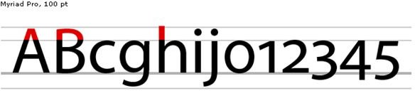
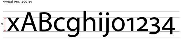
Foremost, guidelines exist for basic font measurements. Determine how long you want the bottom letters’ extensions to be – or how tall you want letters. A primary guideline reflects font uniformity. To get you started, some basics include baseline, ascent, descent, font height, and X-height (maximum lower-case letter height). The ascent is the highest point above the baseline for letters like b and k. The descent is the distance at the lowest point from the baseline of letters like g and y. The entire vertical height of your font (distance between highest ascent and highest descent numbers) is called font height.
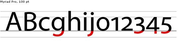
Letters like r and s have an x-height, which is the tallest height of a lower-case letter. As a rule, the ascent number is four times that of the descent number. If the ascent number is 400, the descent number is 100 – and the font height is 500.
After determining measurements, you will give your font uniformity by using these measurements all through the alphabet. Remember to think of the baseline as an invisible line your letters are set upon.
Terms
A common language of type-related terms is prevalent in the font-design world. To relay visual messages among other typographers, you will want to acquaint yourself with the common design jargon. These are terms used by those who work with fonts and type. So by knowing these technical terms, you can take part in a more educated conversation with typesetters and other font designers. Familiarize yourself with the following terms that regularly come-up in work-related discussions:
Apex – where two strokes meet at the top of a character.
Cap height – how tall capital letters are in a particular typeface.
Font

– belonging to a particular family of typeface.
Glyph – special characters, symbols or punctuation in a font-design.
Hairline – thinnest stroke in typeface.
Kerning – the space added or subtracted between two characters.
Ligature
– forming one character by combining two or more letters.
Logotype – combining two or more characters to form a single unit – like ellipsis.
Mean line – X-height; imaginary line that runs atop lowercase letters that is non-ascending.
Serif – line crossing the end of the stroke of a main character.
Stroke – primary part of a character.
Terminal – stroke end without including a serif.
Typeface – grouped characters, numbers and symbols sharing common design.
Weight – stroke thickness measurement – extra light, light, medium and heavy
Font Data Protection
While basically a typeface design is a style of print, the font you design refers to the font file and its data. Realize that even though U. S. copyright law will not protect a typeface design, the font data you design is protected by law – so someone cannot take your data and create his own font (just as you cannot use another designer’s font data). If you are designing a revival – copying from an existing model – the typeface copyright owner must have been dead for 75 years or the copyright must have expired. Otherwise, you must seek permission from the present copyright owner.
Finally, important terms and guidelines to know when designing your own font are a snap with an online editor. Some of the following links let you import your own graphics. Then you turn those graphics into a font for a relatively cheap price (under $10). FontForge is a free download that offers a real professional look. You can import your own pictures and turn them into glyphs. Though it’s designed mainly for Linux/Unix systems, it can run under Windows with a difficult installation. The program offers a lot more for a font than an online editor, but we’ve included some other useful resources below to get you started.
References
-
File:Fonts-C.jpg http://commons.wikimedia.org/wiki/File:Fonts-C.jpg
-
File:Fonts-scharfes-s.svg http://commons.wikimedia.org/wiki/File:Fonts-scharfes-s.svg
-
The TypeRight Guide to Ethical Type Design, (2011) -http://www.typeright.org/ethicsguide.html
-
File:Ascender.png http://commons.wikimedia.org/wiki/File:Ascender.png
-
Dynamic Graphics: Type Terminology, Hart, Cassie, (2005) -http://www.dynamicgraphics.com/dgm/Article/28539/index.html
-
All images are in the public domain:
-
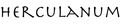
File:Herculanum (typeface).png http://commons.wikimedia.org/wiki/File:Herculanum_%28typeface%29.png
-
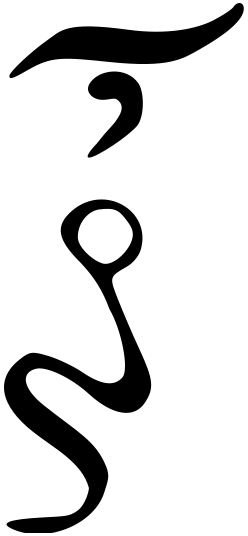
File: Greek ligature oun.svg http://commons.wikimedia.org/wiki/File:Greek_ligature_oun.svg
-
File:X-height.png http://commons.wikimedia.org/wiki/File:X-height.png
-
Digital Art and Design Site: Font Design –Basic Measurement Guides for a Font, Cipollo, Diane, (2011) - http://www.bellaonline.com/articles/art26097.asp
-
File:Descender.png http://commons.wikimedia.org/wiki/File:Descender.png
-
Useful Resources:
Fontifier http://www.fontifier.com/
FontForge http://fontforge.sourceforge.net/
fontstruct http://fontstruct.com/
YourFonts http://www.yourfonts.com/


