Most professionals between the 15th and 20th centuries who influenced Greek typography were not Greek. The development and setting of Greek typeface had its premise elsewhere in Europe.
Stimulus Outside Greece
Through history the Latin influences in Greek script affected elegant Greek typography. But the major development and setting of Greek typography had its stimulus outside of Greece – most of the influential professionals at its premise were from the rest of Europe. Even today’s multi-script fonts retain their roots in this history and technique of Greek’s diverse cultural identity. So it is not surprising that Greek typography reflects a substantially greater literary history than all other European languages. That literary history had an early beginning in Greek printing.
The printing center remained in Milan early in Greek’s typographical history. Then in 1476 the first book printed totally in Greek resulted in a whole new series of typefaces. One of the standout figures in this era was French typographer Claude Garamond. He cut Greek elegant fonts, referred to as Grecs du Roi, for the King Francis I in 1541. The typeface was modeled after well-known Cretan calligrapher Ange Vergece’s handwriting. But his style was difficult to translate to the printing press. What followed after the translation were innumerable first editions of ancient Greek classics. Great publisher and humanist Aldius Manutius was responsible for making the editions possible. He brought together some Greek refugees from the fall of Constantinople to read, edit and typeset editions of Thucydides, Sophocles, Herodotus, Plutarch, Pindar, Hesychius, Athenaeus, Aristotle, Xenophon, Euripides and Demosthenes.
Easy-To-Read Typeface
During the 1700’s, Cambridge University Press’ great Classics scholar Richard Porsons created a clean and easy-to-read typeface. The print was founded on his beautiful and neat handwriting. The typeface grew immediately popular when completed in 1808 – it is still preferred in the majority of Oxford Classical Texts today. Greece even used the typography around a century later under the name Pelasgika, but the revised typeface substituted Porson’s upright capitals with inclined ones.
In the same era, late 18th century neoclassical ideals influenced French typographer F. Didot. He created a new Greek typeface in 1805 used by the leading scholar of the Greek Enlightenment, Adamantios Korai. This typeface made it to Greece during the 1821 Greek Revolution. No other typeface of the time could compete. It remained without rivalry as the typography of choice until the end of the 20th century.
In the mid-19th century, Greek typography introduced an italic font – Greek inclined 9 & 12 pt – with many calligraphic overtones. Though the italic font’s original source is not known, German and Italian influences are suspected. For the rest of the century, the italic font’s widespread purpose remained for emphasis of words, excerpts or sentences. The font reflects an obvious calligraphic character style, along with a steep and unsettling obliqueness of the capitals. The unusual aspects of its form led to its 20th century demise.
Close to the same time period, a committee of scholars (chosen by German publisher G.J. Göschensche Verlagsbuchhandlung) determined the new type for the New Testament in Greek. After the book came out in 1803, the typography reflected the better heritage of Greek type design. Several influences are evident from Bodini Greek types. These influences include a marked contrast between thick and thin neoclassical strokes, cursive style and large font size. Additionally, this cumbersome style of typography later indirectly influenced Greek Leipsig type.
Another historical Greek font of the 19th and 20th centuries is Griechische Antigua. This typeface was created by German Maurice Eduard Pinder (most popular from 1870 -1940). However, the type was virtually abandoned after WW II. Some scholars consider it a great loss for Greek typography.
Anglo Saxon Influence
Again, Greece typography appears to have lost much of its own Greek influence to foreign customs. Another example is the Anglo Saxon traditional influence. That influence, particularly, is found in unequal inter-word spaces in Greek typography. These spaces allow more blank space after a full point or following double punctuation – this procedure lets the eye spot the beginning of a sentence more easily. Most Greek typography followed this Anglo Saxon custom (though not when abiding by French rules). While the French promote a standard thin-width space for all double punctuation (except the colon), Greek typeset differentiates spaces for every specific punctuation mark. Following Anglo-Saxon convention, the space before a semicolon is less than a space before an exclamation mark – which is larger than the space before a colon. (Greek guillemets have no spacing.)
Despite all the outside influences of western typefaces with distinct names, the most common Greek typeface remains anonymous. It is often referred to as “plain.” Foreign influences of Greek typography remain evident in its evolution, but the industry differs from the other European countries – most significantly, all three 20th century primary printing methods still all co-exist. Hot-lead typography has entirely disappeared in other countries. Unfortunately, most regular Greek computer-typeset books today remain remarkably inferior than traditionally printed ones. Much of this results from the lack of computer tool development for processing regular Greek. However, modifying and creating computer software to adapt to regular Greek is improving rapidly today.
References
-
Greek Font Society, (2011) - http://www.greekfontsociety.gr/pages/en_typefaces19th.html
-
File:Fonts-greek1.jpg http://commons.wikimedia.org/wiki/File:Fonts-greek1.jpg
Advertisement -
Colvinism: Brief History of Greek Printing and Scripts, Colvin, Matt, (2011) -http://colvinism.wordpress.com/2011/02/24/brief-history-of-greek-type/
-
Latin Influences in the Development of Greek Typography, Silva, Sergio Luciano da and Silva, Sergio Antonio (2010) - http://www.infodesign.org.br/mostraArtigo.php?varId=449&varIdEdic=29
Advertisement -
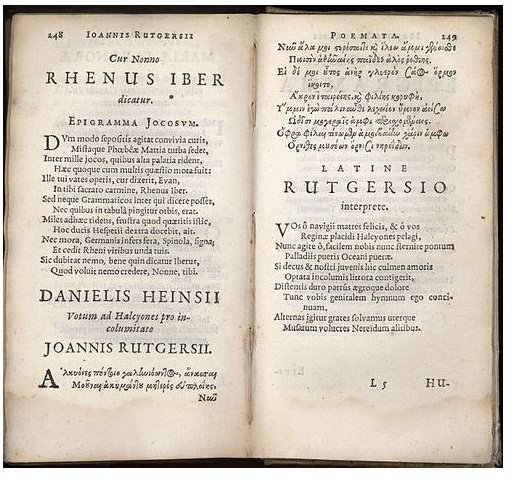
File:Nikolaes Heinsius the Elder, Poemata (Elzevier 1653), p. 248-249 http://commons.wikimedia.org/wiki/File:Nikolaes_Heinsius_the_Elder,_Poemata_%28Elzevier_1653%29,_title_page.jpg
-
Keeping Greek Typography Alive, Haralambous, Yannis, (2002) -http://omega.enstb.org/yannis/pdf/thessaloniki.pdf
Advertisement -
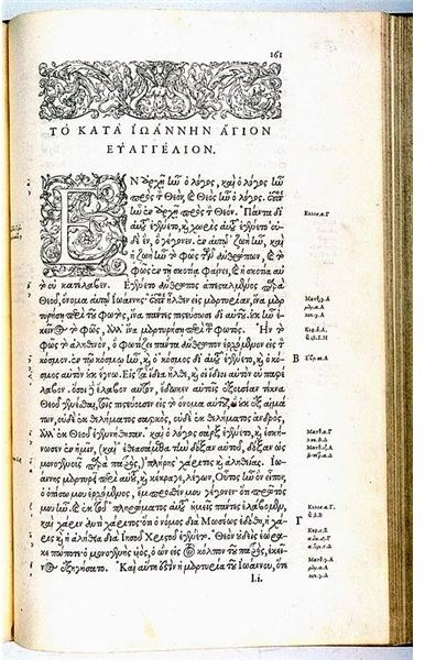
File:Gospel Estienne 1550.jpg http://commons.wikimedia.org/wiki/File:Gospel_Estienne_1550.jpg


