Sometimes we talk about objects as though they were living creatures. This is the case with type characters. As you’ll see in the following parts of a letter diagrams, terms like arm, ear and shoulder are labels for character parts where distinctions between similar typefaces become apparent.
Basic Parts of Letters
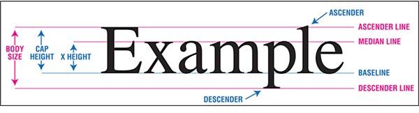
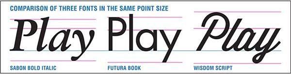
The basic structure of letters can be used to compare the appearance of different typefaces. The diagrams below show ways to compare parts of letters that show differences in typefaces – click for a larger view. Using the same point sizes, the amount of space required for a copy block can vary tremendously based on the typeface selected. Here are some basic parts of letters to consider when choosing a typeface.
Baseline - The floor that a row of letters stands upon.
X-Height - The height of lower case letters in proportion to capitals
Ascenders - Parts of letters that rise above the X-Height
Descenders - Parts of letters that fall below the Baseline
Types of Letter Strokes
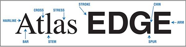
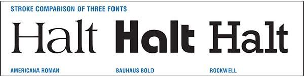
Letters are made up by “strokes.” They are the straight or curved lines that connect to make the alphabet we use to write in English , Spanish, French and other European languages. Different types of strokes can be used to identify unique features of typefaces. Thin “hairline” strokes are most often found in serif typefaces, where there is more variation in line weights. The direction of motion from thin to thick in a stroke shows the “stress” of the typeface.
The following parts of a letter diagram shows different types of strokes including:
Stem - A straight vertical stroke or a straight diagonal stroke
Arm - A horizontal stroke with an unconnected end
Bar - A horizontal stroke that connects on both ends (such as in A, H, e)
Cross - A horizontal stroke that has two unconnected ends (like a t)
Spur - A vertical stroke extending from a letter
Chin - The corner where the horizontal arm and vertical spur of a G meet
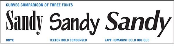
Types of Letter Curves
Curved letters add personality to typefaces. Some are very fat and round, others have slender ovals. Still other typefaces have rectangles with rounded corners instead of traditional curves. There are distinctive parts of curved letters where you can find evidence of differences in similar typefaces.
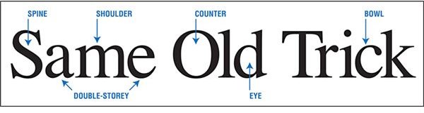
Shoulder - The curved hump in letters like h, m, n
Spine - The central curve of S and s
Bowl - A curved stroke that fully or partially encloses a space (such as O, C, g, p, etc.)
Counter - This is the white space enclosed by a Bowl. There are two types of Counters:
Eye or Aperture - Entirely enclosed space
Double-Storey - A combination of a two fully or partially enclosed spaces stacked upon each other (a, g, etc.)
Serifs and Swashes
Serifs typefaces are characteristic of some of the oldest fonts used. Some believe they originated with stone carvers who used serifs to clean up cracks made while engraving letters into stone surfaces. However they started, they add style and personality to the typefaces they adorn.
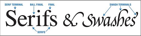
Serifs are one type of “terminators”. Some characters such as lower case “r” have a “finial” or “ball finial” instead of a sharp serif. “Swashes” are fancier flourishes that may replace other types of terminals. Typefaces with alternate character sets often offer a selection of swashes in capitals, lower case letters with ascenders or descenders and letters often used at the ends of words (such as s. l. or h).
Serifs - Lines that cross the end of main strokes of characters.
Terminators - The end of main strokes
Finial - Decorative stroke endings
Ball Finial - A ball at the end of a finial termination
Swash - Decorative flourish termination
Parts Unique to Special Letters
Ever look for a typeface that had a perfect capital “Q”? There are a few parts that take care of those special letters, whose appearance can make a design. Choosing a typeface that showcases the letters in your business name, headline or book title is very important in drawing attention to your message. Here are a few parts to consider in choosing a typeface when special letters appear.
Tails - Short diagonal strokes
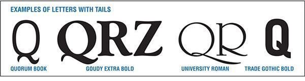
Tails appear in the descender of capital Q, the tail of a capital R and sometimes in capital X or Z. As they don’t appear in many frequently used letters, tails are not usually considered in typeface selection. However, if a tailed-character appears in a main word you will want to choose a typeface with outstanding tails.
Ears - A small stroke projecting from the top of lower case “g.”
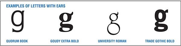
“Walls” do not have typographic ears, but “hearing”, “gorilla” and “gangs” do. Again, ears may not be a design concern unless a primary word or headline contains an offending set.
Beaks - Sharp spurs found on some serif fonts (T, E, L)
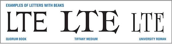
Letters with exaggerated spear-like serifs have beaks. They can be large or small, but are very pointed and project from a main stroke.
References
- Images by Gwen Hagaman
- Type is Art: Parts of a Character (http://typeisart.com/ )


