Anyone who has spent a decent amount of time in a word processing or desktop publishing program has come across a number of typefaces to choose from, including the choice to use a serifical font or a sans-serif font. But what is the difference between serif and sans serif? Read on to find out!
You’ve probably heard the terms “serif” or “serifical fonts” and “sans-serif fonts”, used pretty frequently in numerous software any time you have to deal with design. Some fonts even have names that include the words, like “Comic Sans” or “MS Sans Serif.” Do you know what these mean? And on top of knowing the definition of both of the words, do you know the reason that we have serifical fonts and sans-serif fonts? By learning the history of these fonts, as well as taking a look the textbook definitions and intended uses, you’ll soon become an expert when it comes to knowing the difference between the two.
Definition & Visual Examples
While you might not have known them by name, you have come across both serif and sans-serif fonts. Fonts that are serif or serifical, are fonts that contain a small detail at the end of the letters. The number one example of a serif typeface , that most people think of, is Times New Roman; a standard default font for most word processing programs and desktop publishing programs. For example, the word SERIF below showcases the addition of serifs.
To highlight them better, I’ve colored the serifs in red in this next image.

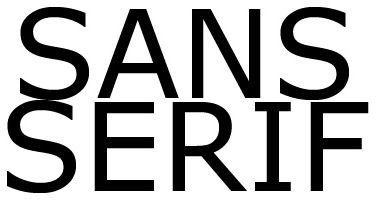
Sans-serif fonts are fonts that lack the addition of serifs. When you think of a sans-serif font, you likely think of something like Arial or Helvetica. Here is an example of a sans-serif font. You can see the relatively “clean” finish to the ends of the letters.

Function
One of the most surprising facts is that most alphabets - even Asian writing systems like kanji and hiragana - have a serif and a sans-serif form. So if this style of typeface alteration is so common, it’s got to have a reason, right?
Serif fonts were though to get their start, back with the Roman alphabet and were largely used for aesthetic purposes. Serifs were often where a writer would flick his brush out, creating a small flourish at the end of a stroke. Stone carvers even imitated this seemingly useless, but visually appealing, practice. However, it turns out that serifs actually serve a more functional purpose than once originally thought. The addition of serifs actually tends to make reading text faster on average, especially in printed works such as books, magazines, and newspapers. It works by closing the gaps between letters, almost pulling the eyes through the words on the page. In a study by Bernard, Mills, Peterson and Storrer in 2001, participants were found to read serif fonts almost eight seconds faster per paragraph than paragraphs that displayed a sans-serif font. The study also showed that reading comprehension was increased a significant amount with the serif font. However, because computer monitors lack a standardized resolution, the serif can sometimes hurt the readability of a body of text on lower resolution monitors. This is why sans-serif fonts are largely employed for the use of any information presented on-screen.
Form
While they may have originally been decorative, serifs are often thought to be a more utilitarian choice between the two. While serifical fonts might provide higher readability, when using a font for a design purpose, sans-serif fonts are a more popular choice with most people. In the same study as cited above, 80% of the people found sans-serif fonts more attractive due to their crisp, clean appearance, even though they openly admitted to finding serifical fonts to be easier to read and comprehend. This is worth noting when designing logos, designing merchandise, or any scenario where you need to present something with a higher focus on form, rather than function. Remember that as a designer and a publisher, it is your job to think about form as well as function, and striking a balance between the two is key for the success of a project.
Preference
Even though one of the major perceived differences between serif and sans serif is that people prefer one font over the other, or there are studies that show one style of typeface leads to better readability or comprehension, remember that personal and client preference plays a large role as well. For large amounts of printed information, especially in educational publications or periodicals, you should use a serif font in order to provide easy to follow, quick to read information. However, for almost anything else, the choice is up to you or your client. Not to mention, you should be sure to take into account the overall design of the project you are working on when you are choosing a serif or a sans-serif font. Take a little time, try out a few different fonts , and see which one fits your project the best!
Resources
Image Credits: Images provided by the author.
References:
A Comparison of Two Computer Fonts: Serif versus Ornate Sans Serif, University of Bristol, https://psychology.wichita.edu/surl/usabilitynews/52/UK_font.htm


