
Are you looking for a color scheme that offers energy and variation, and that can be applied to all kinds of projects in website and graphic design, product packaging and even more? Maybe it’s time you take a good, hard look at rectangle colors. Check out our tips and tricks for this scheme.
Setting the Mood with Tetradic Colors
All tetradic color schemes will be double-complementary, so by default the palettes you derive from them tend to be very high energy. They’re good for edgier designs, or for designs targeted at children. Much like triadic and complementary color schemes, these can be overwhelming and a poor choice for some projects.
By overusing complementary colors, you create a sense of urgency and tension in your design, as well as create something that is physically hard to look at. Imagine looking at a website that only consisted of red, green, blue, and orange, and think about how hard it would be to read that!
To avoid such a scenario, make sure you choose a single color and use the remaining three as accents, rather than equally using all four colors. These palettes tend to also be very high contrast, so make sure you prioritize readability by including a more neutral color, such as black or white, in the main part of your design.
Another smart option for this? Lowering the brightness, saturation, or contrast of the colors can improve readability and give you the ability to use them more liberally in your overall design. And don’t forget: it’s always smart to ask a friend, co-worker, or family member if they think your design has a good balance of colors. Think of these people as your beta-testers, and encourage them to give you feedback.
This picture to the right shows an artistic application of a rectangle color scheme. Here you can see how colors can be placed in such a way that they have a nice amount of contrast but don’t have to “clash” against one another. These same principles can be applied to both graphic and website design by paying careful mind to which colors you place next to each other. Also limiting your brightest colors and using your darker or less saturated colors can help promote balance in your design.
Textbook Definition
A tetradic color scheme is any color scheme in which four points on the color wheel share a logical relationship. Sound confusing? Don’t worry, I can make it easier! What exactly is a logical relationship? Take a look at the color scheme below.

The relationship shows a double-complementary color scheme , the complements being red and green, and blue and yellow. Now, if you connect the lines between the points, you’ll notice something that is true of every analogous color scheme.
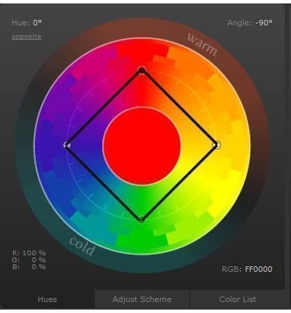
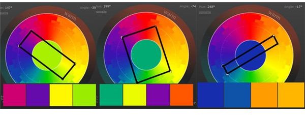
See how they fall in a square? This is what makes it a logical, or rectangular color scheme. Here are a few more examples of these color schemes. As long as you can create a rectangle from the four points on the color wheel, you’ve successfully created a palette of rectangle colors.
Helpful Tools

Color Scheme Designer is one of my absolute favorite tools when it comes to designing any type of color scheme, but it works especially well for tetradic color schemes. The program offers the preset ability to make the design process easy.
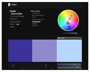
And of course let’s not forget Adobe’s brainchild, the free online program Kuler. This program helps you to design schemes, save them, and import them to Adobe products.
Credits
References: All information is based off the author’s personal experience in color theory, graphic design, and website design.
Tools Mentioned:
https://colorschemedesigner.com
Image Credits:
Color Wheels by Amber Neely.
Uninhibited Anticipation by Jamie B .
Screenshots of Kuler and Color Scheme Designer by Amber Neely.


