You’re looking for a fantastic color scheme for your website. You want it to be playful. You want it to have contrast. What it sounds like you need is a triadic color scheme. Here you’ll learn how this design tool can help you in your desktop publishing projects.
The Definition
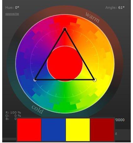
Triadic color schemes are a fairly simple concept. They consist of three points on a color wheel that are evenly spaced away from each other, much like the points of an equilateral triangle. Because of the way the colors lay on the color wheel, they’re often thought to be a fantastic example of contrast working well with harmony. A simple example of a this specific color scheme is red, blue, and yellow.
These are high-contrast while not being as urgent as complementary and split-complementary color schemes . It’s able to get your attention without feeling too overpowering. Here’s an example of how this scheme looks on a color wheel, as well as an example of a the scheme’s palettes.
Discovering Your Target Audience
Because they tend to offer a fair amount of contrast from the other colors, triadic color schemes tend to feel a little juvenile, but you can easily use that to your advantage. Rather than targeting an adult audience, these palettes are perfect for toddlers, kids and tweens. At full saturation, these colors are playful and fun, exerting a feel of energy without urgency. Just like analogous color schemes , it’s a good idea to pick a single color with two accents, or even better, use these colors to supplement a mostly white layout.
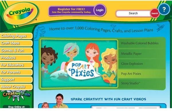
Want a fantastic, popular example? Look to the left! Crayola’s website uses bright, primary colors to market its very familiar brand of children’s art supplies. These colors are attractive to young children who seem to be drawn to the high energy of bold primary colors. Not only do children associate these bright colors with fun, parents tend to be drawn to things that are brightly colored when looking for services and products for their kids. So this is a great theme if you run a daycare website, are creating signage for a playground or designing graphics for children’s clothing.
If you find that the color scheme still feels too bold for your liking, lower the saturation or the brightness of the colors involved. By doing this, you can easily expand the audience your palette can target.
Tools for Creating Color Schemes
When it comes to creating your own color schemes, doing it by hand can be a little complicated. However, thanks to the Internet and a few brilliant minds, there are some great options to help you create these palettes more effectively.
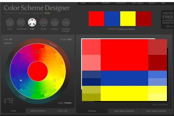
Color Sceme Designer is hands down one of my favorite helpers. This specific scheme designer also provides the option to select a triadic color scheme which takes the headache out of trying to design it on your own.
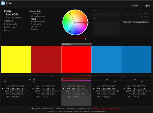
Kuler is Adobe’s dirty little secret. It’s a free online color scheme designer that offers a “triad” option, which is your one-click fix for all your needs!
Credits
References: The author’s personal experience in graphic design, website design and color theory.
Tools Mentioned:
https://colorschemedesigner.com
Image Resources:
Examples of triadic color schemes by Amber Neely.
Crayola Website by Crayola .
Screenshots of Kuler & Color Scheme Designer by Amber Neely.


