In this Paint Shop Pro tutorial, we’ll show how you can transform a lifeless digital photograph into an image resembling gothic fantasy art by combining a few of the software’s most common tools.
Creating Gothic Effects
One type of artistic style that is popular in today’s world, especially among science fiction and fantasy fans, is the Gothic effect. This term can have a fairly broad meaning, depending on who you ask. However, for the purposes of this tutorial, we’ll assume that it means a dark, gloomy, and almost sinister look.
Now, Paint Shop Pro doesn’t have a preconfigured tool especially designed for creating Gothic effects. Instead, we’ll use a combination of several effects to achieve this look. There’s actually a number of ways to go about this process, so if you experiment a bit with the available tools, you might find another method you prefer.
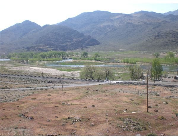
We’ll start out with the drab digital photo shown below. That’s one nice thing about applying artistic effects to photos – the original ones you start out with don’t have to be that great. Basically, you just need to pick one that contains some of the elements you want to build your creation around. In this case, I wanted something with a mountain in the background and a few sparse trees. (Click any image for a larger view.)
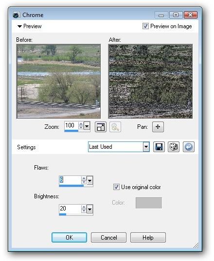
The first thing we’re going to do to this photo is apply a chrome effect. (For more details on how to use this particular tool, see the tutorial Paint Shop Pro’s Chrome Effect .)
The screenshot below shows the exact settings used with the chrome filter, but you may have to modify these settings a bit for different photos, depending on what’s included in the shot.
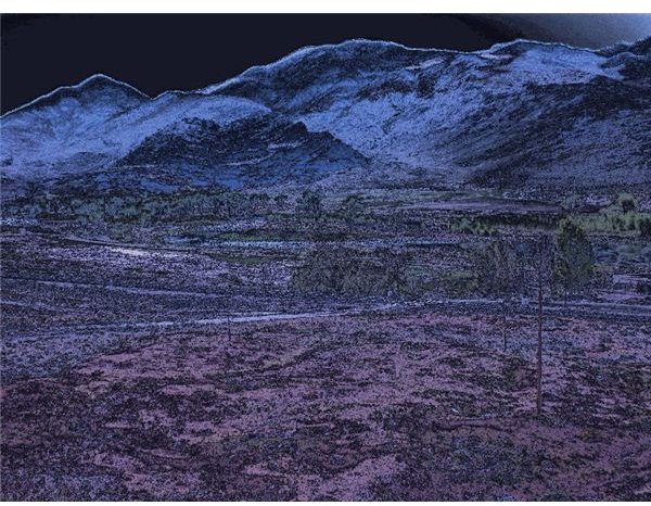
After applying these changes, we have the following image as a result.
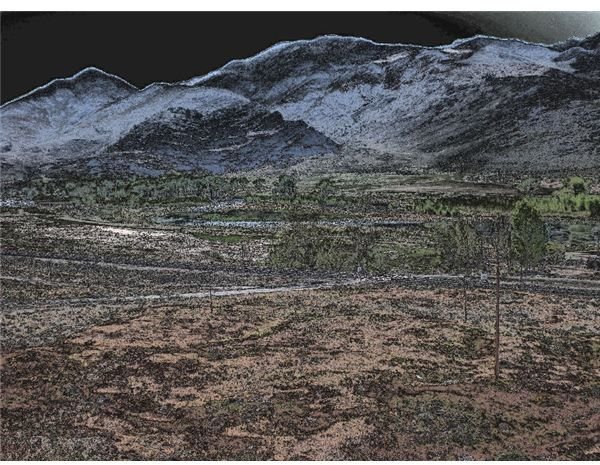
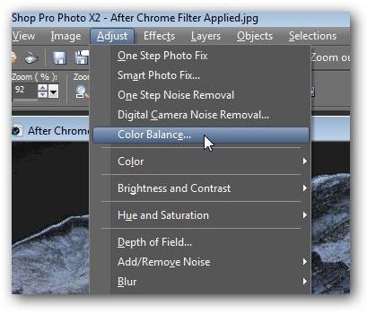
We’re already well on the way to getting that dark, gloomy look. In fact, you may often be able to achieve the results you want by only using the chrome filter. However, in this case, we have a little more work to do. There are too many green tones, and it would be nice to get rid of them while introducing some more purple into the image. For this, we’ll use the Color Balance tool.
You can access this feature by choosing Color Balance from the Adjust menu on Paint Shop Pro’s main toolbar.
Once the Color Balance window opens, make sure there is a check in the box next to Advanced Options. This will give you more flexibility when making color modifications.
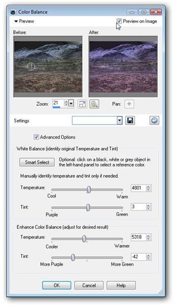
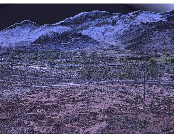
This tool basically allows you to exchange green and purple tones in the image. In this example, we’re going for a slightly “cooler” look and introducing more purple to the image. Below is the result of these changes.
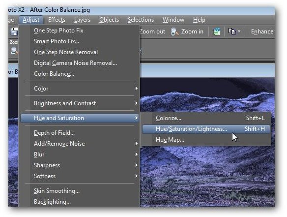
We could stop here, but I’d like to see a more bluish tint to the mountains in the background. To achieve this, we’re going to use one of Paint Shop Pro’s hue and saturation tools.
From the Adjust menu, select Hue and Saturation and then choose Hue/Saturation/Lightness.
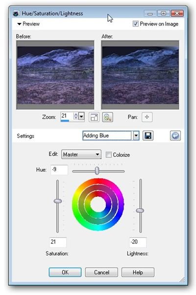
This will open another window where you can manually make adjustments to the settings for the hue, saturation, and lightness . Again, you can experiment with the sliders here to get the exact effect you want. The screenshot below shows the setting we’ll be using.
With these changes, our image has transformed into the one shown below. Quite a change from the original photo, isn’t it?
Additional Resources: For more tips and tricks, be sure to check out the other items in Bright Hub’s collection of Paint Shop Pro tutorials here in the Digital Photography Channel.


