Open High Low Close charts are the most used bar charts in the stock and foreign exchange markets. With the use of advanced software codes, the preparation of the OHLC charts is very easy and they help the user community to take decisions on stock investing.
Introduction
Open-High-Low-Close charts are widely used in the stock and foreign exchange currency trading market. The use of the OHLC bar charts started decades back but with the advent of computers and modern technical advancements in data analysis and graphical interfaces the use of the OHLC bar charts has grown in multitudes. There are many sophisticated software packages intended to make the OHLC bar charts from the huge data related to stocks and shares. OHLC charts depend on the tons of stock price data for a period of time. Many OHLC charts use one or more year data to analyze the stock price movements.
Understanding the OHLC chart
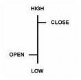
As the name suggests OHLC chart is a form of graph depicting the movements of the stocks prices in term of open, high, low and close prices. Each item in the OHLC chart shows a bar for a time period selected. For example if the OHLC chart is for a year, the time slot selected may be one day. Each vertical bar shows the range of price, the high to low prices, for the time period selected. The ticks placed on the bars represent the opening and closing prices. Typically left ticks stand for open price and the right ticks represents the closing value of the stocks. The bar charts take into consideration the time factor. The bars are given different styles or shades depending on the price variations in the market.
Advantages
The OHLC bar charts are very useful in analyzing the variations in the stock and currency prices over a period of time. The OHLC charts are amenable for further processing for useful interpretations. Currently Open High Low Close charts are the most used of the stock chart types for taking judicious decisions on the investment opportunities. They are widely used in technical analysis – for recognition of support and resistance levels and trends. OHLC charts really represent the row stock price data in a convincing and easily readable graphical format. These OHLC charts usually show the day to day variations in the markets. If necessary, you can go on making OHLC charts for hourly variations as well. There are many investors analyzing OHLC charts for weekly variations.
Taking advantage of OHLC
OHLC chart provides much information regarding the stock, apart from the stock prices. You can see the trends of the each and every feature of the stock market from the OHLC charts. You can go for perfect analysis of the data movements based on the OHLC bar charts. For example, you can consider the daily high values of the stocks for a year and consider a trend setting. The extreme price distribution can be made from the OHLC charts and a model for the future trend prediction can be derived out of it. Same is the case with other parameters like open, close and low prices in a day. OHLC charts can also help you to assess the correlation between the opening and closing prices of the stocks for a time period. This helps the investor to estimate the expected closing price from the day opening price, helping the investor to take decisions on selling and purchasing of the stocks from the market. There are many OHLC chart “structures” considered as a buy/sell indicator in technical analysis. But this is a topic of another article…
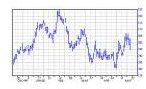
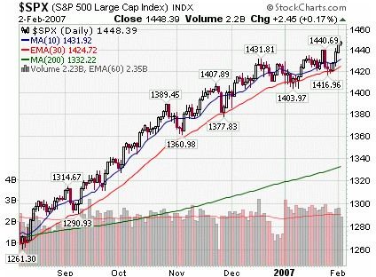
OHLC examples