Collapsible panels exist on many commercial websites when there is a need to display additional but normally hidden information for users who need it. When the page loads, the user sees only a tab for the panel. Clicking the tab will toggle between displaying and re-hiding the panel.
Insert a Collapsible Panel
To see how this works in practice, open a new HTML page in Dreamweaver CS3. Give it a name and save the page. If you do not do this before inserting any Spry widget, you will get a prompt to save the file first. Then click on “Insert,” “Spry,” Spry Collapsible Panel.” You can also find this on the “Insert,” “Layout objects” menu. The Spry widg
et is just a special case of the Layout system in Dreamweaver.
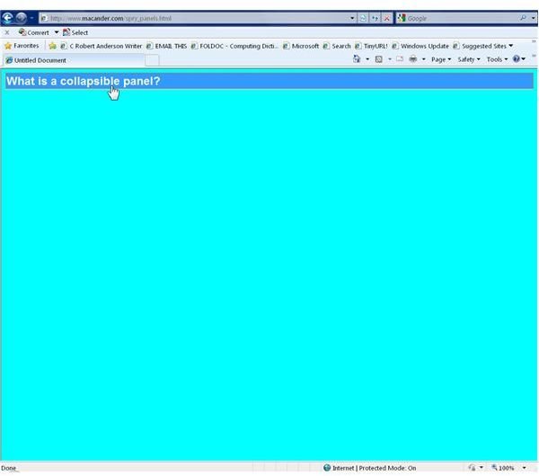
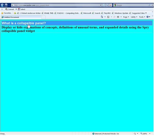
Start by supplying text to replace the default label “Tab” with something that tells the user what to expect. For this example, the Tab label now reads, “What is a collapsible panel?” Follow the same process to insert the content you want to appear when someone clicks on the tab. For example, to answer the question posed, the Default Content now is “Display or hide explanations of concepts, definitions of unusual terms, and expanded details using the Spry collapsible panel widget.” The associated image is an example of what a visitor would see on a Web page. The example in the next section shows what appears when a visitor clicks on the tab.
Customize the Panel
At the creation or insertion of a collapsible panel, the Properties section has two menus—Display and Default state. The Display can be open or closed. Open means it is visible in the Design view while you work. Leave this open so you can what you are doing. The Default state has the same two options. For this, choose “Close” since open would keep the contents visible on a browser all the time, which defeats the purpose of a collapsible panel. The Properties section also has a checkbox to enable animation, but that is irrelevant for this introductory explanation.
Editing the other properties of these panels means using the CSS Styles panel. You can get to these by clicking on “Window,” CSS Styles” and scrolling down to the styles for the SpryCollapsiblePanel.css section. You may need to expand this to see all the options. The most important changes to make are the text and background colors so they fit with your Web page design. In this example, with a sort of blue/cyan (#00FFFF) background, the background of the content is set to a yellow shade. The “CollapsiblePanelContent properties control these settings. When first viewed, the only styles are margin and padding. By clicking on the “Add Property” button and scanning down the drop down list to choose “background-color,” there will then be another drop down list to choose a color, in this case, #00FFFF. The text in the image now is bold, selected in the same way by adding the “font-weight” CSS style and setting it to Bold. Many more styles are listed giving endless possibilities for tinkering with things like fonts, margins, padding, alignment, background images and positions. This example makes only a few more changes. The first is to set the background color of the CollapsiblePanelTab itself to black (#000000) and the color of the text to white (#FFFFFF). For easier viewing in an image, the font-size settings are 24 pt, although it is unlikely you would do this on a real Web page. When finished you must upload not only the new Web page but all the modified CSS styles listed under “Spry Assets” in the file list on your computer.
Using these panels, besides enhancing your site, demonstrates professional web design and may encourage return visitors.
This post is part of the series: Using Spry Widgets in Dreamweaver CS3 to Add Verstility to Your Web Design
Spry widgets can enhance otherwise drab displays as well as offer options that would otherwise require convoluted codind or in some cases not even be possible without using additional programs. This series describes how to use some of these widgets.