How can you talk about stars if you don’t know how they are classified – or, if you don’t know what the different classification systems out there are? This article goes through and describes the basic structure of the Harvard and Yerkes spectral classification systems and how they’re used.
Stellar Classification Is Spectral Classification
Spectral analysis is a thorny thing to understand in the details without a good chemistry background, so the details will be spared here. Essentially, the light from a star is split through a diffraction grating, and then analysed for absorption lines of particular ions of particular elements. This gives scientists an idea of what makes up the atmosphere of a star—or at least, what parts of the atmosphere we can detect through the rest of a star’s opaque-to-transparent atmosphere, which in itself can provide scientists with valuable information regarding the outer layers of a star.
This spectral analysis is the predominate source of information regarding a star, and thus, is the predominate means by which we classify stars.
Harvard Classification
This is the most basic way to classify stars. Essentially, it looks at the colour of a star, and classifies it on the basis of that. Now, there are strong correlations between the colour of a star and a few other features, most notably surface temperature. (Temperature is give in degrees Kelvin (K), where T(°K)=T(°C) + 273.15) For that reason, most astronomers just make the jump from colour to surface temperature when labeling stars. The classification is listed below:
O: Blue: >30,000K
B: Blue-white: 10,000 - 30,000K
A: White: 7.500 - 10,000K
F: Yellow-white: 6,000 - 7,500K
G: Yellow: 5,200 - 6,000K
K: Orange: 3,750 - 5,200K
M: Red: < 3,700K
This may be most easily remembered with mnemonic “Oh Be A Fine Girl Kiss Me!” (No chauvinism is intended with this mnemonic: some astronomers out there may wish to replace “girl” with “guy”, depending on their personal preferences.) This goes from hottest to coldest, blue to red. Think of how the blue heart of a flame is hotter than its flickering red extremities. Within each class, stars may further by subdivided 0-9 by their color, again by hottest to coldest.
You may be wondering about a few things at this point. One, why this particular arrangement of letters and not something, say, alphabetic? And two, why are the gaps in temperature between the stars uneven? Well, both of these are for historical reasons that are complex, varied, and frankly not all that interesting to most people. (Check out the resource section at the end of the article if you’re one of those who are, in fact, interested.) Basically, astronomers just put up with these quirks because that’s how things are done, and no one has any real impetus to go about changing them.
Now, it should be noted that many additional classes have been invented in recent years for new types of stars, for instance W for Wolf Rayet stars or T for methane stars. However, these form a small minority of stars, and will not be discussed in this article.
Yerkes Classification
The Yerkes spectral classification, also known as the MKK or the (updated) MK system, is basically an extension of the Harvard classification system, adding in a numbered luminosity class to give additional information about a star.
The luminosity of a star is also determined from spectral data. Large stars have larger surface area, small stars have smaller surface area; this is evident. This means that at the surface of a giant star, there are fewer gravitational effects and thus lower gas density and pressure than at the surface of a relatively denser dwarf star. This results in luminosity effects, particularly pressure broadening of the spectral lines in the smaller stars. This in turn is used to determine a star’s luminosity.
The luminosity classes follow thusly:
0: Hypergiants
I**:** Supergiants
II**:** Bright giants
III: Normal giants
IV: Subgiants
V: Main sequence (dwarfs)
VI**:** Subdwarfs
VII: White dwarfs
Within each class, subclasses may be notated by adding in 0, a, ab, or b, from highest luminosity to lowest.
Take both the Harvard class and the luminosity class together, and you’ve got your Yerkes class!
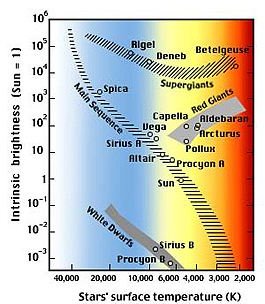
Hertzsprung Russell Diagram
Now, to bring this all together. The Hertzsprung-Russell diagram is one of the single most important explanatory tools in astronomy. It has the colour/temperature—the Harvard class—on one axis, and the absolute magnitude on the other. Stars are then plotted onto this diagram. What emerges are distinct groups of stars, which happen to be organized by their luminosity class. Pretty cool, huh?
Along this graph, a variety of things can be demonstrated, from the life sequence of your average star to stars entering and leaving an instability strip to the composition of various clusters and galaxies, which can lead to powerful conclusions regarding how our cosmos works.
Marginal Symbols
Another notational note, there are marginal symbols that can be used to express, well, marginal classes. The – sign is used to express that a star is between two classes. The + symbol is used to express that a star is above a certain class. The / sign is used to express that a star is either one class or the other.
For an excellent overview of stellar classification largely in layman’s terms, as well as some of the history and details such as additional classes of stars, check out the Wikipedia page .