If you’re looking for a catchy way to promote a product or service, why not try business postcard marketing? This article explains tips on how to use self-designed postcards for business marketing purposes, as well as design tips to make sure your postcards stand out and look good.
1. Decide If Postcard Marketing Is for You
Postcards generally cost less to send out than regular mail. After all, they don’t need an envelope and don’t involve printing multiple pages of information to get your point across. They’re intended to be a quick and catchy way to get people to take notice of your product or service. Because they are often full-color and an irregular size when compared to other mail, they stand out.
However, realize that there are certain services that you can’t market via a postcard campaign. You wouldn’t try to market something like life insurance with a postcard as this seems rather shady and impersonal for such a personal service.
Designing postcards at home is easy to do with the help of a desktop publishing program of your choice, such as Adobe Photoshop, or you can even use word processors like Microsoft Publisher to create postcards .
2. Know Your Audience
When it comes to using a postcard for marketing, think about your audience. For example, if you’re selling expensive furniture, your target audience is probably not going to be college-age adults. Likewise, if you’re going to be selling energy drinks or miniskirts, you can probably avoid sending out your cards to those older than 35 years of age. This is one of the most crucial things to keep in mind, because when you obtain mailing lists, you’ll get to pick the area you’re marketing to. Learn the neighborhoods around your business and what kind of people inhabit them, and the rest of the marketing will seem easy.
3. Know Your Product or Service
Knowing your product or service helps a lot as well. For example, once again let’s say you’re selling expensive furniture. What does that bring to mind when you think of fonts and color schemes for advertising? Avoid bold or jagged fonts that would be used to market more “extreme things.” Finding a nice serif font and using adjectives like “rich” and “luxurious” will go a long way. However, when marketing your new energy drink, think bright, neon colors, lots of images, and action words like “energetic” and “powerful.”
4. Don’t Print What You Don’t Need
It’s smarter to save time, money, and effort by only targeting individuals, groups of people, or neighborhoods who would be interested in your product. This means that you should only print what you need with very little extra. This is a great way to stay on budget and even cut costs while still driving customers to your business.
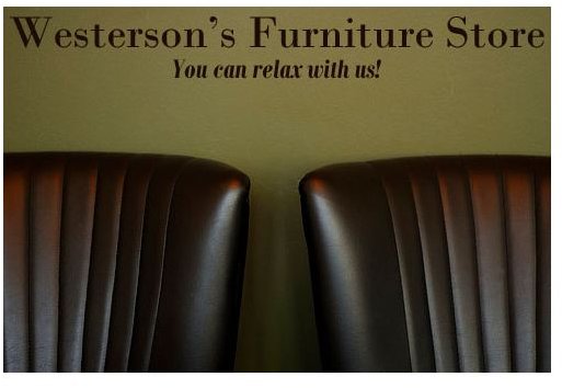
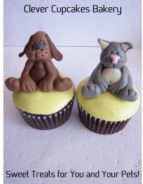
5. Market Services with Text, Market Products with Images
Once you understand how most people process information, marketing becomes a lot clearer. We buy physical products with our eyes first, which is why people like fast cars and leather couches; we’re drawn to things that are well designed. Marketing objects with high resolution pictures of the product will catch your potential customers eye much quicker than any amount of adjectives you could fit on the postcard.
However, services such as house painting, dog walking, and even beauty salons will greatly benefit by providing their customers with information about services provided, prices, and special deals you may have going on. When the product is not tangible, or cannot be touched, people almost always need to be convinced to pay for the service. This is where it is crucial to provide information that the customer would like to know.
Of course, using a program like Photoshop, Paintshop Pro, or GIMP, you can still provide both images and textual information on your postcard. And you should! Here’s an example of two postcards, one that markets a service, while the other markets a product. See how they both include text and images?

6. Print to the Edge
For the front of the postcard, it makes a very striking effect if you print to the edge, rather than leaving a white border around your image. This reminds people of photographs and traditional postcards, and stands out fantastically! Just make sure to keep your information away from the edge, so you don’t have any accidental cut-offs. For the back of the post card, you’ll do good to avoid printing too close to the edge to make sure none of your information gets clipped off.
7. Know your Postcard Sizes and Print Settings
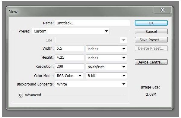
If you’re going to design your postcard by hand with a program like Photoshop, the standard postcard size is 4.25 inches tall and 5.5 inches wide. However, if you feel like you need a little more room, 5.5 inches tall by 8.5 inches wide will still be cheap and easy to send. And no matter what you’re printing out, make sure your images are crisp and clear by making sure you have the right DPI for your project. For printed projects, a DPI of anywhere from 150-300 is great for making sure the project looks as clean and clear as a photograph.
8. Make Sure Your Text Is Readable
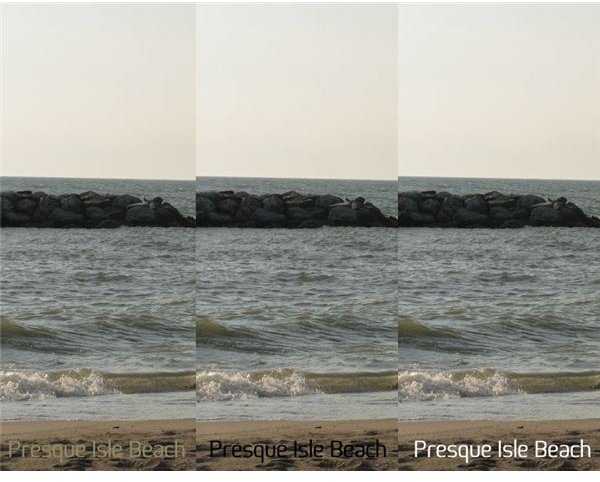
One of the most unfortunate mistakes in postcard marketing is when a design looks good, but the text fades completely into the background. One of the easiest ways to fix this is to avoid using colored text, and stick with the traditional high contrast black or white. Here’s an example below that shows three different shots of the same postcard, one with a color font, one with a black font, and one with a white font.
However, there are times when that won’t be enough, and your text might still fade into the background. There are two fantastic options to help fix the problem, and both are extremely easy to do using Photoshop or any other DTP program you feel comfortable with.
The first way is to simply create a rectangle beneath your text, fill it with white, and drop the opacity down to 50%-25%. This will allow part of your image to show through, but give your text the advantage of standing out against it. Here’s what that would look like!
The second way is to add a stroke (or outline) of a contrasting color around the outside of your font. Normally, you’ll either pick a white font with a black stroke, or a black font with a white stroke. This is done by using Photoshop layer styles , and here’s the result you get.
9. Leave Adequate Space for Information
Don’t forget to leave a space for the stamp, the postmark, and address on the back. Nothing could be worse than designing a beautiful postcard that could be returned to you because there was not enough space to accommodate the amount of information needed for both you and the postal service. Leaving an inch and a half to two inches from the top for your stamp, return address, and postmark, as well as a third, or even as much as half the card for a large, well printed address will make sure that your card gets where it needs to go.
10. Pick Your Paper
Not unlike printing business cards at home , when picking a paper for printing out your postcards, you’re going to want to go with a heavier paper that can stand up to the rigors of being put through the mail system. When it comes to a finish, you can use a glossy paper to help boost your colors, but remember that if you live in an area that has a lot of precipitation or humidity, this can cause the ink to run. A heavy, matte paper will hold up in humidity and rain and has the advantage of being cheaper, but colors are noticeably less vivid on matte paper.
References & Image Credits
References: All information is provided by the author who has a background in graphic design.
Image Credits:
All Photoshop screenshots were taken by Amber Neely
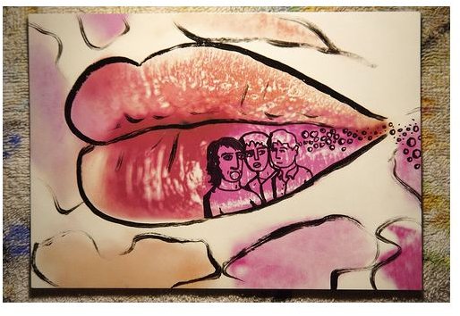
Postcard Colab by Raysto
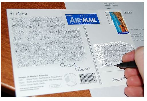
Postcard 1 by Glenn Brown
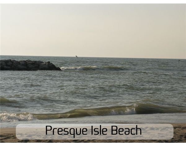
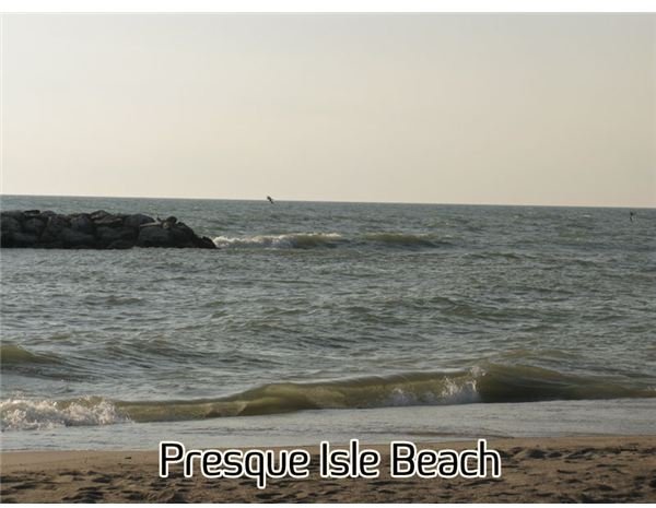
Presque Isle Postcards by Amber Neely
Furniture Store Postcard by Amber Neely (stock listed below)
Doggy Daycare Design by Amber Neely (stock listed below)
Cupcake Design by Amber Neely (stock listed below)
Stock Used for Design:
Leather Chairs by Frank Servayge
Dog by Diganta Das
Dog & Cat Cupcakes by Clever Cupcakes
Presque Isle photo by Amber Neely


