Now that all your data is organized in Excel, it’s time to create the actual histogram. We’ll walk through those steps in this guide.
Column Charts and Histograms
Histograms can be constructed in Microsoft Excel with the Column Chart tool. You do have to make some modifications to the column chart to make it look like a histogram, and we’ll cover the steps needed to do that in this guide.
For this tutorial, we’ll be working with the example discussed in earlier parts of this series. Also, if you would like to download the Excel file that contains all of the data, tables, and charts used in this series, you can find it in the Windows Platform Media Gallery .
Creating the Histogram
In the steps that follow, we’ll construct a histogram from the table of data created in part two of this series .
**
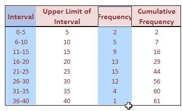
Step 1: Select the columns with information pertaining to the Interval and Frequency, as shown in the image to the right.
Click any image for a larger view.
Note: If your columns are not adjacent (like the ones in this example), select the first column and then hold down the Ctrl key while selecting the second column so that both are included in the selection. In the image to the right, the selected area is highlighted in blue.
(Editing Notes: In the original publication of this article, we used the Upper Limit of Interval instead of the Interval column so that the x-axis labels on the final graph would be shorter and fit better in the small space provided. Some found this a little confusing and thought the resulting graph was not a histogram due to those labels. To make things clearer, we’re reverting to using the full interval class names. Note that this doesn’t change anything except the data labels – both versions are the same chart and both are, indeed, frequency histograms.)
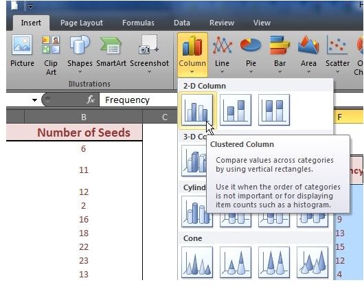
Step 2: Go to the Insert tab in Microsoft Excel, and click on Column in the Charts section. Choose the 2-D Clustered Column option – the first choice under the 2-D Column grouping, as seen in the screenshot to the left.
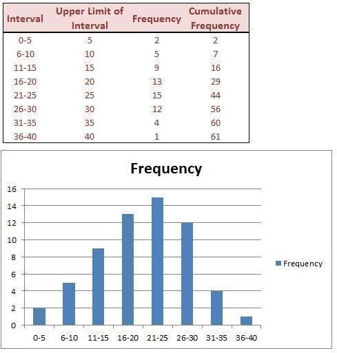
Step 3: By default, the histogram will be created on the same spreadsheet. You can click and drag it to any new location on the sheet (see image to the right) or even move it to a new worksheet .
Improving the Appearance
While our finished result is a basic histogram, there’s a lot that can be done to improve its appearance – including changing the distance between the gaps so that all of the bars appear to “touch” one another. We’ll cover those steps in the next article of this series, Formatting a Histogram in Microsoft Excel .
Don’t forget to check out the other Microsoft Excel chart tips found here at Bright Hub.
Additional Resources and Materials
Explaining Bimodal Histograms – This guide explains what a bimodal histogram is and gives examples, including an example that looks bimodal at first, but really isn’t.
Box Plots vs. Histograms – Is it better to use a box plot or a histogram to represent your data? This guide compares the two chart types and looks at cases in which it may be more advantageous to use one over the other.
Combining Chart Types in Microsoft Excel – This tutorial describes how you can represent two different chart types, such as a column chart and a line chart, in one graph in Microsoft Excel 2007.
References
Microsoft Excel Official Site, https://office.microsoft.com/en-us/excel/
All screenshots taken by author.
This post is part of the series: Histograms in Microsoft Excel 2007
In this series, we’ll cover how to create a histogram in Microsoft Excel 2007. We’ll give some tips for entering your raw data into an Excel spreadsheet, show how to use the frequency function to organize your data, and then demonstrate how to construct and format the histogram from this data.


